Single Page Comic, the first John Space adventure.
-
Thank you for your feedback! I will be working on it this weekend (can’t wait!).
@Griffin-McPherson nice to hear that you are starting a single page comic too! Can’t wait to see your work! yes, I noticed that the maximum was usually 9, but as you said, for a single page comic, it might not be too bad
 I am working on a A4 format actually. It does not look too bad when printed. I was afraid of the font being too small, but Comic Sans 11 point is actually bigger than expected. Did you decide on a font?
 -
@Geoffrey-Mégardon no clue about font or font size. Can’t recall what the norm is but I should probably figure that out to see how much space I need to leave for speech bubbles
-
Here is some updates. I basically made a second pass, to tighten the ideas/sketches.
It is less tight than what I was planing, but there are poses that were challenging and a lot of design decisions that slowed me down. I did not do a lot of preparation work, so I had to improvise a lot (how do a spaceship outside door work? How does that monster look like? Etc).
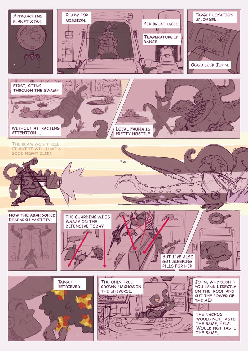
It is taking much longer than anticipated, but I guess that is the price to pay when not doing any preparation work!
-
Pretty awesome for you first onepager!

The only thing that is confusing for me is the panel on which one sees the tree for the first time. Panel says: "Important item in the middle of the panel: TREE", but the text introducing this panel says "But I've also got sleeping pills for her". So my eyes expect to see something that fits together with that. And doesn't.
I THINK the small thing on the top of the tree-panel suggests a sleeping injection, but as the text says "pills" and nowhere else it gets clear that he has a weapon that can send sleep "injections", that's a little bit hard to understand.
How about making the tree-panel a "standalone" panel, with no diagonal egdes and a bubble in it that says "Finally!"? Diagonals are for action (or disagreement), and in my imagination he is in no hurry anymore when the door to the tree opens, but has already defeated the AI.
And the victory over the AI happens in the panel before? The last John who makes a hand stand could rip out some cables with the free hand or do anything that makes clear he switches of the AI? Or smash it on the ground if it some kind of drone. And the text could only say "Gotcha!", as this would be enough and would not take away much space.
In the panel in which he is taking a nacho, it would be more natural to mak him look at his FINGERS and the nacho they are touching, instead of lookinh upwards.
Oh, instead of my suggestion of writing "Finally" into the tree-panel, you can put the "Target retrieved" there, and the text "The only tree grown nachos in the universe" fits much better into the panel where the nachos are visible for the first time.
-
@MimiHecher said in Single Page Comic, the first John Space adventure.:
Pretty awesome for you first onepager!

Thanks!
The only thing that is confusing for me is the panel on which one sees the tree for the first time. Panel says: "Important item in the middle of the panel: TREE", but the text introducing this panel says "But I've also got sleeping pills for her". So my eyes expect to see something that fits together with that. And doesn't.
I THINK the small thing on the top of the tree-panel suggests a sleeping injection, but as the text says "pills" and nowhere else it gets clear that he has a weapon that can send sleep "injections", that's a little bit hard to understand.
How about making the tree-panel a "standalone" panel, with no diagonal egdes and a bubble in it that says "Finally!"? Diagonals are for action (or disagreement), and in my imagination he is in no hurry anymore when the door to the tree opens, but has already defeated the AI.
And the victory over the AI happens in the panel before? The last John who makes a hand stand could rip out some cables with the free hand or do anything that makes clear he switches of the AI? Or smash it on the ground if it some kind of drone. And the text could only say "Gotcha!", as this would be enough and would not take away much space.
I forgot to draw an electric arc going from the gun to the IA eye between panel 8 (with John doing an hand stand) and 9 (with the tree). I drew it in the first thumbnails. That's how he desactivates the AI. I think it is a good idea to help the reader by replacing "pill" with something like that signifies an Electromagnetic pulse (not sure what word).
In the panel in which he is taking a nacho, it would be more natural to mak him look at his FINGERS and the nacho they are touching, instead of lookinh upwards.
That does make sense ! Don't know why I draw it that way...
Oh, instead of my suggestion of writing "Finally" into the tree-panel, you can put the "Target retrieved" there, and the text "The only tree grown nachos in the universe" fits much better into the panel where the nachos are visible for the first time.
I want some suspens (a micro suspens I guess!). We see the tree, we see these triangular yellow stuffs, and then, I say it with words.
-
@Geoffrey-Mégardon I love it how much thought you put in everything you draw!
Yes, with the electric arc and something else instead of the word "pill" my problem of understanding will definitely be solved!I understand the deliberate suspens in the text.

-
Enjoyed your process! Very much looking forward to more of John Space’s adventures.
-
@Geoffrey-Mégardon very fun to read. Well done!
-
Here the update of the day.
I finished the inking (I think!). And I made a very rough color pass (a "color thumbnail"?) just to try some colors and see if it works or not and get your feedback.
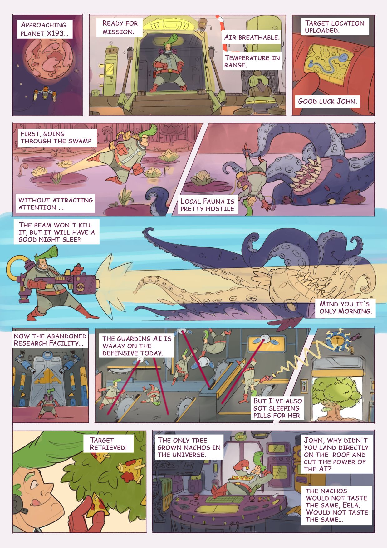
I tried to used a limited palette for the different environments, but I am not sure if everything fits/works together yet. Not sure about the blue background for the long horizontal panel (where John Space is shooting).
In case you wonder how it looks in black and white, here it is:
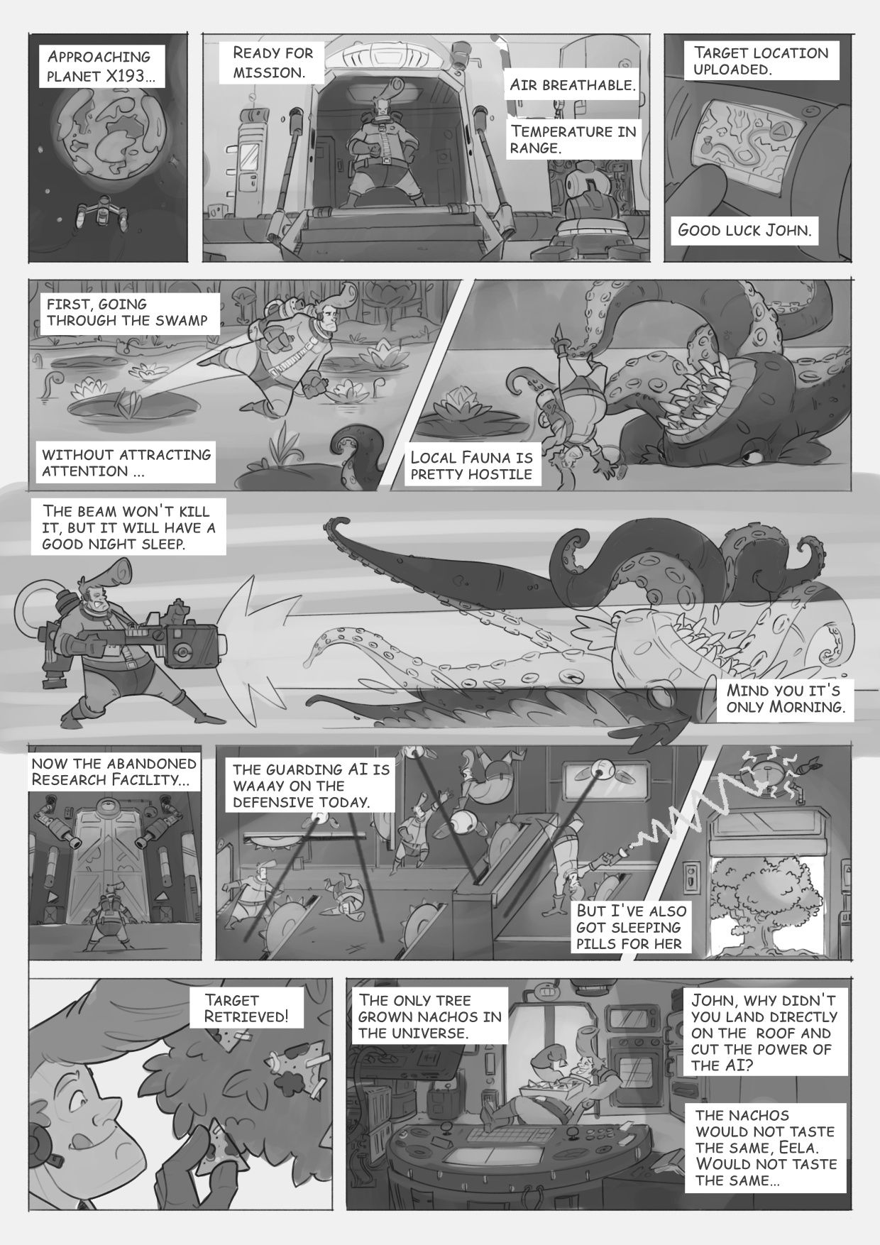
To be honest I prefer the black and white version
 I am not sure what I am doing wrong with the colors, but I am not 100% satisfied.
Edit: @MimiHecher I still need to find another word for the pill, I will edit the text when I am back in Affinity Designer.
-
@crispalomino thank you! I hope I will get quicker at producing them!
 My plan is to do a webcomic.
 -
@Mewie Thank you! it is nice to hear

-
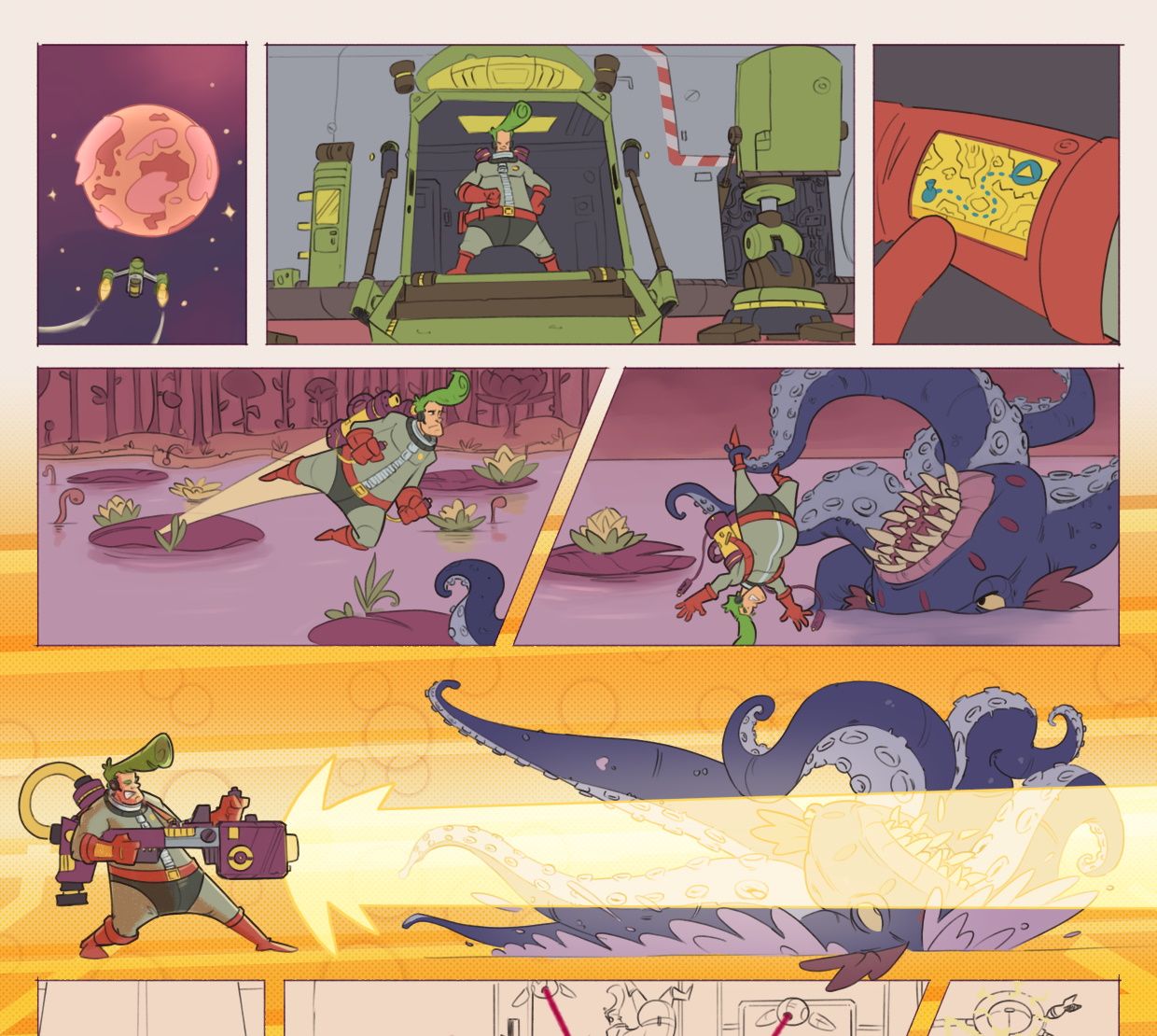
It's taking me sooooo long to add color! I don't know if that's normal or if I am way out of my comfort zone (first comic!).
Basically I decided to move to Clip Studio for the coloring because it has more tools for selection and filling (compared to Procreate). But I am not sure if I am saving much time as some selection/fill tools do not like that my "inking" is made with a semi-transparent pencil. So I might need to use a more traditional inking brush for the next iterations.
Anyway, as it is taking me ages to color, I felt I needed to post my progress, to kind of feel like I am progressing.
-
@Geoffrey-Mégardon Color always takes me FOREVER too. You've really grown and nailed this one pager! it's fantastic. You could consider doing black and white until he gets to the tree and just have the tree and after in color.
-
@Geoffrey-Mégardon The palette you chose is very harmonious and energetic
-
@Geoffrey-Mégardon it looks great! Good luck with it.
-
@ksfabian Thanks! yeah, I think one thing that made the coloring so time consuming is that I used a semi transparent pencil brush for the inking. It looks great but it does not work well with the fill tools. I think it is too late for me to go black and white
 but yeah I do want to give it a try in the future.
@jenn thank you! I've used Strange World from Walt Disney as an inspiration.
@Erichousel thank you! I will be posting the final results this afternoon!
-
As promised, the final cut!
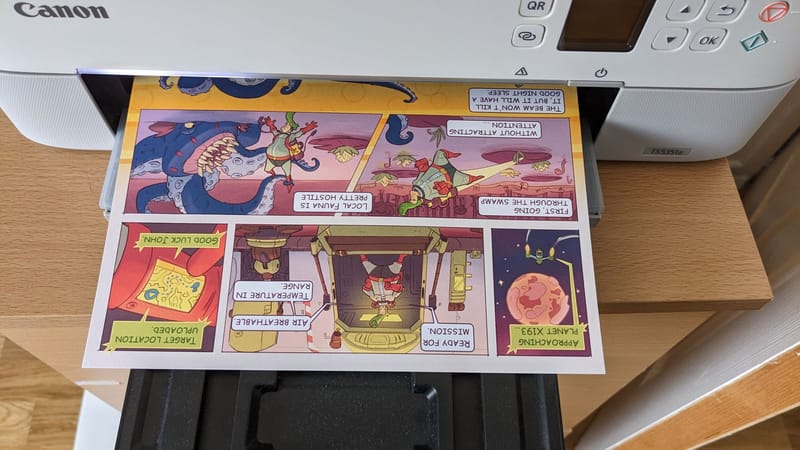
The first adventure of John Space, that's so exciting!
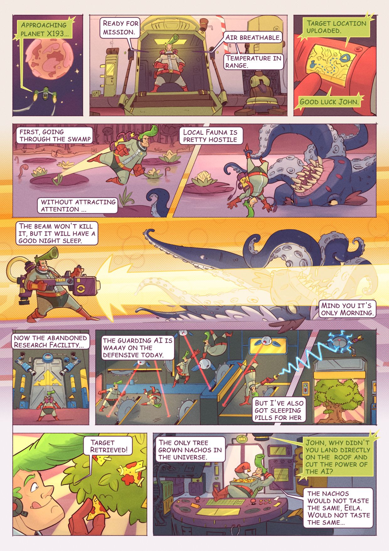
Thank you all for your support while I was making it; it was a lot of things to learn and improvise upon, and to read your encouragements really helped!
I think I will take a little break and focus on world building and visual dev in the next weeks. Turns out that I had to improvise on a lot of things even for this single page comic. I would like to get a better ideas of who is John, how is his spaceship, how other characters and worlds look like etc.
Feel free to give feedback even if this is finished work, I can use the feedback for the next story!
-
@Geoffrey-Mégardon this is such a clever comic and very enjoyable from a readers standpoint. I would definitely want to read more about the adventures of John space from the looks of this first one.

-
Referenced by
Geoffrey Mégardon