Feedback on my comic cover
-
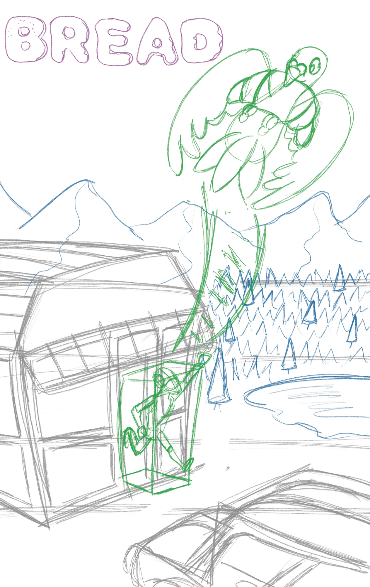
I'd love some feedback on my sketch before I go further with it. I always go forward too fast and miss important mistakes in my sketch. Thank you so much!!

-
@ksfabian I love how the letters look like bread.
 I think the sketch is intriguing and has great action. Although I am not skilled with covers, I'd suggest making the title look like it's nestled very comfortably in the empty space in the sky. I'd keep your font but change the positioning of the mountains and/or bird to give the title breathing room, but with less empty space below it. If you're planning to publish your comic, consider looking up the distance font can be from the edge of a page based on which printing service you might use.
Also consider where your name as creator can be naturally placed.
Hope that's useful!
-
@KathrynAdebayo Thank you! I totally forgot about the bleed even though I looked up the measurements with bleed (face palm) Thank you so much!!
-
@ksfabian I love seeing this new concept! I'm curious about book cover design. I'm not as experienced in book covers so I can't really speak to improving your sketch really but I'll say I love the movement and cool way you drew "Bread". I suppose as you work on color I'll understand more of what you are envisioning.

-
I would suggest creating more variation in size and placement of objects. The mountains are all very uniform which feels unnatural. You could try bring them way up on the left side and then bringing them down a bit lower on the right. A lot of areas are the same size here. The horizontal lines you have really point this out, the mountains, trees, and pond all take up about the same amount of vertical space. You could show more distant trees trailing off from the mountains and also speckled around the lake more so these areas feel more varied and dynamic.
Similarly the bird, house, and car are all similar in size. The bird seems to be the main focus so you could keep it about the same size while making the house and car smaller. This would also create a more dramatic perspective.
This is a good general layout and a fun perspective. Don’t be afraid to to really shake things up and shift around the placement and size of things until the composition feels just right. It’s important to really nail the composition because no matter how good the rest of it looks it will never matter if the composition isn’t up to par. -
@Griffin-McPherson Thank you so much! I will definitely adjust those today.
-
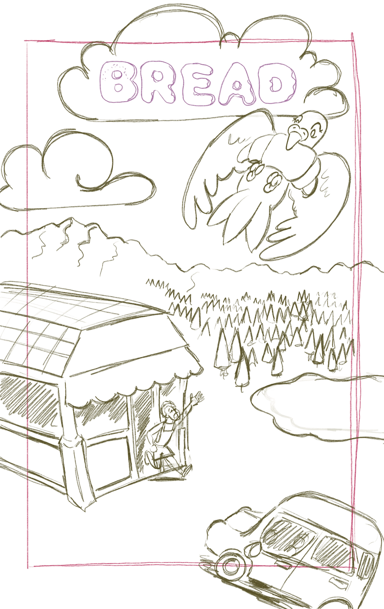
Here's my updated sketch. Again, feedback is not only welcomed, it's celebrated!

-
@ksfabian This is looking much better! I'm definitely not a pro when it comes to covers, but something I have seen is when the text interacts with the image. You could experiment with having the bird's head/wing cover the text a bit. That way you could bring that cloud down and make the title bigger. It also might be a good idea to bring the bird down in the sky a little so that the wing tip is overlapping the mountains. That would add more depth and take care of the near tangent.
-
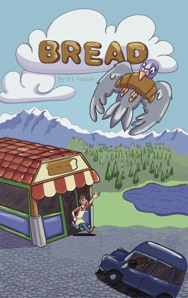
Have you done any more updates? I can hardly wait to see the finished cover, this looks fantastic!

-
@Robyn-Hepburn
 Sorry Here is the finished cover.