Website launched! Critiques welcome
-
@NessIllustration Interesting! I do see how it cleans up the art and looks more professional...

-
Hi @kirsten-mcg, I ended up doing the same on my Kamari piece after the good advice here.
-
Website looks great @ArtistErin! The improvements certainly helped!
-
@Mimi-Simon Oh yeah you nailed that point totally. I have to make myself walk away often. I could fiddle with something forever! And I'm not a programmer either
 I'd rather be an artist, it's way more fun
 -
@Jeremy-Ross Thank you Jeremy!!
-
@Jeremy-Ross glad I wasn't the only one!
-
Your site looks great now @ArtistErin ! I think the changes you made really help, IT looks clean and professional and is easy to navigate. And you're not the only one to buy a domain name that isn't exactly right. I added "art" to my domain name after my name, and now it’s so long I'm kicking myself and wishing I had just used my name. But The address is really a Little thing I think. Most people just click on the link without thinking about it much!
-
Looks great, now! Good job!
-
@ArtistErin I only saw your new and improved site, but it looks great. Clean, simple and the works get all the attention they deserve. Great job!!
-
@kirsten-mcg Thank you Kirsten! This means alot to me! I can tell, in fact, I know this is the stuff I was afraid of doing: making mistakes, looking like a fool or unprofessional which tends to sprout thoughts of imposter syndrome and perfectionism, which has stopped me in the past from getting out there. Risking looking amateurish, huge fear. But I tell myself now just do it anyway and I can change my mind, course correct, and don't worry so much.
My brother is a great photographer, and is helping me with my photos! Looking forward to this part. I feel good photography is important for branding...
 Upward and Onward
 -
@Charlotte-Glaze Thank you Charlotte!!!

-
@Chantal-Goetheer Thank you Chantal!!! Yeah it's been a learning curve! I can say with every ounce of myself it is so satisfying to do the thing I have been afraid of. Tackling fear head on seems to be my theme this year.
Talking to potential art directors, agents, employers... that's next

-
@ArtistErin You go girl!!
-
@Chantal-Goetheer Thanks!!!! I'm working a full schedule along with squeezing in an hour or two before I have to go in to work. Not easy but worth it...
Slow and steady wins the race
-
@ArtistErin indeed, keep going. It's so tough sometimes. Didn't manage much since the new year, flooded with overtime and trying to make a career switch into elementary school on the side. Im cheering you on. Good for you that you are managing to find time on the side!
-
@Chantal-Goetheer Thank you Chantal!!

-
@kirsten-mcg Oh, that’s really good info to have!
-
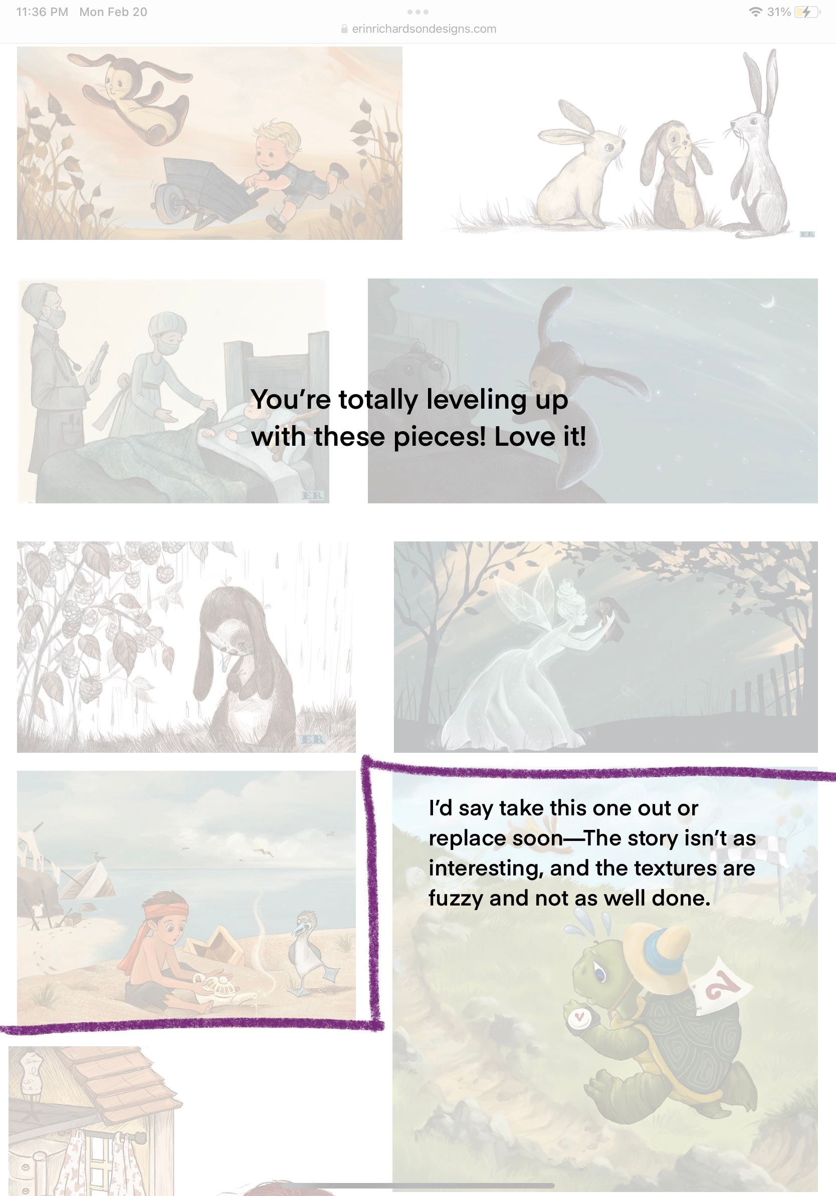
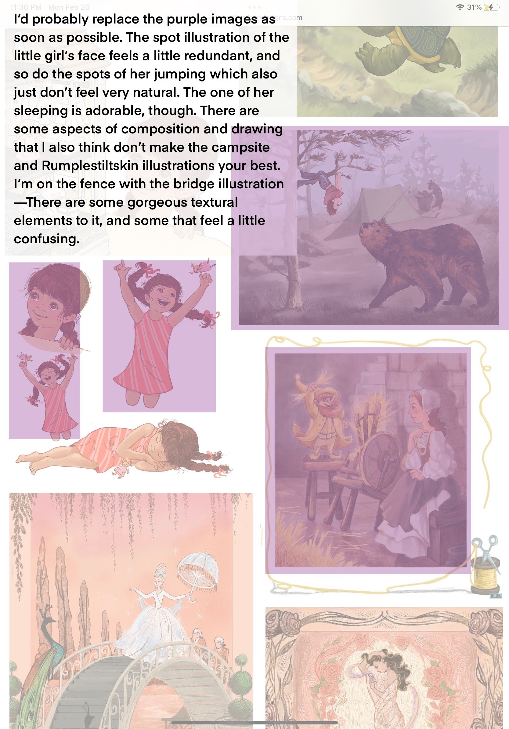
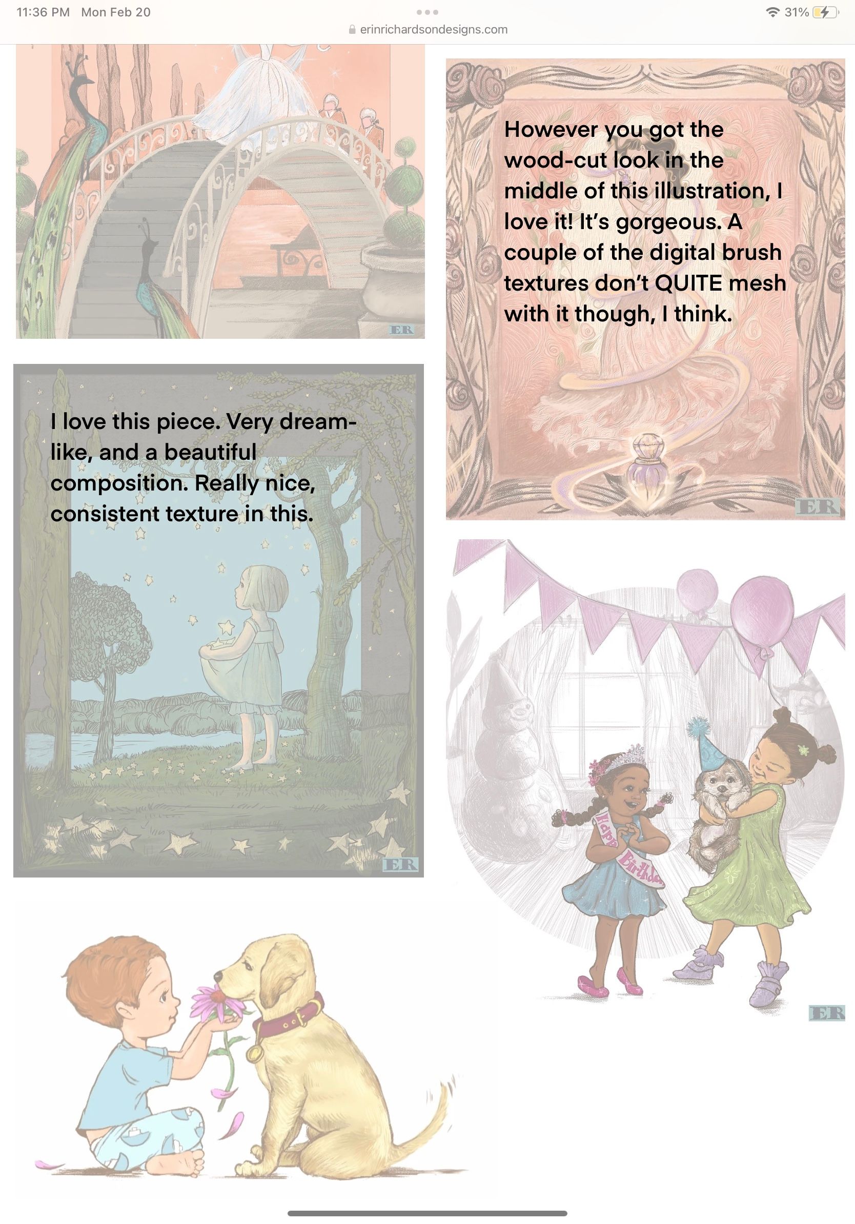
@ArtistErin Hi Erin, this is looking great, and it seems like a lot of people have given excellent website design feedback already! I did have some thoughts on the presentation of your portfolio, though, if you’re interested in that type of input. I highlighted and commented on a few things:


I hope this is somewhat helpful to you on your path to becoming an epic illustrator! Let me know if I went too far with this. Also, is that an actual lino cut in that rose/bottle illustration?? That’s such a cool effect.
-
@Sarah-VanDam THANK YOU Sarah!!! Thank you for taking the time with breaking this down for me in such detail. I totally agree with you BTW about all your points. It's interesting, I created the Velveteen images most recently, and the others are more or less some of my better works yet in the realm of middle of the road on my skillset journey, from Folktale week, and so you confirmed my thoughts exactly. So just thanking you again for this!
So now, I am putting together some stuff to replace the pieces you mentioned, the tortoise image might get cut altogether as it is compositionally boring and no sense in trying to fix it at this point.
The lino cut technique I used in the Potion image was a filter I used in Photoshop that I loved and although it was neat to apply, it feels somewhat busy and distracting, inconsistent with the linework in the other pieces.
The character sheet definitely is needing to be changed up. I'll re-design her in different poses to show more believable gestures and sequences. Again, this is one of my earliest attempts at creating the same character in different positions.
I'll post the spread I am currently working on, hoping to make progress with different situations showing emotion and relatable situations. I am considering buying a critique from SVS, when that becomes available! Obviously I want to fast track this process so I'm not spinning my wheels, and you definitely helped me in feeling so much more focused. Can't thank you enough.

-
@willicreate Thank you!!! Replied to @Sarah-VanDam about moving forward with improving the pieces, and considering buying the critique offer coming up through SVS, coming I think Mar. 1? Listening to the Patreon podcast, crossing my fingers I can swing it. I've been spending so much $ but honestly I feel that based on what I'm hearing, it's worth its weight in gold.