Critique on my Glow submission
-
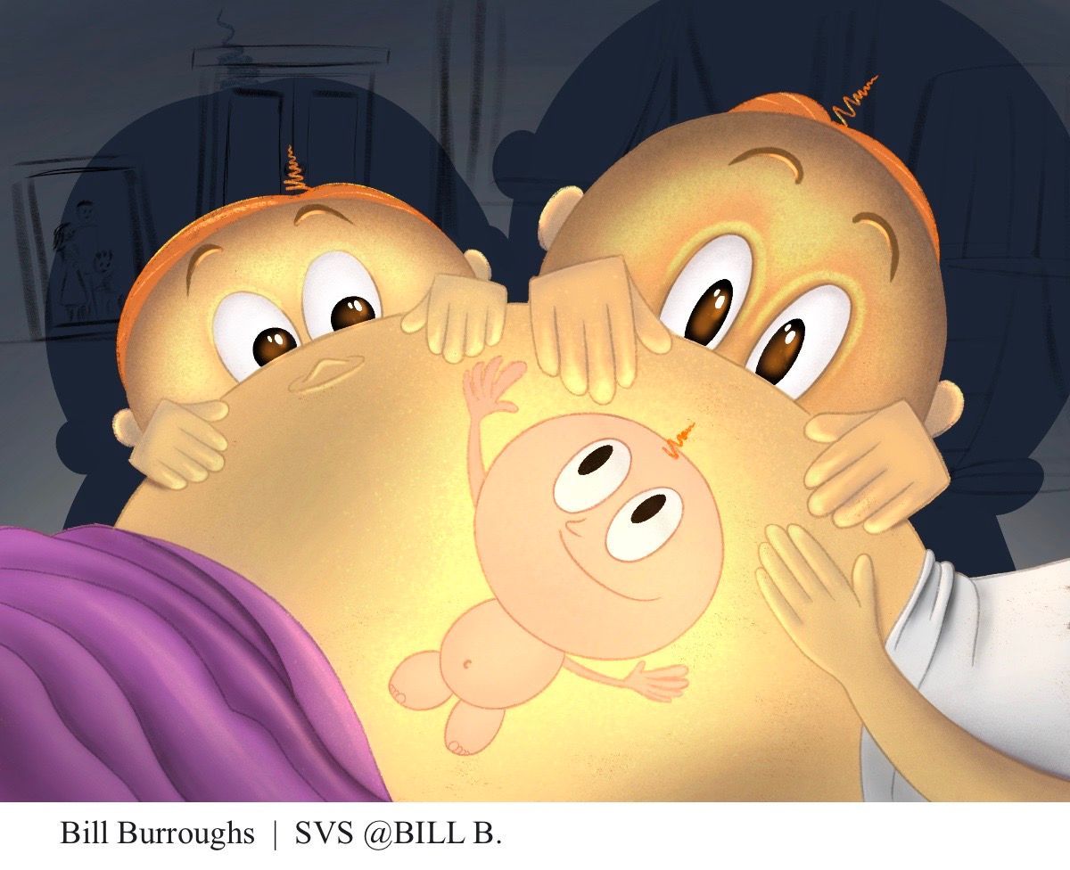
Hello everyone. This was my submission for the Glow Critique Arena. I would appreciate any feedback on composition, proportions, design, painting, pretty much all of it.
Thank you.
-
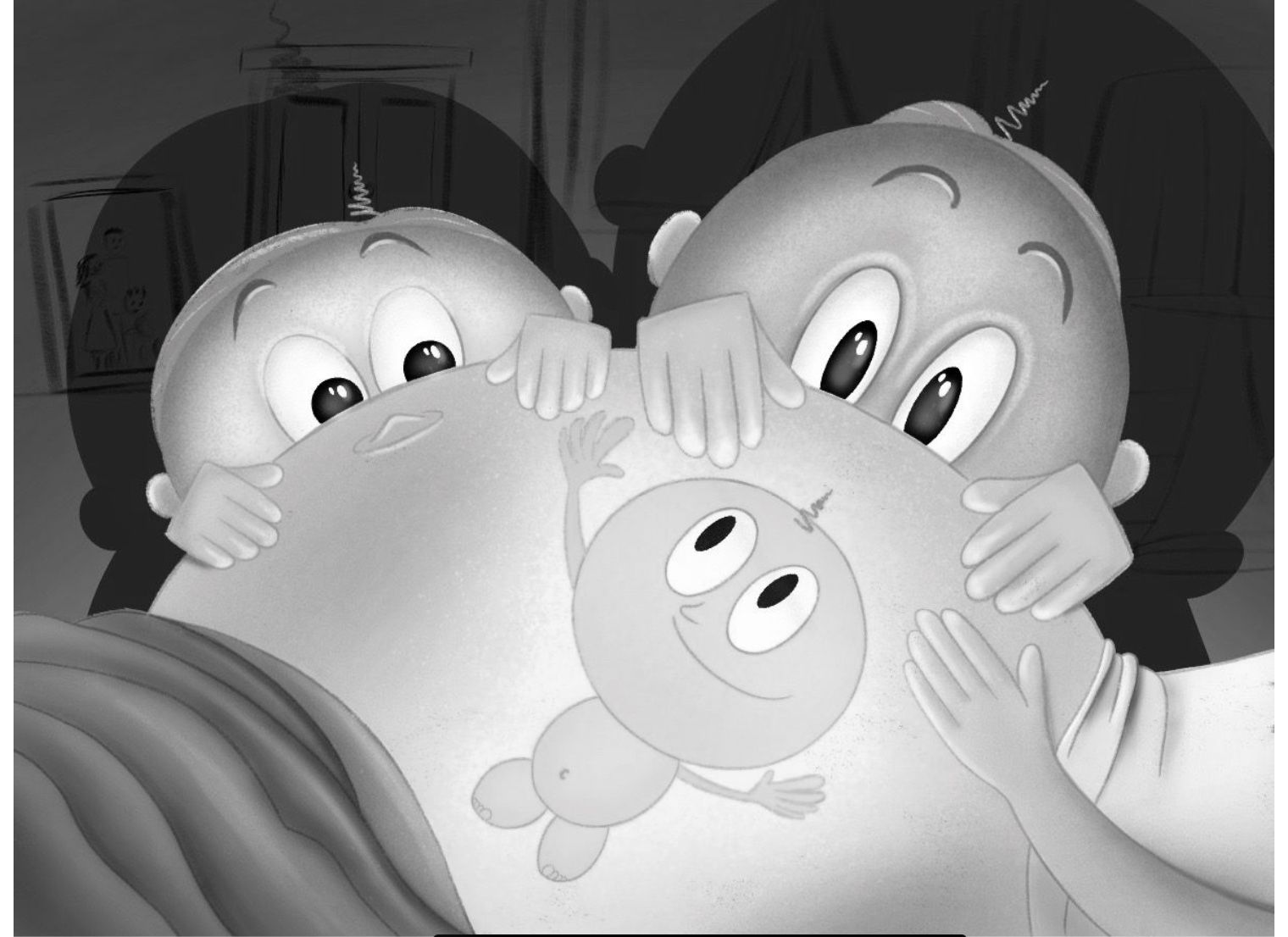
@Bill-B loved your concept! Such a good idea. I think the baby in the belly should look a bit more undefined/ get different colours. Now it looks a bit like a sticker on the belly rather than being inside the belly. And somehow try to get more contrast between the kids behind and the belly. Now they have very similar colours. I like the composition of them peaking over wouldn't change anything in that area.
-

This is such a cute idea.
The first thing I can see is that there isn’t a whole lot of value changes. The siblings kind of get lost behind the moms belly. Next I would deepen the area of baby for the orangey glow, and soften the boldness of the baby as it currently has more of a tattoo feel than baby from inside interacting with their siblings. The last think I will mention is moms hand is disproportionately small both in relation to her belly and to her toddler Her hand would be closest to the camera, so should be fairly enlarged.
I would play around with thumb nailing all of the different point of views you can take on this image, and see if there’s a better view point. Maybe mom i on the couch and both kids are snuggling her belly with one giggling to imply feeling kicks. Just a thought.
-
@Bill-B the baby is a bit confusing to me because it looks more like a sticker rather than looking like we’re sort of seeing into the mother. To fix this you could could have the area around the baby much darker, more like the inside of the mother. Sort of as if the baby were a little spot illustration on the mother’s belly. It’s also confusing to me that the baby is glowing. I think you could instead just make the mother’s belly glow. I think that would also bring more focus to the theme of the beauty and wonder of child birth rather than making the viewer wonder why the baby is glowing. Hope that helps!
-
Love this idea...I agree with Griffin's comments above. I also think there's maybe an issue with proportion - the small children's hands are much bigger than the mother's and I think perhaps the mother's bellybutton is not in the right position for how the mother is laying? Hope these thoughts are useful

-
@Bill-B This concept is super cute! I agree with Griffin's comment about mom's hand being too small. Looking at some reference of pregnant women might help too. I know this is a highly stylized piece, but mom's back looks way too long right now. I think going back the the thumbnail stage and playing around a little more with shapes and proportions might help a lot. And you can post thumbnails and roughs here and get everyone's feedback before going to final! That always helps me a ton and keeps me from doing lots of work on a piece where the design isn't working. This is such a darling concept I would really love to see a re-work of it!
-
@Chantal-Goetheer Thank you for the response. I tried for several days to get the baby to feel like it was inside the belly, almost like in a cave. I just couldn’t get it to read correctly or make it feel appealing. I think I should have worked harder to give the baby more form so it don’t look flat like a sticker. Thank you.
-
@kirsten-mcg Thanks for the response. One of the struggles for the composition was the mothers belly. It had to be big enough to block the other characters but was to big for the baby. I do agree that I probably need to do more exploration to see if I would come up with a better composition.
Thank you for the feedback.