Critiques Please! • Nativity Triptych • WIP
-
I am working on a Nativity Triptych to use in centerpieces for a Christmas Activity at my church.
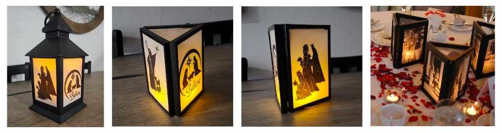
We'll be making something like this:
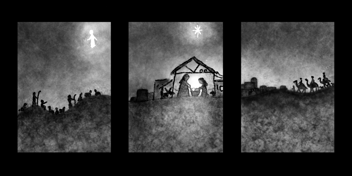
We're still deciding, but I think we are going with the picture frame idea (not the lantern). The first few pictures are prototypes my friend put together with some images she found online.
The last photo is the idea I found on Pinterest.I thought it would be nice to have one scene that wraps around the centerpiece.
Here's the sketch I came up with so far:
Any comments / critiques are welcome!
-
@Miriam What a beautiful centerpiece idea! what sizes will the frames be?
Generals:
- If you are doing paper cutout and the frames are small, the silhouette needs to be a lot stronger on each frame.
- You may want to position the focal point of each frame where the strongest light from the tealight will be. Then you are taking full advantage of the setup!
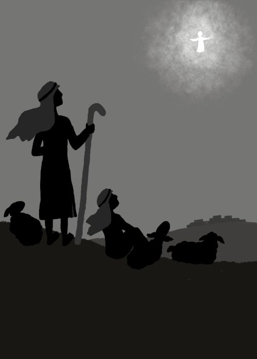
Frame 1: I assume they are the shepherds when the angel appears. This scene needs to have a clear focal point (either the angel or the shepherds ' facial expressions) which means one of those need to be bigger. Shepherds, angel, ground/hill -> assign a relative size to each: small, medium, huge (refer to Will's Creative Composition class)
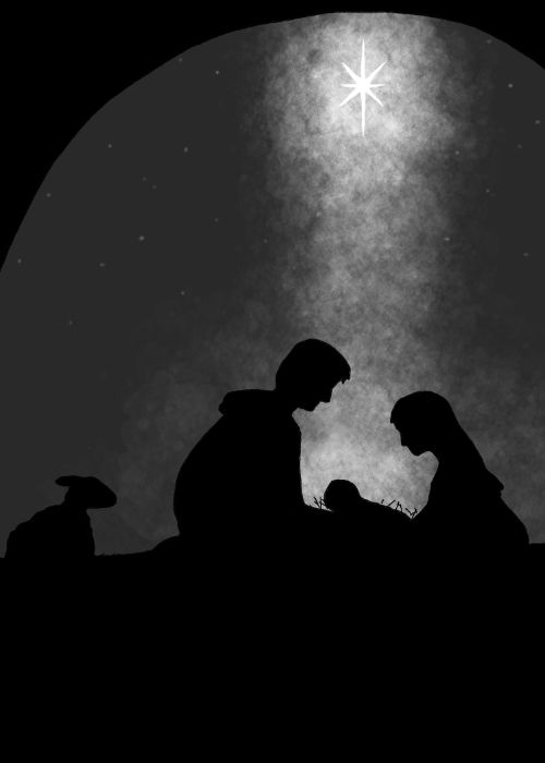
Frame 2: Mary, Joseph and Jesus in the manger need to be bigger on the frame. Currently half of the frame is taken up by the ground, I would bring this down to 1/3 and rearrange the elements a bit to get a stronger silhouette
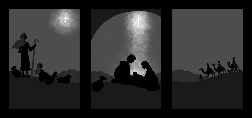
Frame 3: Is OK as is if the focus is travel (the magi coming to Bethlehem from a faraway place. Make the camels just a biiit bigger and you're good.
Enjoy the creation process
") would love to see the final product!!
would love to see the final product!!www.instagram.com/art.melc.illo/
www.artmelc.com
I write weekly on mondayblues.substack.com -
@Miriam one thing I noticed is that the horizon in the starting image and the horizon in the last image won't match when they're attached to each other like the pictures show. Other then that I love it. I hope you share the final result with us when you're finished!
-
@ArtMelC & @kirsten-mcg Wow, thanks for all the great advice!
I thought thought they were really pretty when I saw it on Pinterest a long time ago, so it's nice to have an occasion to use the idea.
The frames are 5x7. We're using 1.5" & 2" battery powered candles. So that helps put it near the center, and my friend thought of using a mirror underneath the candle to help reflect more light.
I had wanted it to be one image that wraps around, but you are right -- I was concerned about the subjects being too small & having so much "empty" space, so thanks for confirming that & giving me the push to make a better composition.
I will work on all of the things you both mentioned.
-
Here's my new version for the Nativity image. I will add some textures which will lighten all the layers up, but I thought I'd share what I have so far.
-
@Miriam I love it

-
@Miriam This looks great!
-
@Miriam Beautiful!
-
' This is my new version for the shepherds so far. As with the Nativity, I will add some textures which will lighten it up. (I want to wait until I have the rest done before I put in the textures so hopefully the three images will match.)
-
@Miriam Wow, this is cool! I’m curious, though, how will you make the different layers of value? Maybe different paper thicknesses? Will you simplify everything to black silhouettes?
https://sarahvandam.art/
Instagram: @sarahvandam.art and @artistsandbox.etsy -
@Sarah-VanDam Thanks! We will be printing the images onto vellum paper.
(In case you aren’t familiar with it, vellum is a semi-transparent paper with a very soft diffused look. It looks similar to tracing paper, except vellum is much thicker & sturdier. You may have seen it used in graduation or wedding announcements. I think it’s traditionally / originally made from goat skin, but I’m sure most isn’t anymore.)
I was planning to have it in a silhouette, but I was worried that the shape of the shepherds would be difficult with their head coverings. But now I’m concerned that the images won’t match as much.
-
Referenced by
 Miriam
-
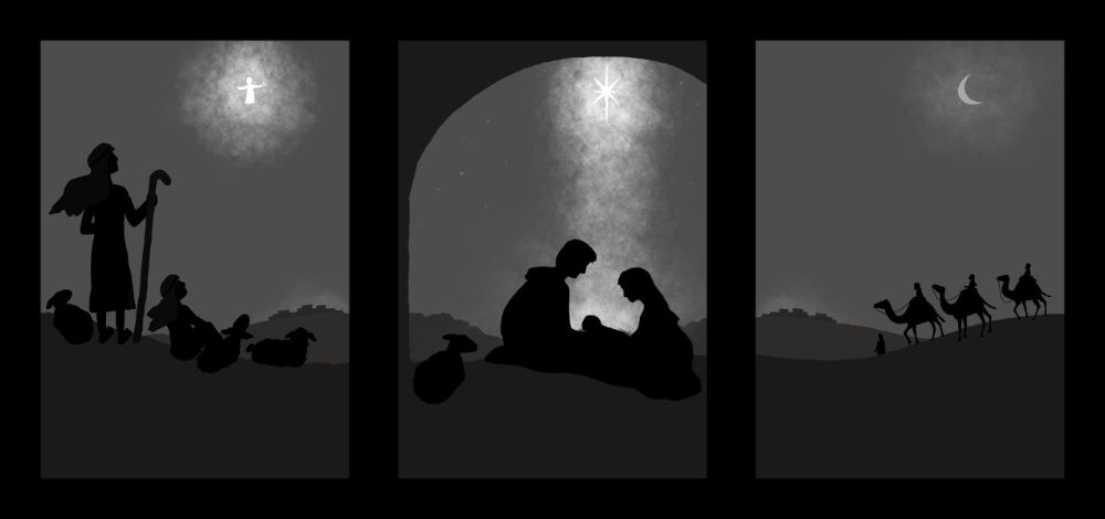
I'm working on the composition for the wisemen illustration & also on how the three images line up, so they will have a nice transition around the centerpiece.
-
@Miriam it's looking great lined up like that. Want to see a picture of the finished centered piece when it's all done.
-
This post is deleted! -
Thanks, @Chantal-Goetheer! Yes, I’ll have to take some pictures when they are completed.
-
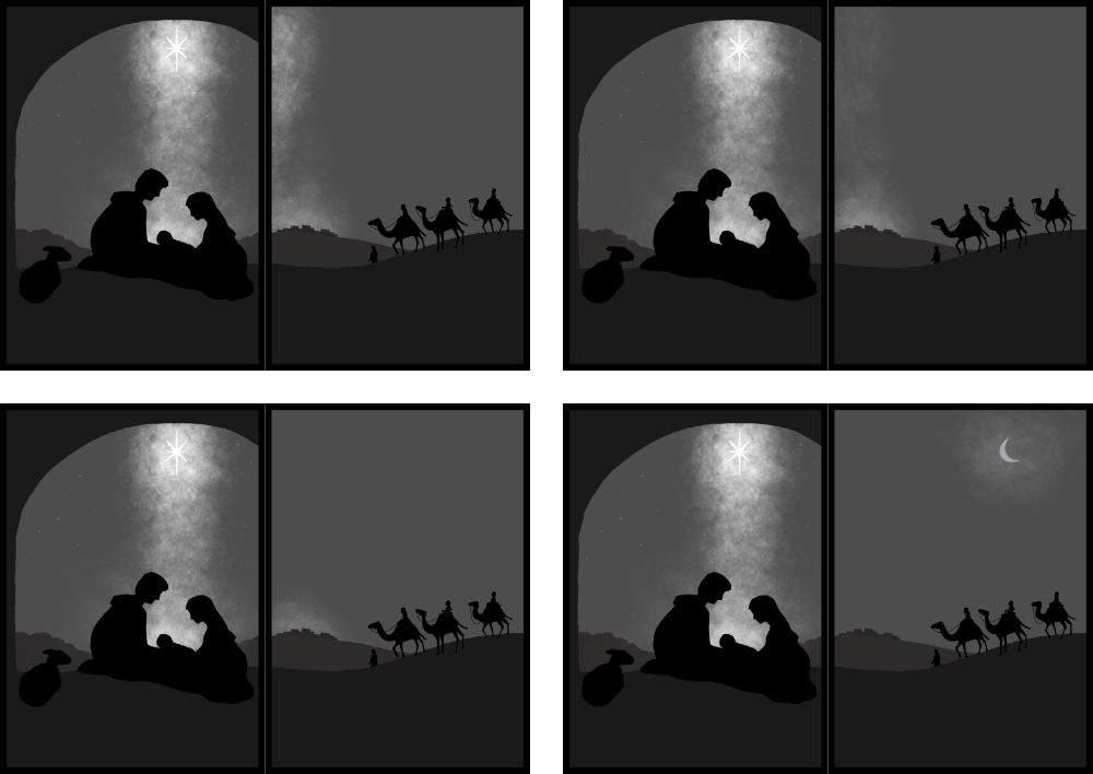
Here are my concerns at the moment — aside from the fact that I want to finish by tomorrow (Tuesday) afternoon! (The centerpieces are for a party on Saturday & we need to assemble about 30 of them.):
• Does the arch look ok on the Nativity / Holy family?
It’s meant to suggest the stable / cave they stayed in.• Is it working to have the shepherds’ head coverings & crook a lighter value when the other two images are full silhouettes (other than the background layer)?
I thought the shapes would be hard to distinguish in full black.
(I think having the lighter values of the background & sky help. Plus, I plan to add a lot of texture to all the layers.)• I was also wondering about the sky for the wisemen.
If it was a stand alone image, I would draw the star. But I didn't really like the idea of having a large star in all three images.Should I just see if the textures & some regular stars can take care of it? Or should I try adding a moon?
(I also need to finish cleaning up the wisemen & camels.)
• Please let me know if you have any other critiques or suggestions!
@ArtMelC, @kirsten-mcg, @Frogpunzel, @Sarah-VanDam , & @Chantal-Goetheer Thanks for all the compliments, comments & encouragement!
-
@Miriam
For the arch it looks fine. Maybe on the sheep side you could have a slight hint of the wall as well.I get that you dont want another star, wouldn't quite fit. The other one works because it's the angel coming. But maybe the star of the nativity scène could spread some light to the side of the wisemen? As it does downward to the nativity?
The silhouette I think should also read fine when it is just all black like the others. Could you try to see how it looks? It looks seperate enough to clearly see a shepherd silhouette to me. It will maybe work best with the light when all silhouettes are the same colour/value wise?
Good luck finishing it!
-
@Miriam I love the look of the uneven arch over the Nativity.
I think the shepherds should be silhouettes like all the other figures. They look like they would read just fine without the lighter color for their head covering. If I squint my eyes it all blends together, and I still see a shepherd.
I agree with @Chantal-Goetheer that making a little light from the star over the nativity bleed over into the wiseman image would work well. That way you can still suggest that they're following a star, but not need to repeat it.
Good luck! And show us the finished pieces!
-
@Miriam I would have to agree with what has been said. I think spilling a little of the stars light onto the wise men's side is a great idea. For me I didn't realize the arch was to represent the stable/cave, but I thought it was more of a designed border. I do think it looks fine, I just didn't quite get the whole idea. This is a really neat project, I have wanted to attempt a nativity scene for some time but not quite sure how I would want to do it.
-
@Chantal-Goetheer @kirsten-mcg & @Frogpunzel
Thanks for the advice!
Adding the bit of wall on the manger scene really helps. I also lowered the arch a little.
I tried adding a glow like it’s coming from the star, but it didn’t look right because there’s a gap of sky in between. I’d have to move the star over for it to work, but I like having the star right above the manger.
So I tried adding a moon for the wisemen, plus a little glow on the town & I like it.
You guys were right, it is better for the shepherds to be fully silhouette to match the other frames. I also added glow on the town to match the wisemen image.
Now I just need to lighten up the layers with a textured mask & try to keep the same glow effects.
@Frogpunzel It would be great to see your version of a Nativity.