Feedback: Book cover composition
-
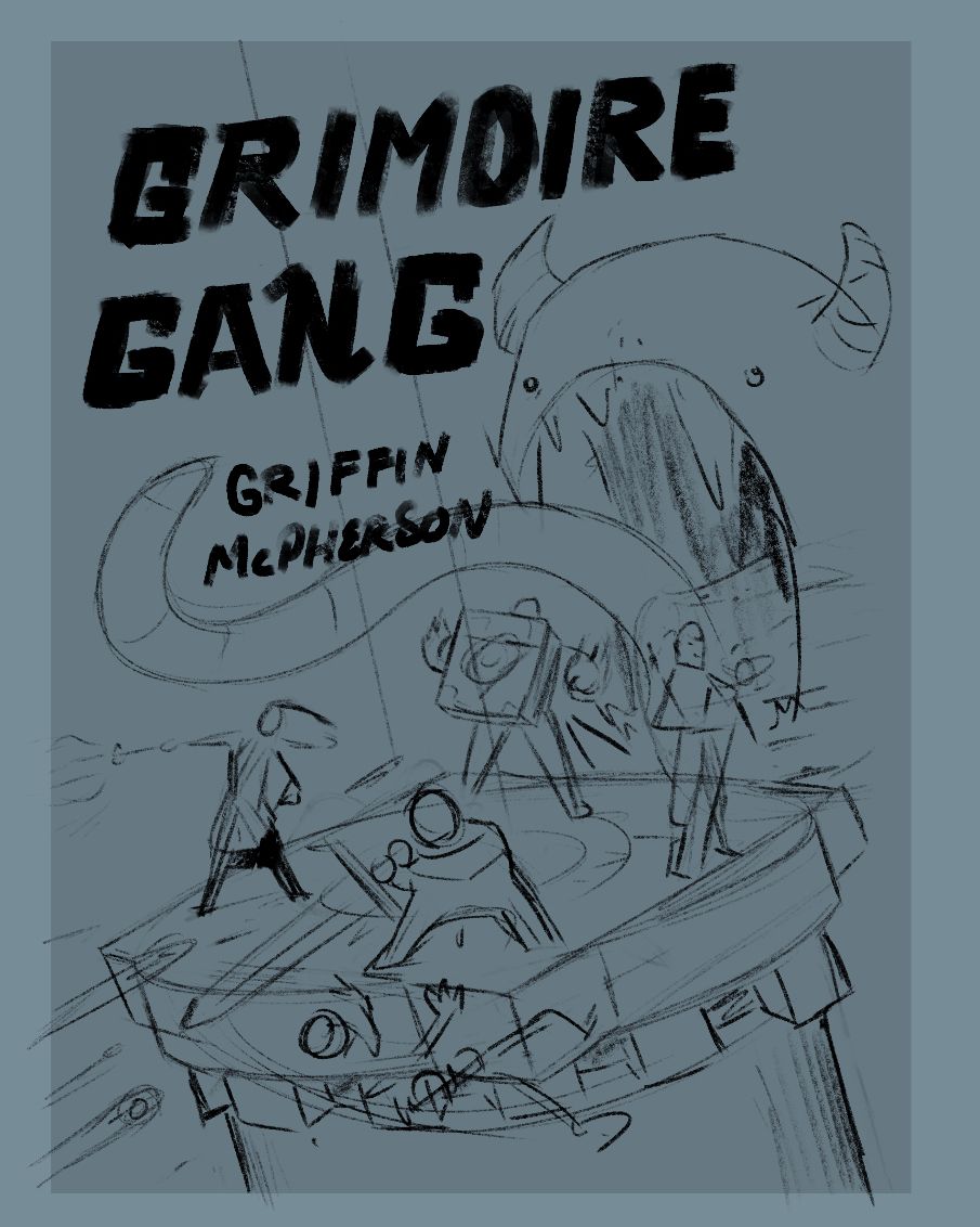
Basically just as the title says. Just wanted your opinions on how the composition is looking for this book cover piece. I find getting the title and name in the right spots to be particularly tricky so let me know if you think that’s working
-
@Griffin-McPherson looks pretty good to me!

-
@Griffin-McPherson really like the diagonal composition you've got going. The text fits nicely too.
-
I like it @Griffin-McPherson. Please share the finished cover.
-
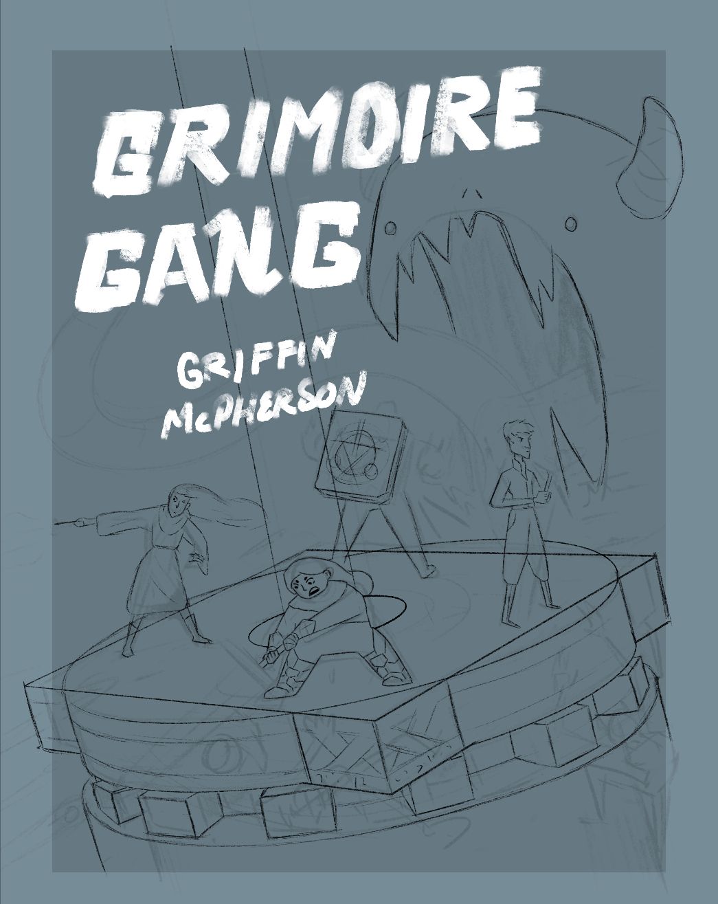
Update: so I scaled it up a bunch because I feel like it scales up the feeling of chaos. Let me know what you guys think on that. I also think I’ll have a frame so parts of the image overlap onto it to make it feel like it’s popping out a bit. Let me know your thoughts!
-
@Griffin-McPherson I like the scaled up version. One thing that I liked about the original was that the monster's tongue looked like it was grabbing your name and it's not in this one. Is that something you could try to make happen in this version of the composition?
-
@Stephanie-H I think I can find a way to finagle that!