Illustration critique please
-

I posted an illustration from this book a week or so ago, and I wanted to share the rough copy of this 2nd illustration. Thoughts?
This spread is from later on in the book, after Raccoon is regretting getting the attention of the photographers in the park, and realizes that getting his picture taken isn't fun anymore.
Id like to get your opinions on this before I start the good copies. These two illustrations are the ones I plan to send finished with the book dummy. -
Hi,
I don't know if it's just me, but the large flashes to the right of him seem to be too big and tI feel like they draw me away from your character. If I block out those two it gives me a better focus on the raccoon and I don't think the cameras would realistically have a shot of him anyway because of his back to the tree. I also think if he had the arm closest to us appear up, kind of up blocking the bright flash from his eyes, maybe casting a little shadow across his face it would help it read even better. That's my two cents, otherwise....looks great! -
I really like your story idea and I think the idea for that page is great.
To me the flashlight shapes read like stars or give me the positive feeling of stars because of the line shapes. I think you had a more aggressive shape in the other illustration. More the triangle shapes that show a punch in comics? -
@jenithornhill I didn't know what the lights were until I read your description, but after reading the text, the image makes sense. The flashes are very bright & glaring, so the discomfort is coming across in the image. However, it would be good to show more of it in the raccoon's expression with squintier eyes & more frown. (Maybe raising the hands over the eyes, but just put them next to the eyes or shading them from above, so you don't cover the eyes in the image?)
The raccoon in the drawing could be wandering blindly, but I think it could be more dramatic.
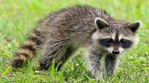
Also, raccoons don't have stripes on their bodies — just the tail (and the mask on their face).
