WIP environment illustration
-
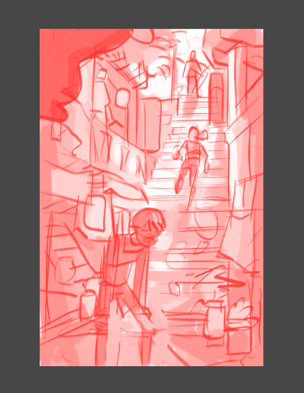
What do I need to improve on this comp? I’m open to any suggestions, thanks guys!
-
@phoenix-yip
Hi Phoenix,I’m having trouble understanding the story in your piece, so I’ll give some input on what I can see. My eye is very drawn to the person at the top of the stairs. If they are your main focus, the draw is going there. I feel though, that everything is too center of the page, I would offset the image either to the left or to the right, and fill in the extended side with more of the environment. Why is the person at the bottom of the stairs out of breath? Is he being chased? Is he running a marathon? The other thing I would suggest is to darken all of your values, you’ll have trouble adding light to white areas, so even if you took them to a baby pink, you’d have an easier time working with the light. I hope that helps a bit. P
-
@phoenix-yip
I like the overall layout. My eye easily goes to the characters, and the environment is not distracting at all, despite having a lot there.
However, what i’m getting out of it is: bottom person, p1 is out of breath because they couldn’t quite stop/catch ponytail/ninja person, p2, who will now make it to master person, p3. My eyes go p1 to p2 to p3. I think that story is good, but my eyes are flowing up. Depending on the format - I’m guessing graphic novel - that flow direction may go against the ‘normal’ flow — but if it works with the rest of what you have, then it’s fine. You’d kind of have to ‘re-shoot’ it from over the master’s shoulder to correct that, which is a big change you might not be what you’re looking for.Also, p1 is looking away from p2/p3. This seems a bit unnatural to get him facing the reader rather than having him looking in the direction of p2/p3?
-
@phoenix-yip If I read the story correctly, I see someone whose stolen something from your main character in the front (a poor boy/beggar -clothes are torn) and the criminal boss guy is standing at the top, people looking out their windows down at the poor guy.
Now composition, just a quick adjustment would be the spacing of your characters. Have the robber either closer to the main character or closer to his boss. It's too evenly placed, reduces the drama and tension I think (what I mean here is the robbers foot is close to the main character's head is a similar distance with the robber's head and his boss's feet).
")
-
@tonydupreart As far as format goes, its just a standalone piece. Thanks for your input!