Critique/Suggestions Please!
-
Hi, all!
First time posting my work, but I lack an artistic community in my area so I really need your eyes and perspective. I’m working on a book for a family friend’s kid, so it doesn’t need to have a totally-professional quality (i.e., done in Photoshop, since I don’t have it) but I want to get as close as I can with what I have. I’m working on an iPad Pro with Procreate. The gist of the story is that a frog learns how to do frog-things from other animals.
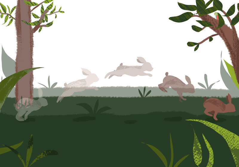
This is Tapeti teaching Frog how to jump. I’m generally really happy with how it’s turning out, especially since I haven’t done any serious art in several years. I have a thick skin so be as honest as you please.
-
@sminthy
I really like this! And procreate can be a great tool for making professional level books. Yours looks really nice and clean and I could easily picture your style in a book from the library or bookstore. Keep up the great work.")
-
@sminthy This is cool! Really, I don't have a ton of experience... So take it as you will. Your darkest bunny has a very similar dark background, your light bunnies have a light background. You may consider finding a way to help them stand out. The huge area of white sky also really draws my eye away from the bunny. But if you have words going there maybe that will help. I like how you show the whole jump, great idea. Keep up the good work!
-
@kathrynadebayo said in Critique/Suggestions Please!:
@sminthy
I really like this! And procreate can be a great tool for making professional level books. Yours looks really nice and clean and I could easily picture your style in a book from the library or bookstore. Keep up the great work.Thank you so much! It’s nice to hear my first attempts are working on some level
I’m having a hard time carrying this style into more zoomed-in images, but I’m sure I’ll figure something out. Really, I’m just having a hard time getting the textured layer to work, but I’m still playing around. -
@frogpunzel said in Critique/Suggestions Please!:
@sminthy This is cool! Really, I don't have a ton of experience... So take it as you will. Your darkest bunny has a very similar dark background, your light bunnies have a light background. You may consider finding a way to help them stand out. The huge area of white sky also really draws my eye away from the bunny. But if you have words going there maybe that will help. I like how you show the whole jump, great idea. Keep up the good work!
Oh that’s a great point! I hadn’t thought about modifying the background behind the different tones for the bunnies. I’ll play with that for sure. I was planning on using that white space for the words, but maybe I can do a wash of a less-distracting green or something there just to imply more of the rainforest around them. I’ll play with it and figure that out
Thank you for the feedback!