Stuck looking at my own work – Feedback request
-
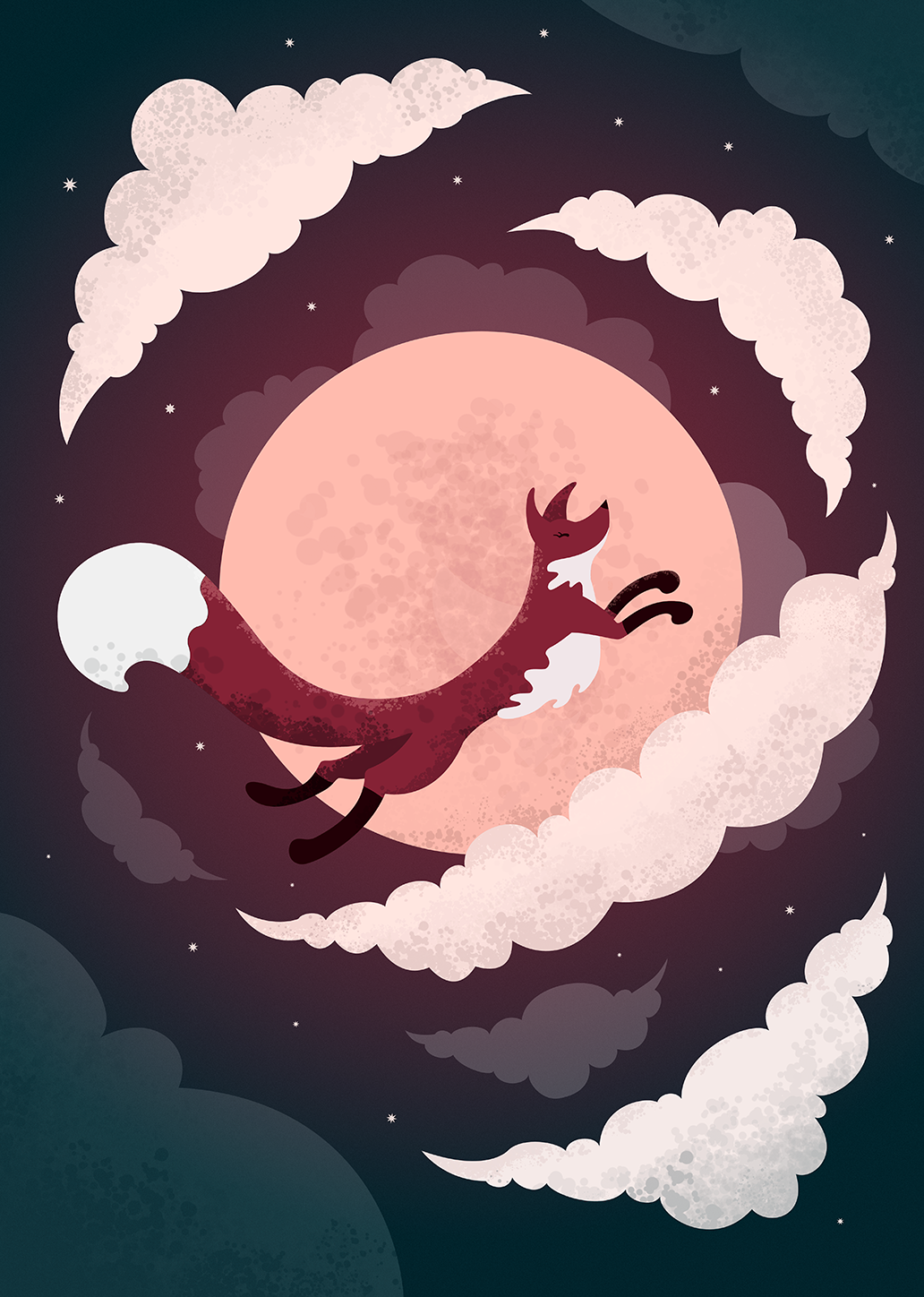
Hey everyone! Been a while since I was active here. I really need another eye on this. I did this illustration as a poster, But I might do some kind of story related to this character (the fox).
Specific things I would love to get an extra eye on:
Composition: does it work? Is it interesting enough?
Color: What do you think?
Story: I'm thinking of adding some other elements to this, like, maybe 2 other foxes that are flying in the distant clouds to make it feel more interesting and to add some sense of scale. Or maybe something else. I want to invoke the sense of wonder and mystery, like there could be a small story about this flying moon fox.Any critique is welcome.
Thank you in advance

Cheers
@designforsloths -
Hi Johan!
I love this piece! I love the gradient and the textures and the fox design is super cute! My two cents would be to maybe add a hint of a city/village down below? Like the fox is flying over a specific place where people can see them and point and be awed. I can't wait to see how this piece evolves! Thank you for sharing!
-
Hi Johan,
I think this is already very appealing. My feedback: the very centred composition works well for a poster but if you want to make it more illustrative maybe make more use of the rule of thirds, pushing the fox to one side of the other. I also think adding some mist or glow effect behind the fox might help separate it from the moon.
I also agree with Aprilshin about adding some sign of ground such as houses or mountain at the bottom.
-
@aprilshin Hey! Thank you for the amazing feedback. The town/people idea really has me interested, although I'm concerned with how that would work if I want to show the fox up close like that. I may have to look at some references and sketch out a few more thumbnails to get some ideas out
") I'm gonna look into it!
I'm gonna look into it!@CukiArtist Hey! Great feedback, I'm going to play around some with the composition. I do centered compositions a lot and I want to get better at more interesting comps. Also I agree I might need something to separate the fox from the moon.
Thank you both for your time! Stay tuned for an update!
//Johan
-
Hey!
Great start! I like the white color on the tail and under the side, It gives a good contrast to the scene.
Feedback wise:
- try experimenting with a complementary color in the scene.
- adjust the placement of the fox, focus on the rule of thirds.
- slightly blur the background clouds.
- think about adding white to the foxes eye as the black is slightly blending into the brown.
I hope that helps