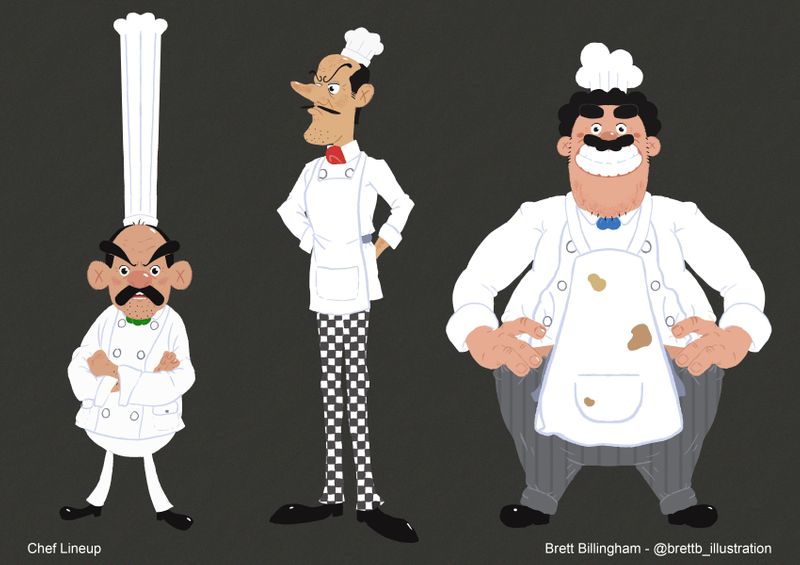
Chef characters - feedback request
-
Got inspired by all the great character design talks at LightBoxExpo, so I put this chef lineup together. I'm really happy with how it turned out but I'd still like to improve it.
I've been staring at it for too long so I was wondering if someone else could give me some feedback?

-
@brettb_draws The main things that stand out to me as slightly off are the pants patterns (more so the one in the middle.) With the way you've nicely creased the shirts, it feels a little odd to see an uncreased pattern on the pants. The pants in the middle feel a little too distracting as well with the intense contrast of the checkerboard. Other than that, you've certainly conveyed three kitchen personalities well!
-
@brettb_draws I also attended this year's LightBox expo and watched all the VizDev seminars. So inspiring.
I don't have any criticism on the designs, but I do have a question. Are these chefs brothers? They each have similar facial features with another. I recall the panelists say to make up a background story for each character, so can you share what your character's story?
-
@Tristan-Lapetz Thanks for the feedback
 !! I agree, I think having the patterns less flat may be a better style choice for this.
 -
@willicreate Thanks very much ! I had the intention of them all working in the same kitchen in a mediterranean setting like Italy or south of France, so I guess they could be brothers. I'll perhaps put some text on the page explaining that or change the title to make it more obvious. Thank you
