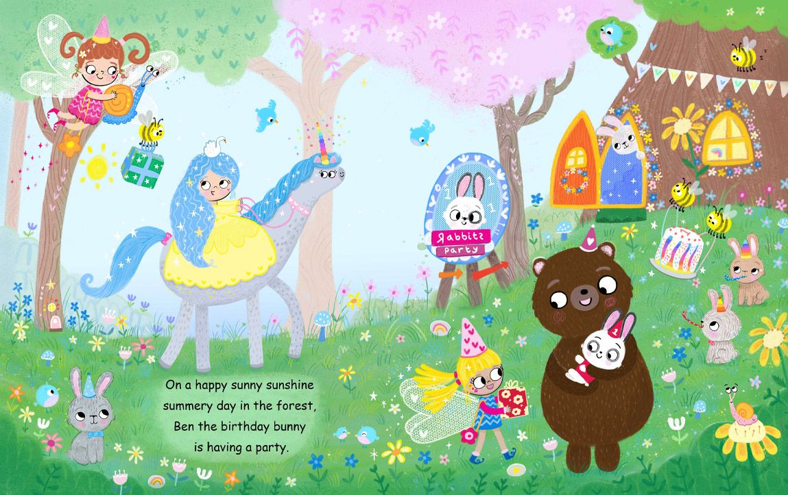
New portfolio illustration. How would you improve it?
-
Thanks everyone who helped with suggestions with how to make this illustration better. @Melissa-Bailey-0 @RachelArmington
To make birthday bunny the center of attention he is now at the front of the scene and lifted up by the big bear, as Melissa suggested, the lightest value on the darkest value. He looks more like a one year old now, he looks cuter.
The other change is the unicorn and princess, the dress is a lighter and paler yellow and the unicorn is now light grey so they are still part of the scene and yet not taking up so much attention.
The grass area is lighter for the text. Thanks for all the help. Is there anything I have missed? Would like to know if you spot anything.
Website http://www.judyelizabethwilson.com/
Instagram https://www.instagram.com/judyelizabethart/
Sharing positivity through art.
-
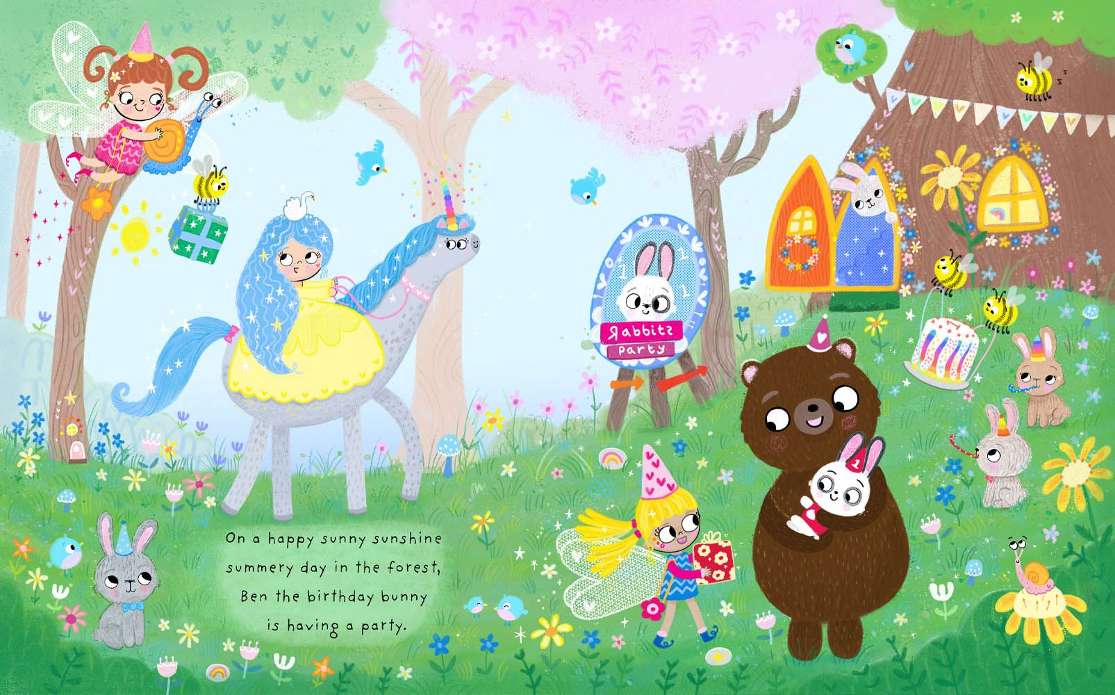
@Judy-Elizabeth-Wilson Wow!! Such an improvement in showing the story! And it is beautiful and such a wonderful style for children.
-
@KathrynAdebayo Thank you Kathryn! I agree, everyone's ideas really came together and the story really shines now. I am very happy with this illustration compared to the first version.
-
@RachelArmington Really glad you noticed the carrot door!
")
Website http://www.judyelizabethwilson.com/
Instagram https://www.instagram.com/judyelizabethart/
Sharing positivity through art.
-
@Judy-Elizabeth-Wilson
And now I want blue hair like the princess! So lovely! -
@Judy-Elizabeth-Wilson you fixed the value issues! The main character is easily identifiable now. Well done! This is such a CUTE illustration! Love all those details.
So, this is really nitpicky, and it's applicable only if you're planning to put this in your portfolio with text: you may want to choose a different font. While it's very legible, it's Comic Sans, and most book designers HATE Comic Sans. Art directors, who might be looking at your portfolio, are often also book designers. Avoid inducing an icky gut reaction -- use a different font.
Font recommendations? Gaegu, the font you originally had, is good. ABeeZee is also a font that would work well and is free for commercial use from Google Fonts. The goal in book design, when choosing a text font, is for it to be easy to read and to be "invisible" -- you don't want the reader to notice the font as that will take them out of the story.
Alrighty! I got wordy again! Sorry for rambling on. Long story short: your illustration is ADORABLE. Definitely portfolio-ready. The only thing I'd personally do is choose a different font (but that just might be perfectionist me!). The illustration is great!
illustrator - author - smiley person
mbaileyart.com
instagram.com/mbaileyart/ -
@Melissa-Bailey-0 Thanks Melissa. Especially for your guidance and tips. Bringing rabbit and bear forward made all the difference!
Haha, I will swap the font back to the other one, internet was down for and some reason because I have PS where you can download fonts online when internet is down, any of the downloaded fonts are not available, only the preloaded fonts. I will check out the other fonts you mentioned too! -
Last one, I promise. Here the finished illustration with a better font. Thanks everyone!
Website http://www.judyelizabethwilson.com/
Instagram https://www.instagram.com/judyelizabethart/
Sharing positivity through art.
-
@Judy-Elizabeth-Wilson awesome! Your first image looks like a nice cute drawing but this illustration is definitely a picture book spread
Nicola Schofield
Twitter: twitter.com/NSchofieldArt
Instagram: instagram.com/NicolaSchofieldArt/ -
@NicolaSchofield Thanks Nicola. Could only have done this with everyone's suggestions and ideas! I am really happy with the bear and rabbit.