5 Little Penguins - Critique Request
-
Cheerio, fellow SVSlearners... It has been quite some time since I was here last, but two interstate moves and one pandemic later, I figured now's as good a time as any to jump back onto that wild stallion that is illustration, pet it gently on the neck and yell: "HiHo!! Let's go for a ride!"
I came to SVS as a complete novice, and have now embarked on a little project which I hope will eventually find its way into book form. Mrs. Casual wrote a story about 5 little penguins who live on the North-pole (Weird, I know!), and hired me to illustrate. Since she has the pleasure of being my wife I gave her a sizable discount!!.
Here's the first illustration I came up with. It's a 2-page spread, and I'm fairly happy with the fact that I managed to make the penguins look... like penguins (Y'all should have seen my first few attempts!!). So, having said all this, I am asking for comments, constructive critiques, tips, tricks, and whatever else you handsome creative folk might have to offer. Style, composition, perspective, color, lighting... I much appreciate your time and input!
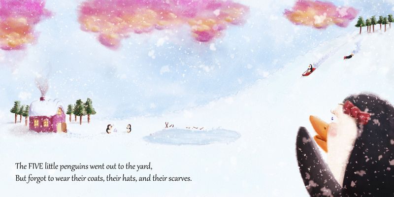
PS: Just to clarify, those are Cotton Candy clouds and Christmas trees... In case anyone was wondering!
I hope the publisher likes stick figures!!
www.casual-t.com
www.instagram.com/casualcreates.art -
@Casual-T I have a few things to say about it. I really love the fluffiness of the clouds, I think they look great! For cotton candy though, it would make more sense to me if they were pink and blue? I don't know, that's just my opinion. And also I think the snow that you can see on/in front of the penguin in the foreground might look a bit better if it was a lighter color. Also the big open space in the middle seems a little too bare to me. Maybe just a couple more Christmas trees there and it would look really good. I am not in any way a professional artist, so if everything I said sounds wack, sorry! Haha! I really like it though. I think you did a great job!
Ambria (Bri) :D
-
Thanks @ambria! I much appreciate you taking the time. Your comments are not "whack" at all. In regards to the big open space in the middle, as this is meant to be a 2-page spread I wanted to keep the middle clear of anything important, since that is where things might get lost in the gutter (where the pages meet). Now that I think about it, I should probably move those hockey sticks over a bit, since they seem to be right in that area...