Landscape Values
-
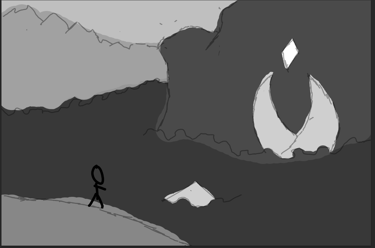
Hey people, I'm working on this landscape and just finished blocking out the values. I would appreciate yall's opinion on how I could improve the values.
-
Hi, I think the silhouette of the person and the gem look nice and easy to read with these values.
Can you tell more about the mood you’re trying to create with this scene? That would determine what’s working or what could be improved. -
@Travion Hello! I think you are on a decent track with the values. However, the mountains in the background have a really dark value. Typically speaking with atmospheric perspective, things get lighter and less saturated as you get further and further into the background. The things in the foreground usually have more detail, and are more saturated (darker in foreground). I am still struggling a lot with values myself, (especially when I'm also incorporating color) but this is what immediately jumped out at me.
So, I would make the foreground the darkest value, the mid ground a middle value, and the mountains in the bg the lightest value out of those three. I can tell that there is an important object in the midground area that you want to draw attention to. So, I would make that glow brightest in the scene.
I hope that makes sense and helps a little. I don't know exactly what you have in mind for this scene, but if nothing else, I would study up on atmospheric perspective. I think that would help you a lot in your value studies as a whole
")
Deviantart: https://www.deviantart.com/jacy13
Instagram: https://www.instagram.com/jacy13draws/?hl=en
Portfolio: https://jacy13.artstation.com/ -
@LouD Thank you. I'm trying to go for a sense of adventure and wanderlust. I want people to think "oh what are those buildings" and "What could be hiding in the jungles below".
-
@Jacy13 Thanks. I know what you mean. I worry that if I lighten the mountains the building and gem would blend in too much. Mood wise, I'm trying to go for a sense of adventure and wanderlust.
-
Cool, it looks like an epic landscape. Here are two landscape paintings, both by Albert Bierstadt (I made grayscale)
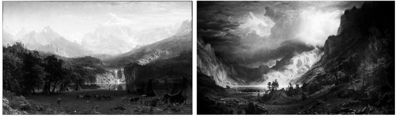
Left: The Rocky Mountains, Lander's Peak (1863) - Right: A Storm in the Rocky Mountains, Mt. Rosalie (1866)They’re both mountain scenes with a bright highlighted focus point in the middle ground.
In the left, the values are mostly arranged in horizontal shapes, and I think that makes it look more peaceful but still wonder where the path goes. On the right there are strong diagonal shapes, with some going out the top of the page, and I think it makes it more exciting or even dangerous.I think your composition is also pretty horizontal, if you want the quest to look riskier you could make more diagonals.
-
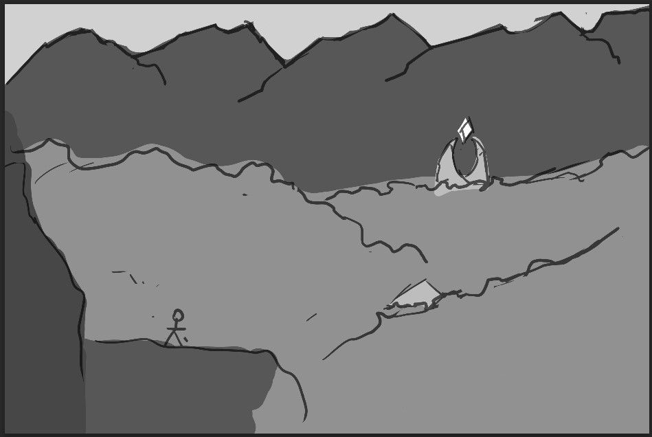
@LouD I think I get what you're saying and I changed things up a bit. I feel like I going in the right direction, but not entirely sure.