mastering perspective - tz
-
Hi,
I ve subscribed some weeks ago, and after finishing the course about perspective, I upload the firt 2 exercizes. I you had the time and the will, I d love to hear some critics. More exercizes coming soon, I hope.
thks in advance,
tomas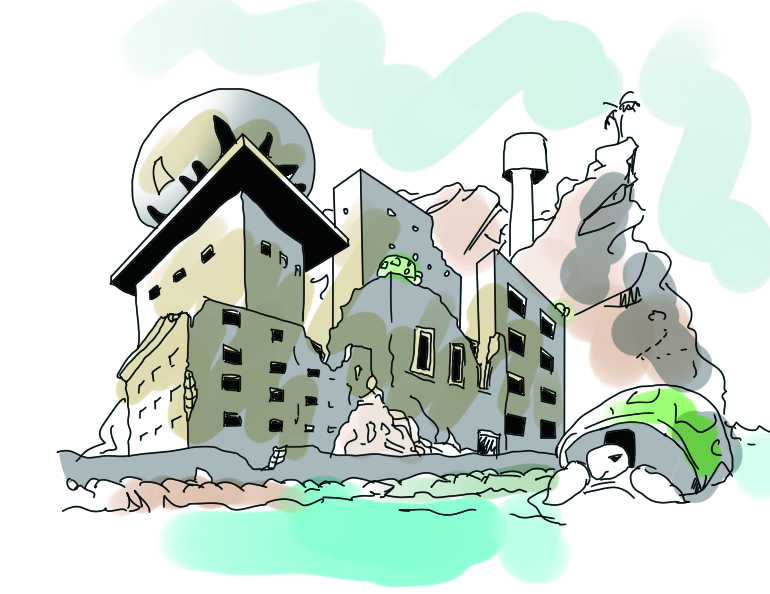
-
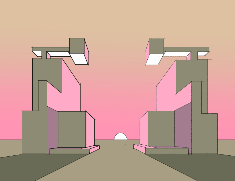
one more
-
Here are my impressions:
Perspective seems to be working really well on your larger shapes, the second image especially. I like how use added shading in perspective as well. Shows you have a good sense for how things are really working, rather than simply applying rules.So, all that's left is nit picking. In the top image, there's an object in the distance on the right, a bit up the hill-- a water tower? It looks a bit off to me. Maybe try drawing it as a box on top of a box, paying close attention to centering the top one (draw your x's, etc), then fill in with cylinders and see if that helps.
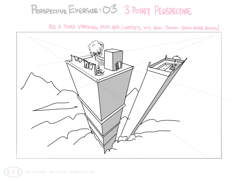
For the third exercise, I think the larger/closer building looks great. Your additions of architectural details, clothes line, etc, seem to be working well. The open door looks askew to me, not sure if that was intentional. The second building looks wonky to me, and I'm guessing that's just because your vanishing points are so close in.
Maile
-
Here's a quick perspective check on the top one
http://drakkheim.com/perspective/grid.php?image=79cd21bb2cfc4b99c75886c1356ecb80.jpg&save=1The second one is spot on, but the third one seems to ignore the down VP for the things on top of the buildings. Dont forget that everything that is vertical (the little building, tree, & the back building corner posts) needs to point toward that bottom VP.
-
Nice going, keep pushing yourself, its the only way to get better.