working on a book dummy - need some feedback for the cover design
-
Hi,
First of all: Happy new year! may it be a merry, healthy and peaceful 2021 for everyone.
I took the ‘how to plan and complete a big illustration project' from @AnnaDaviscourt as a preparation for a project I wanted to tackle for a long time. I wrote a story and wanted to prepare a book dummy.
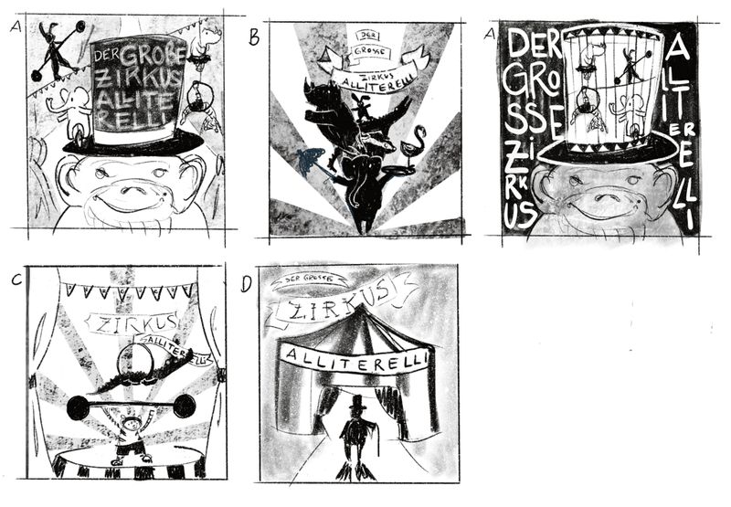
I am a little less than halfway through the storyboard and now deviated from my original schedule a bit. As I really felt like I wanted to look into the book cover already. So I did quite a few options as thumbnails and I wanted to share my favourites here to get some feedback. which one do you think is worth exploring? and why?
Thanks so much for taking the time and giving me feedback!
-
@doro_thea These are a great variety of thumbnails!
My personal favourite is A (white background) because:
- the title placement is the clearest to read
- the illustration shows clearly that the book is about a circus
- it may be interesting to work the animals and circus elements around the negative space
- if the monkey is a main character of the book, then it's good to have it prominent on the cover
B and C are good if there's no main protagonist of the story. I like B better than C. It creates a "Grand show" vibe.
D creates a bit of suspense but it'll depend on the vibe of your story if it fits in.
Best of luck!
My least favourite is the A with the dark background because:
- The title is hardest to read
- many viewers wouldn't like to see animals in cages
-
@doro_thea that is a fun class I like how you are approaching it using cover design idea. Will you have a different cover each week with a different color? My favorite is A( 1st)followed by B they make me interested and wanting to see more. Have fun! I’ll be checking back in!
-
I agree with the others. I like "A" with the light background best because it was easy to see and read the text. It also had small, medium, and large items in it. My eye was drawn to it. "B" is also nice. "A" with the dark background looks cool to me from a graphic design point of view and I actually like the placement of the title around the hat, but it is hard to read. Like what was said before, people may not be okay with the animals in a cage.
-
@Neha-Rawat Thanks so much for the in-depth feedback. Some of the points you mentioned never even occurred to me even though they are ver obvious (fe. animals in cages...)
And also thanks for pointing out that A is best if the monkey is the main character (which it is not), therefore I think you are correct that B works better.
thanks so much for your feedback! -
@powsupermum that is a fun idea as well, maybe I will do that later. But I am actually not going to do the assignment but plunge straight into a project I wanted to do all along. I want to create a book dummy and either go to Bologna book fair or Frankfurt Book fair next year. I am working on the storyboard at the moment, but somehow felt it would help me if I got started on the Cover already.
So I have the next weeks planned when to finish what, lets see how I can manage to stick to my plans... -
@Kim-Rosenlof Thanks so much for your feedback. So I think it is narrowed down to A(with the light background) and B, with all the feedback. Do you also agree that A gives the feeling that the Money is the main Character? As it is actually not.
-
Great designs and sketches! I'm really intrigued to know what your story is about!
For me, "A" with the lighter background works the best for a cover. It is easiest to read, especially as a thumbnail or from a distance. And a cover with a character "close up" seems to attract readers' attention. Which is the main purpose, right? Of these 5 designs, "A" feels like it would be the easiest sell.
-
@Melissa-Bailey-0 thanks so much for the feedback. yes, you are correct, a close up is usually a good one...
I'll try to share some more about the idea during the next weeks and ask again for feedback
-
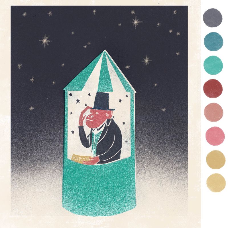
Hi, keep on working on the dummy and tried out some colors. which colour world do you prefer? I know this is not the cover anymore. I will share the progress I am making on that later. But I started with some colourschemes as well and thought I'd ask for feedback as well..
thanks for looking and taking the time.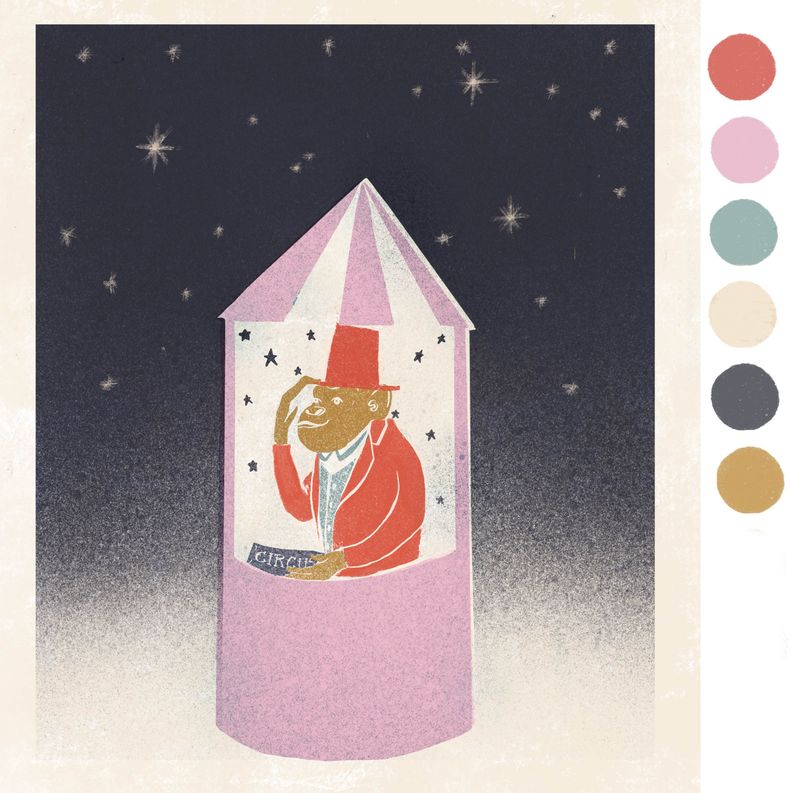
-
@doro_thea both palettes are lovely! For me, the question would be: what color scheme best helps to tell the story? Each palette sets a slightly different mood. What is the story about, and what feeling do you want the colors to convey?
-
@Melissa-Bailey-0 Hi, thanks for the feedback. basically it is an ABC book with everything written in alliterations. Every page a new character is introduced but as the book advances, you can see different stories unfold in the background if you look closely at the pictures. It is all about an evening at the circus and quite lighthearted.
So, what do you think now? With the pink, I am also not sure if people put it too much in the "only girls" section, which it is not. -
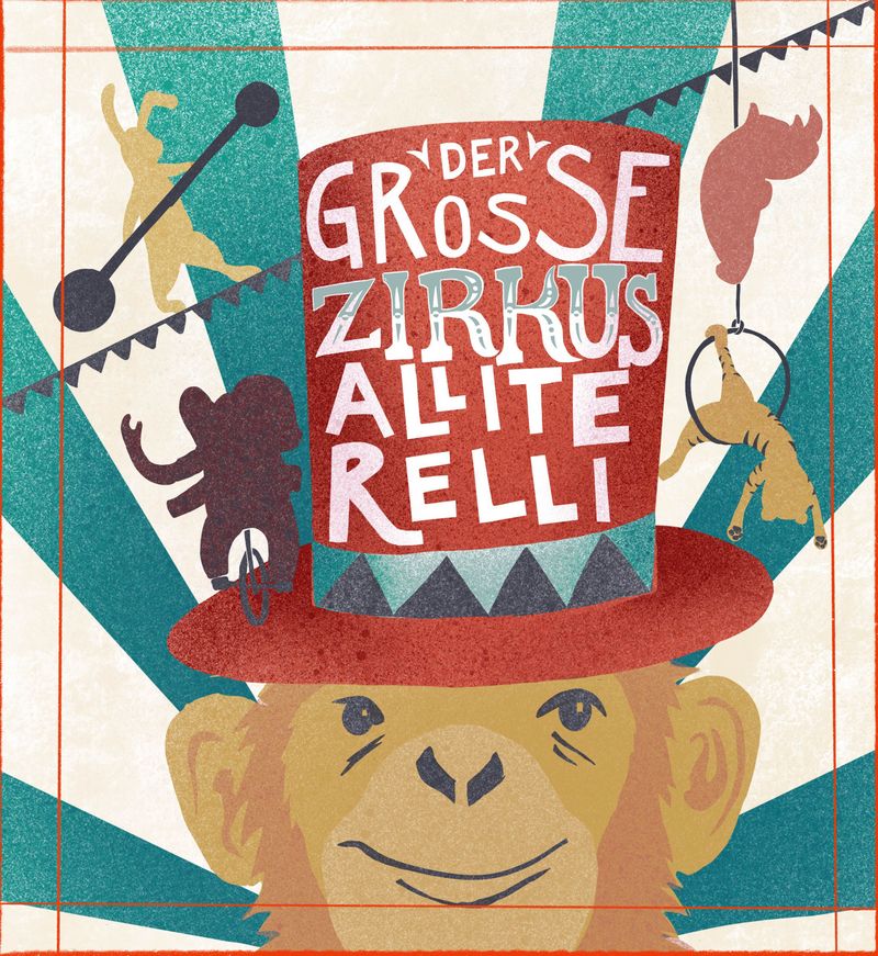
Hi,
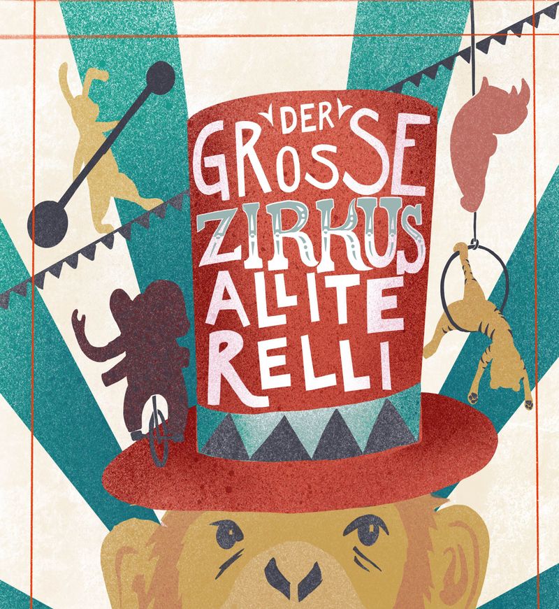
I have been working some more on the cover and stuck with version A, for now. I am still considering to do B as well. Lets see.
But there is my work in process. There are still a quite a few details missing and the colour is also still work in process but I wanted to get your opinion on the which crop you like better. (fe. I think I like the one without the mouth better, but does the monkey look quite sad without the mouth?)As well as on the colour. I want to keep it quite abstractly coloured ( fe. not grey for elephant) but I am not sure if this is successful. I merged the colour-palettes from above and like it, but I am not sure about the yellow on the monkey for example and colour balance over all.
thanks for taking the time for feedback!
-
I like seeing the process on this and also how it turned out! I think they're both great but the first crop makes the whole thing more mysterious somehow. But if you're going for a happy monkey, the second one is better but maybe make him seem happier? I'm not sure which look is more appropriate for your project but I'm really lovin' the palette and the typography you chose on this .
")
-
@Jeannelle-Pita thank you!
I like what you are saying about the mysteriousness. Therefore I think I will go for the first crop, as it really doesn't need to be a happy monkey. I will keep on posting here how it still evolves. I still need to add some detail and play around with the colours some more... -
@doro_thea Awesome! I would love to see how this turns out. Good luck
-
This is looking really good! I think the colors are nice, and to me it's okay that the animals are not the exact color they are in real life. The typography is cool. All the animals are silhouetted nicely, but I have a hard reading the elephant because the greenish color behind it is the same value. When I squint, I have a hard time seeing the part that is on the green.
-
@doro_thea looking really good! Love your concept and the idea of using abstracted colors. A few things to think about:
-
The elephant is disappearing -- perhaps it could be a brighter or ligher color, to stand out from the darker teal and red?
-
If this is an ABC book intended for young readers, you may want to consider upping the saturation of the colors or making them brighter, to appeal to very young eyes. However, your palette is gorgeous and this may not be needed. Just a thought.
-
-
@Melissa-Bailey-0 Thanks for the suggestion. the elephant works way better in a lighter colour. going to post an update in a minute, feel free to take a look at the most recent version.
I think I am going to stay with the colour palette though. I Know what you mean about the more saturated colours, but somehow I find this fits the mood and the intention quite well... -
@Kim-Rosenlof @Kim-Rosenlof Thank you! And thanks for pointing out the part with the Elephant. Hope the newest version fixes it. I am going to post it in a minute, feel free to take a look.