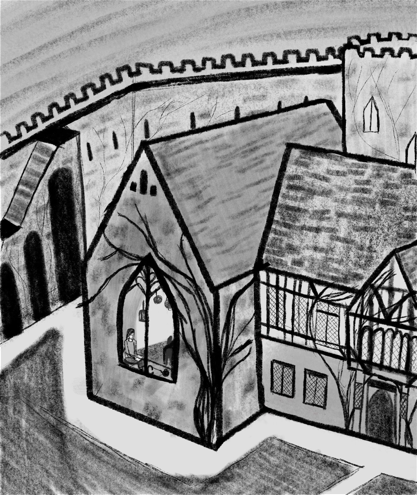
hello, I capture the Castle, and maybe some feedback??
-
Hello guys
Happy new year! I Hope 2021 is kind to all of you.
I’m new to the platform and hoping to use it to help improve my illustrations and get to know aN awesome community of people with similar goals and passions.
In my wildest dreams I’d love to illustrate classics like Jim kay is doing for the Harry Potter books. Therefore, to develop my portfolio I’ve set myself the project of creating a series of illustrations for the novel “I capture the castle”. It is about an impoverished family living in a castle turned home in 1930s England and is in essence a coming of ages story. It’s captured the hearts of many readers and is well worth a read.
I would welcome any feedback you have on this sketch for the first chapter. Perspective is something I struggle with a lot and I’m also worried the the illustration is a bit too busy (although I am learning towards a more detailed style).
Also, while I have my justifications for the way i’ve done it (see below) and did experiment in the initial thumb nailing stage, I’m not sure if its the best way of communicating the ideas in the text- I would be interested to hear your thoughts or illustrations communication what exactly is written in the text/ using them to read between the lines and offer the reader a different view on the text.
The book is written first person and begins with the iconic line “I write this sitting in the kitchen sink”. It then goes on to discuss the characters observations of her family from the sink, how the house they are living in is grafted onto a castle and how she aspires to be an author. I think there are a more obvious ways to depict this opening scene than the way I chosen e.g making the sink more obvious, showing the members of her family she describes, however I really want to vary my compositions as much as possible, thus I settled on this version which clearly identifies the main character and places her in the setting implied, but not described yet in the book (although other descriptions are offered throughout). The book after all is written in the form of a diary and is about the inspiring authors attempt to capture (in writing) the castle and the life of the inhabitants. As an illustrator I want to capture her capturing her world if that makes sense


-
@mollylgm Welcome to the site!
I'm not familiar with the book, but I'll offer my insight.
It took my a while to figure out that the character was actually siting in a sink (I thought she was at a table and there was a placemat/table setting in front of her), but after zooming in I now see the sink she is sitting in. I agree that suggesting the setting/sink is better than just blatantly showing it, but right now, it's a bit too suggested.
You also state that you're aiming to go for a more detailed style, and I can definitely see that at play here.
In terms of perspective, I actually think your image holds up pretty well; there are planes that seem a bit off (the section of the sidewalk in front of the transparent window, for example), but nothing that breaks the image, at least to me; one thing I would suggest, though, is consider adding thickness to the bricks that make up the wall, as they look flat/paper-like right now (though maybe they are that thin in the book?). That would make the wall very congested, though, so maybe a different brush should be used for the wall? I'm not really sure.I've got a couple of suggestions that could help make the image better: consider zooming in on the character and/or making every other surface more detailed except for the window/interior/character/sink. Either method should allow for more emphasis on the character/sink through the method of cropping (not too much, but I think some of the background adds negative space that isn't entirely necessary in terms of composition) and/or increased contrast (right now my eyes consistently look at the sidewalk, as it is so much lighter than the rest of the image; adding some texture to it might negate this).
You've got a good start and I think the composition in general works well. Some added detail and trimming might just be all you need to make this piece a stellar one! Keep working on your perspective, too!
-
Hey Jonathan! Thank you for this welcome
 Your feedback is really helpful- thanks for taking the time to write it. Yes, I will definitely work on making the sink more obvious...hopefully colour and depth compared to the other surfaces will help indicate that it is indeed a sink.
your suggestions are really constructive. I think I'll use texture and plant growth on the different walls to try and differentiate them and draw attention to the character. -
@mollylgm Sounds like a plan!