Treehouse WIP
-
Hi
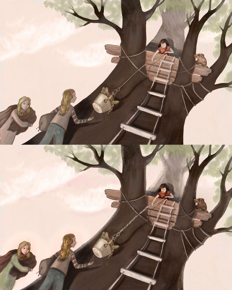
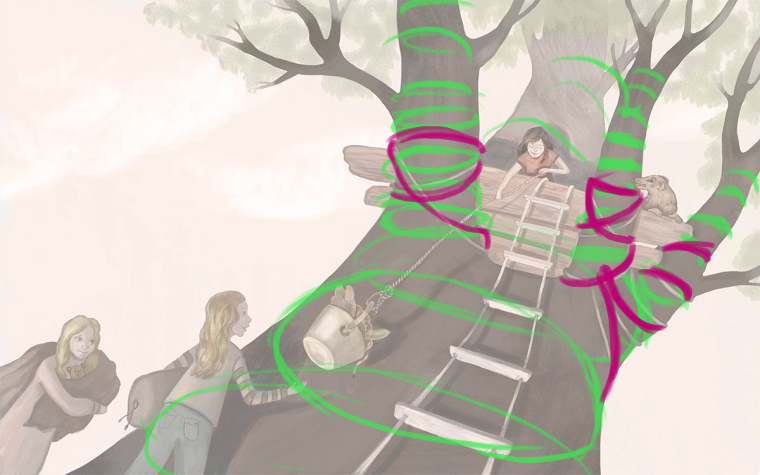
Thought I would share my treehouse illustration before entering it! Hopefully some people will help me with some of the issues I have been having.Great work by everyone on the thread. I love seeing everyone's interpretations.
This is based on a story from when I was younger when I stayed the night in my friends tree house.
It felt like a mini adventure and I remember it being really exciting but in a few hours we got bored and hungry and went in around midnight!This is the piece so far:

Any feedback is very welcome as it's the greatest way to improve!
So the issues I have been struggling with is:
Kids are hard to draw! Do you think they look right? Was aiming for 11-12 year olds at the top and the right one at the bottom, and an 8 year old at the bottom left.
I still struggle with texture. How may different brushes do you usually use in a piece? I really like to keep with one or two but maybe more would help to keep the variety. I am aiming not to make my pieces look too digital though.
What do you guys think about the ropes around the tree? I didn't want to add all the detail as it might distract from the main rope holding the bucket but I wonder if they look weird.
Thank you for the help. Sarah
-
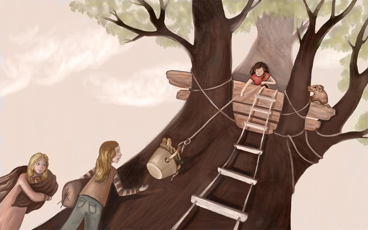
Hi Sarah. Really nice illustration so far. I love the mood and color palette you've established. To address the points you were wondering about, here are my thoughts:
-
I do think they are reading as kids in the age range you were going for.
-
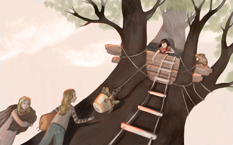
You have a good start on texture but i'd consider bringing it in other areas to unify the piece. Maybe simplify the way you've rendered the floorboards and put in a texture similar to the tree. Maybe put some texture on the sleeping bag and the girls clothes in the foreground.
-
You could probably just put hints of texture to the ropes, maybe in the areas that are closest to the viewer. I also don't think you need to render that main rope as heavily as you have. I'd focus more on contrast so the rope stands out more. So far the all over rendering of that rope has pushed back it's emphasis and the other ropes are standing out more. You want it to stand out because it helps lead the eye between the focal points.
Other things I see that may improve the illustration:
-
Stronger cast and occlusion shadows where the branches meet the floor boards and where the ropes wrap around the branches. Lower the horizontal cast shadow behind the girl in the tree a bit.
-
Stronger occlusion shadows on the girls in the foreground. I would make them a little more contrasted overall and I might carry some green from the tree and som red into their clothing.
-
Soften the edges of the tree a tad.
I did a paintover, hope you don't mind. It's pretty subtle because I think your illustration is pretty strong, but I try to show some of the suggestions I've made.
-
-
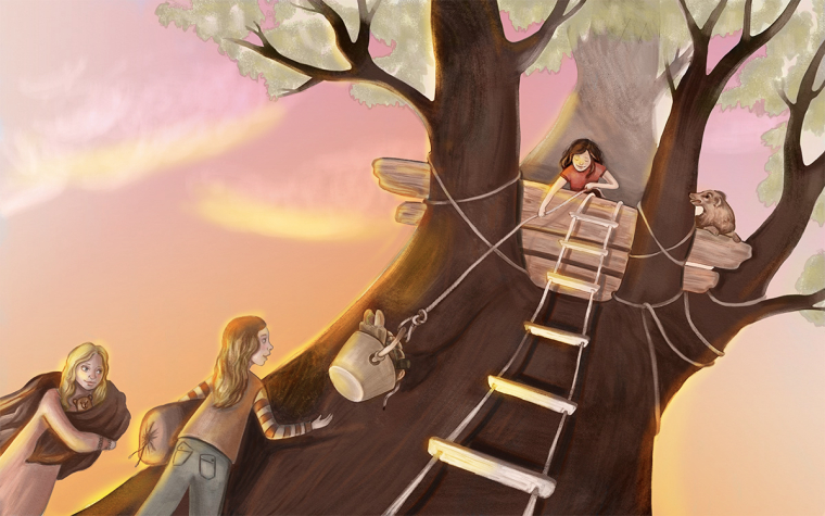
I think @TessW 's advice is spot-on! I would only add three other possible tweaks.
- the lighting is still a bit confusing, especially on the kids. Here is where some rim lighting might help you out a bit.
- I would bring a little more of that warm pink into the inside parts of the tree.
- You have the opportunity here with the ropes to really push the form of the tree so it feels round and looming. Right now it feels a bit flat I think because the perspective on the ropes is a smidge off.
I love the classic British children's book feel of this piece!
-
Hi @TessW and @WithLinesOfInk
Thank you so much for the feedback. I totally agree with everything you say and will do some updates tonight.Was trying to get the light to come from the bottom left so might need to fix some things to make that more obvious.
Website: http://www.seelliottcreations.com/
Facebook: https://www.facebook.com/SEElliottCreations/ -
@sarahelliott489 said in Treehouse WIP:
Was trying to get the light to come from the bottom left so might need to fix some things to make that more obvious.
Ah! Well, in that case you can do the opposite of the lighting I suggested. I would recommend having a visible light source, too. While it can be fun to play with off-screen surrealist lighting, it's super tough to do without seeming accidental. A lantern, flashlight, magical glowing orb, cadre of fireflies, or something could go a long way to selling that lighting!
")
-
All of your ideas were great. Thank you.
I was trying to make it look like the end of the day. Not full sunset but late evening.
So my main source of light was the sun...Hard to put that into the image!Getting better at light is my next challenge. Just ordered the Colour and light book by Gurney James. Defiantly want to make some images with glow.
Website: http://www.seelliottcreations.com/
Facebook: https://www.facebook.com/SEElliottCreations/ -
@sarahelliott489 said in Treehouse WIP:
So my main source of light was the sun...Hard to put that into the image!
OH! Derp! In that case, it would be coming from behind the tree and the lower left. Using the setting sun as a main source of light is so hard because, due to the direction and intensity of the light, everything ends up being silhouetted. A cheap trick though is to add a bright rim light around the tree and characters on the left side that's more intense towards the bottom and softens towards the top. Setting sunlight is very warm so I lean towards oranges. And then make it more saturated, with a brighter gradient towards the horizon and a darker one towards the top (I went for a reddish purple at the top so it wasn't a super stark contrast). Quick fix and it gets the point across without being too accurate, haha. I'm pretty sure Lee taught me that one, too.
-
@withlinesofink Hi thanks for the draw over. It does look cool with that lighting. I purposely chose to not have it in sunset colours as wanted it to be early evening and was not sure it fitted with what I wanted the piece to convey. I definitely like the rim lighting though.
Going to call it a day on this piece. I am not totally happy with the final image but I really challenged myself with perspective and drawing things I don't usually draw like trees and kids.
As always SVS is great at helping out and I will take all your feedback into my next pieces. Getting the lighting right is my next challenge!