SCBWI narrative art award - advice? Help? Anyone else working on this?
-

I would love advice/help on this one! Obviously very rough sketches, but is the concept clear? Any ideas for how to add more perspective interest?
As always super grateful for all of your wisdom!
-
@allysa I think the story/concept is clear. Girl wants to free the fish from the zoo, goes to make special suit for the fish, help it escape, then shows the fish the open ocean. I hope that's right. Your thumbnails have really helped show a solid story. I would only say that it may be nice to have more shot variation, as they all seem to be very side-on.
-
@allysa to me it looks like the fish is sad because it has not seen the world, so the girl is making a special suit for the fish and now they are enjoying a beautiful sunset on the top of a mountain.
-
Hi @allysa, this is great! It’s also on my plate to work on this month.
-
@allysa I think to @MarcRobinson's point, everything in the narrative is crystal clear. If you pushed the compositions more dynamically for each of the frames that might be more interesting?
I have thumbnails below for idea you can take or leave or steal.
Each frame is numbered
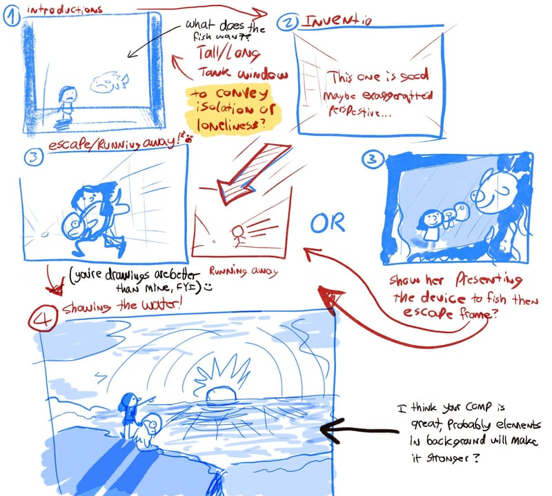
Frame three you might try an angle where the "camera" is inside of the tank WITH the fish??
FYI, I have a habit of doing diagonal compositions so take my advice with a grain of salt.By the way, your style is super cool and my favorite frame is the lighting in the first one. I imagine there's sunlight beating through the water and the girl is silhouetted in shadow. Which I'm a sucker for.
-
@alexw and @MarcRobinson @MerryMary @Jeremy-Ross:
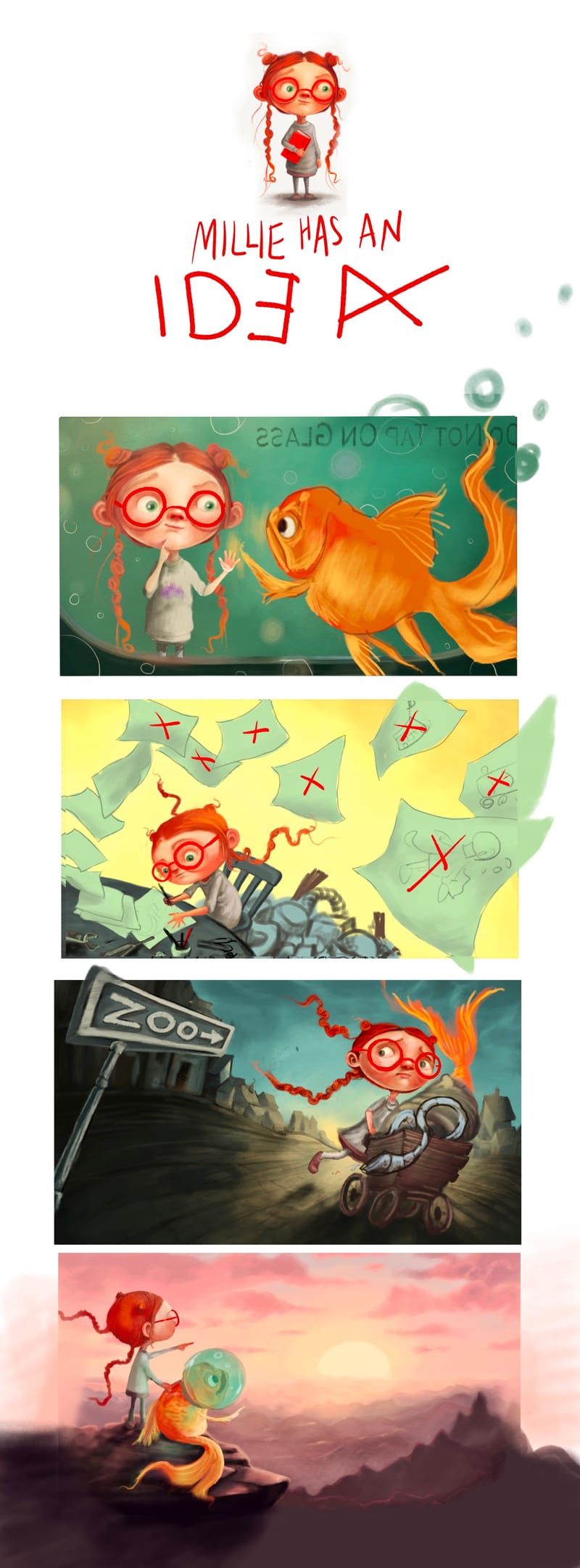
Hey thanks so much for all your feedback! I’ve been playing with this a bit more and here’s what I have. Perspective and character consistency are very hard for me (clearly!) - any ideas on how to make the girl look like….well, more like the same kid? Any ideas on how to push the variation in the scene more before I start in the the rendering proper? Putting on a movie and rendering is my happy place but I’m trying to take a bit more time with composition since variation is a week spot in my portfolio.
Also, anyone else working on designs for this??
Oh, and is it gimmicky or nice to submit to SCBWI like this, with the pages (which will have designs for different fish-suit ideas) and sign and mountains coming out of the frame?
Thank you thank you thank you!!!
-
@allysa I just wanna say, that you definitely have what it takes to compete in this art competition. I could see you easily winning, or competing in the higher ranks for sure! Hope that boosts your confidence, and I applaud you for having the ability to have a movie on while rendering. I literally CANNOT work with a screen on, I'm so easily distracted that it's annoying!
I have more thoughts!
Millie's Character:
Initial thoughts: You made her like the same kid for all of the frames. I immediately remember her, I immediately can hear her voice, and see her pigtails going crazy like floating tentacles with their own minds and intentions, almost like micro characters that enforce her character! (A+ in my opinion)
The Frames:
1. In your thumbnail at the top, which is fantastic, you have her with long sleeves, and the rest of the pieces she's got short sleeves. It'd be a cool detail to have her long sleeves remain, and maybe in the "invention" frame, one of the sleeves is bunched up and the other is not, to convey she's so focused she neglects caring for her clothes. It's a very child-like characteristic! In the title frame up top, I would flip the "E" back to normal forward reading. I think if you're going for a "book cover", typographically you want it to be readable right away, and backwards E is hard to read. The font or handwriting you currently have is perfect! (that's my graphic design background talking, fyi)
2. I don't think you necessarily have to be super attuned with perspective, and I applaud your attempt. I think for the "running away" Frame 3, I'm really confused on what is happening in the cart. You might want to have the fish already in the "suit" looking surprised that he's being taken away or something. What is she running away from? I think this might be the weakest frame and might need some work, but that's my only major negative critique to consider. You're ability to convey a story is so strong and I'm missing the connection in this frame, only because of the cart.
3. (opinion) You might want to keep the mountains pulled back into the frame. Not too much coming out of the frame. If you're winning this competition, they stated that they're displaying your work in New York, so you want to keep in mind that your artwork is probably going up on screen and will get cut off.
The sun set in the 4th frame feels a little too post-apocalyptic, like Mad Max Fury Road world. Not sure if a fish would be excited about that. Maybe a city scape, or a town, or a cute village, or a BIGGER body of water. I love that the fish is pointing with her, and she's got long sleeves in this one, so that's great!
Those are my thoughts! You can do whatever you want with them, because your sense of design and humbleness will go a long way!!
-
@alexw first off, thanks for your detailed response!
I’ll take your notes about the sleeves, and although I do love mad max maybe I’ll give her an I heart New York shirt in the first frame, and then they’re looking out over the city in the last frame. Even a fish can get excited about New YorkMy sister also just texted me to say she’s confused about the third frame, so I don’t doubt it’s a bit confusing…my idea was for there to be a ‘reveal’ of the fish suit apparatus in the last image, so she’s got him bundled up in a blanket to sneak him away from the aquarium so that the apparatus isn’t given away until the end. Because of their relative size, I thought she would need a little cart (the design for the cart will appear in one of her papers, so maybe that will help it feel less random? Maybe I don’t need an escape image? Is there something else that’s missing? Or do you think there’s a way to keep some elements of this image while making it more clear (I like her face in that one so I’d love to salvage it at least ;))
Thank you again!
-
@allysa I agree about the escape scene. I think the escape image is important though so we know where the fish went and how the girl got away. Perhaps if we have a little peak of the fish helmet so we can see him a little more, it would make it a little bit clearer.
Also for the last scene, if the mountains were either warmer and lighter, or maybe a little less jagged I think it would solve the "post apocoliptic" feel without changing the whole scene which I generally really like and think looks really sweet.
Both the girl and the fish are really cute and have so much personality I really like them both!
-
@allysa telling this story in only 4 frames is no small task, and I think you are doing loads right. Your main character looks very consistent to me, and also very recognisable. But if you want a tip, it is a good idea to come up with a "formula" for the character. A series of basic shapes that you can refer back to. This was the technique I used for a graphic novel I did, and it helped keep the characters consistent. The only other advice I can give for compositions is to do LOADS of thumbnails. I love rendering too, but I spend about 80% of my time on the sketching/idea phase. It actually saves me time in the long run. I like the vibe you've got going in your images, so I'm looking forward to seeing how you're going to problem solve this one! Quick thought... Is it possible to do inserts/cutaways within a given frame, to help cram more info/narrative into the illustration? Or do you want to stick to one big illustration per frame?