Need Help with Website Decisions!
-
@Kristen-Lango your website is like a treasure trove to browse through. So much to find!! But also very different styles when I went through different subpages. Maybe more focus and try to set a limit of images you want to include? And also limit you menu. Right now besides the about and shop there are 15 or 16 pages.
I do really love your chocolate sea illo but it does have a very different style. A selection criteria of your many works would be, which tell the most story? And what do I want to demonstrate as a style?
The bunnies are super cute, but don't tell a story. I also came across patterns and also points and abstracts (that are still very recognisable you).That pro review is a great idea, also then you probably have to choose what part to review.
Good luck with selecting!
-
@MimiHecher Thank you so much Mimi! I couldn't agree more with everything you said, thanks so much for bringing my attention to the weakness of the second cat witch illustration. You're so right about the pose being flat.
And yeahhh the chocolate sea one is a piece I'm disappointed in myself because I liked the idea but I wasn't so crazy about my execution of it. I've thought about removing that for a while now.Thanks again! I really appreciate your help!
-
@Sarah-VanDam Hmm good question! Here are some artist I really love:
David Catrow
Beatrice Alemagna
Geraldo Valerio
Genevieve Godbout
Julie Mellan
Isabelle Arsenault
Jeffrey Ebbeler -
@Jeremy-Ross Thanks Jeremy! Yeah that pop up is something I added recently and I'm not sure how I feel about it either. I think you're right about taking the ax to that haha
Definitely good advice about getting rid of the sketches with the perspective lines.
I've been thinking about doing that detailed portfolio review. I really want to, I just need to justify the money spent haha -
@Chantal-Goetheer Aw thank you Chantal! I really appreciate all your feedback. Ohh yess the many pages haha this is something else I've been meaning to trim down, and I just always get stuck on which ones to chop. I'm thinking about getting rid of "Past Projects" and maybe the "Sketchbook" and "Fan Art" and maybe condense the two abstract art tabs into just one page.
Yes definitely agree about the bunnies. They are actually also on the character design page, so yes I'll definitely remove them from the main portfolio.
It's so interesting the both you and @MimiHecher thought the ice cream chocolate sea illustration is markedly different from the others. I think I'll certainly be removing that.All your feedback is making me realize something I sort of already had an inkling on, which is that I really need to make more story based pieces. I guess that's why I'm here!
Thank you all so much, you've been incredibly helpful!
-
Phew, okay you guys I think I've made all the changes you suggested:
the site
The only thing I didn't take off of the main portfolio page are the two blue green characters only because someone important in the kidlit world once told me they really like them haha, but other than that I've removed everything you guys suggested and consolidated some pages, and am feeling good about this fresher start. -
Hey @Kristen-Lango you are fast!

I wrote my feedback before clicking on your additional pages with illustrations, so I have to add a note on them:From your watercolor sketches I absolutely LOVE the first one, the two mice with the mouse matches.
I'm not quite sure whether they fit to the portfolio, as they style is more scribbley (does this word exist?), BUT if you ever decide to do one or two additional pieces in that style I would recomment to put the mouse matches into your portfolio, together with the additional illus. To me this style would fit perfectly to early reader's books. -
@MimiHecher Aw thank you Mimi! This is so nice to hear! I've heard similar things about the mouse matches, people seem to like them a lot
 I know what you mean about the scribbly-ness haha it's a word in our world. I actually did that piece so fast and intuitively and am a little scared to try to take those characters and do more with them because I don't know if I can replicate it
  but you know what, you're giving me the energy to try
-
@Kristen-Lango
Oh, I absolutely understand that fear of not being able to replicate something that "accidentely" went right!Maybe you can soften the fear if you plan it like this: As soon as you have the time to do it, give yourself FIVE attempts to replicate that style. Each of that attempt has to be a true, really felt attempt with effort. But you only "judge" the fifth be comparing it to the mouse matches.
To not let it become boring, make it 5 different illustrations, not repeating the same thing 5 times. Or decide for a story to tell and tell it from 5 different povs.
So the first 4 will only be the way forward TO replicating the style and don't discourage you.And who knows... maybe you will love all 5 illus in the end.

-
@MimiHecher This is a great idea Mimi! I will definitely be trying this!
-
@Kristen-Lango Hi Kristen! Okay—So, first of all, I agree with several people that your blue-green people (especially the one reaching up) and your design of the girl looking shocked at the cat with the worms are my favorite things you’ve illustrated. Even though the blue-green characters are much more simple, their gestures and designs are interesting. The girl’s expression and hand gesture is also well drawn—while stylized, it has good spacial awareness, and it’s really fun to look at.
When I looked up the artists you are interested in, I could see some things that inspired you, from stylization of characters to vibrant colors:
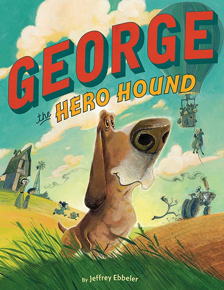
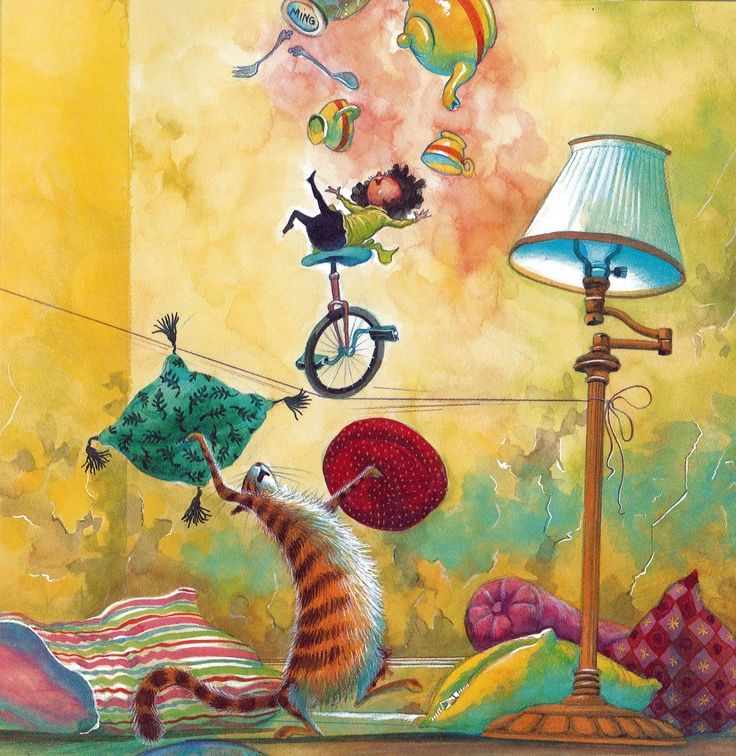
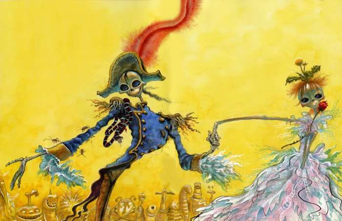
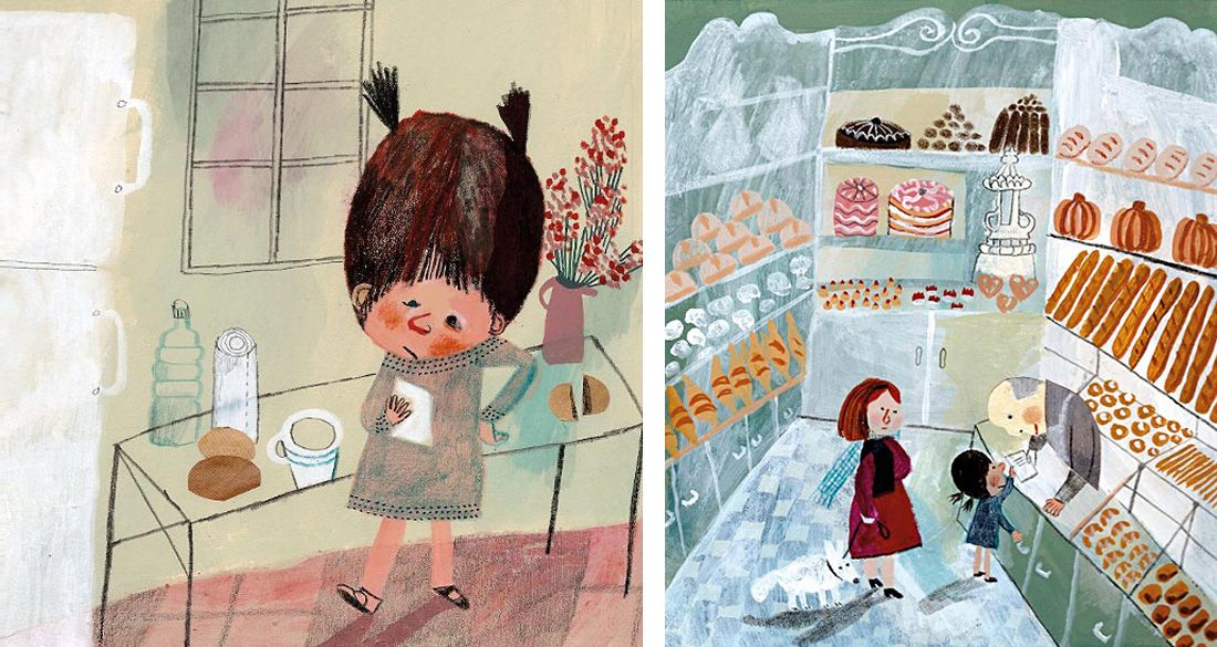
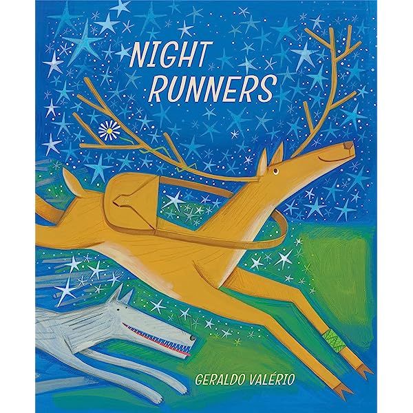
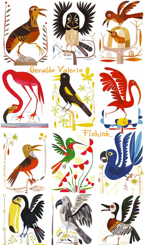
Here’s where I personally think you go from here: Do you remember that 3PP episode where Will Terry talks about getting a critique from illustrator David Small earlier in his career? He essentially asked Will “Why do you have to use so much #*!@% color?” He essentially made the point that, if everything is really saturated and colorful, you can’t create good focal points or tell effective stories. That’s where I think a lot of your pieces are right now: You have a lot of fun with the colors, but it’s not well controlled yet. Even David Catrow reigns in his colors and creates focal points of highest contrast and saturation.
I have an idea for a challenge for the month, and I’m wondering if you’d be interested it: Have you ever done a master-copy before, where you pick one of your favorite illustrators and then try to exactly replicate their work? I’m going to do one of those this month. It could even be just a section of a piece you want to study. And then, the next month, you do your own piece but in their style to apply what you’ve learned.
For example, this was several years ago, but I tried drawing a character in David Catrow’s style:
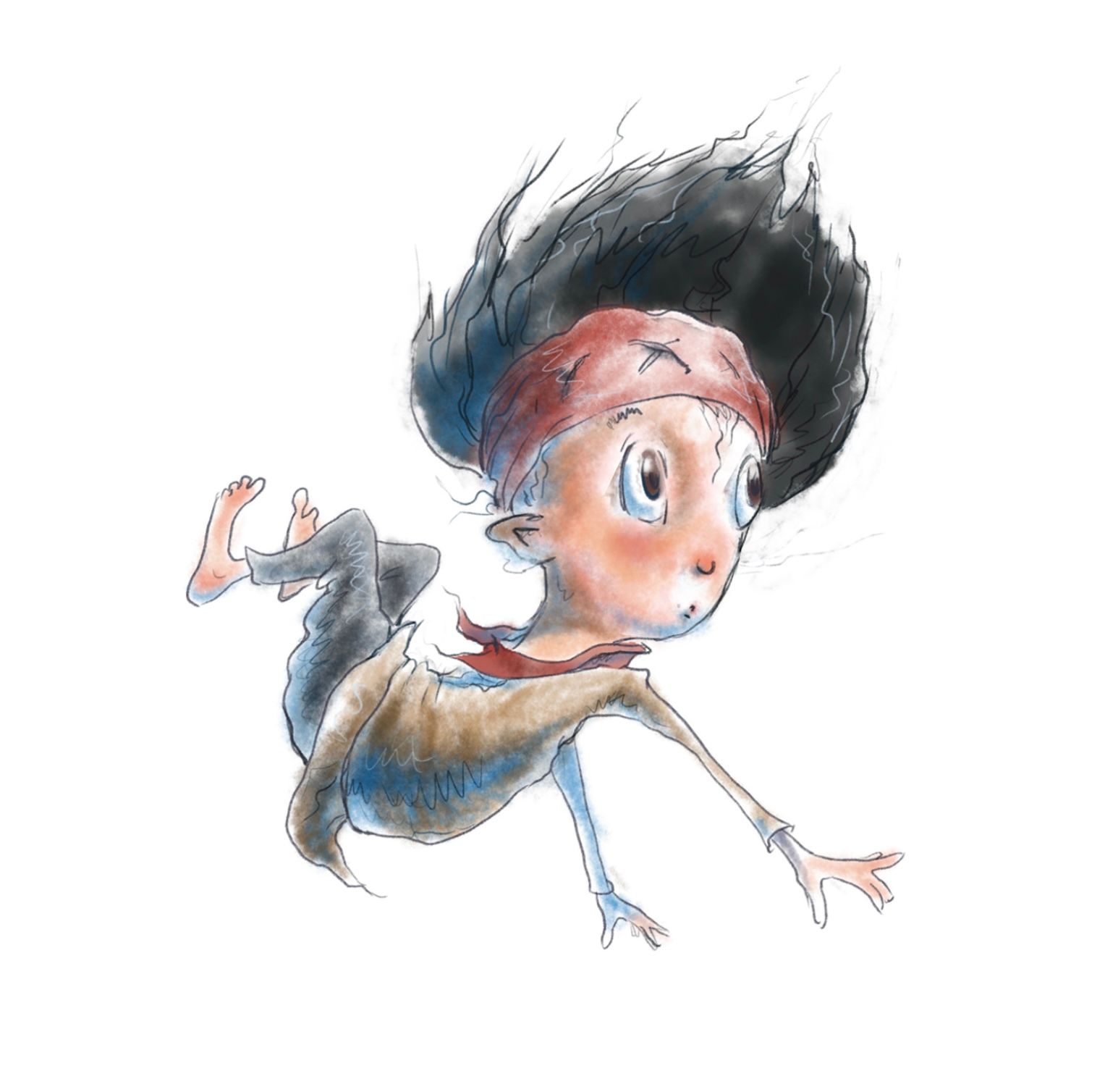
Anyways, happy March! Hope some of this helps.
-
@Sarah-VanDam Oh my gosh thank you so much Sarah! This is extrodinarily helpful! And I loved that you took the time to include images from my favorite artists

Ahaha yesss that episode haunts me. Its crazy you bring that up because that quote that you mentioned from Will has stuck with me ever since hearing it.
I totally agree with you about the focal point issue and not being able to control things yet.
Its so funny you mention master copies because I'm actually in Children's Book Pro right now and just finished some which have helped me to learn a lot about the short-comings in my own work.
Goodness it's like you're reading my mind hahaha it's crazy you included a study of Catrow because I literally just sat down to do studies from his book "Monster Mash" They are just sketches (and I did do more full color studies of Beatrice Alemagna which was life changing haha) but here are a few of them:
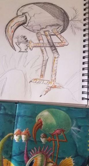
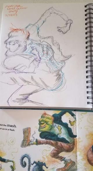
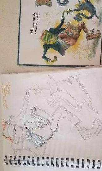
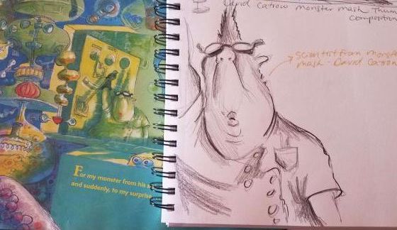
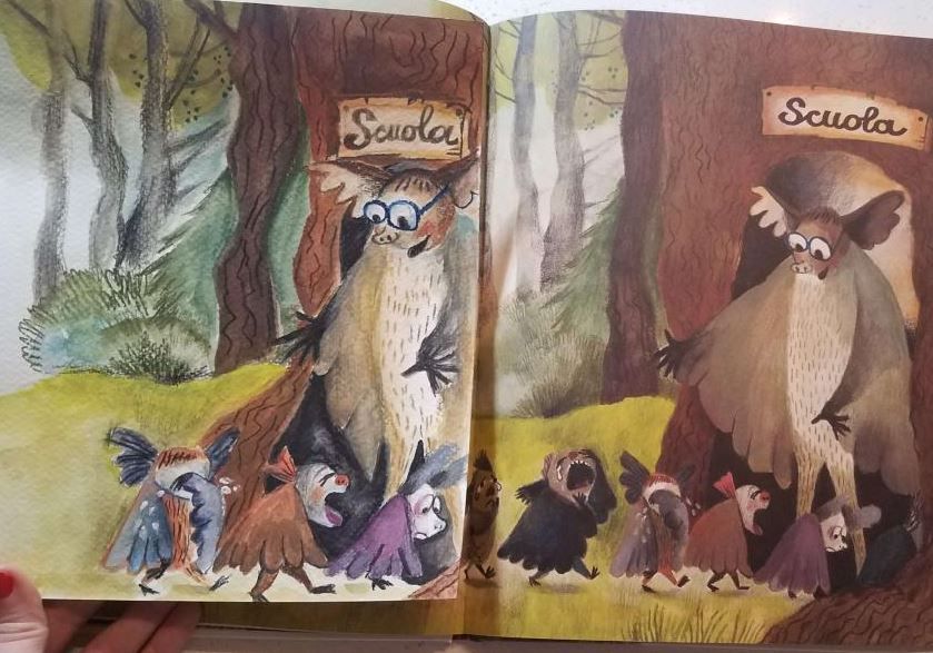

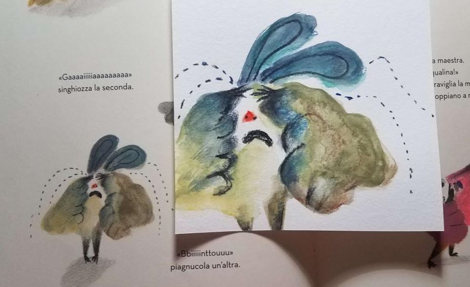
Thanks again! This was so helpful, and I appreciate you taking the time to respond so thoroughly! Happy March to you too

-
@Kristen-Lango Oh, WAY TO GO!! This is awesome!
-
@Kristen-Lango Awww, awesome copying! O_o
I'm really happy for you you are taking CBPro at the moment! I miss being part of it, took it in October 2022.
I'm sure you will love the whole course! Would be interested in seeing your upcoming homeworks as well!
 -
@MimiHecher @Sarah-VanDam aw thanks guys!! I'll definitely post my homework for the class on this thread as well.
Yes I can totally imagine missing the class/group dynamic when it's finished. I'm hoping our group will stay active on the discord. -
@Kristen-Lango I hope so for you, too. I took CBP a year ago, and my Discord group has really died down. I’m grateful for the forum here.
-
Hey guys! Thanks again for all your feedback and support.
In keeping with my earlier promise to update you all on CBP... basically I'm dying

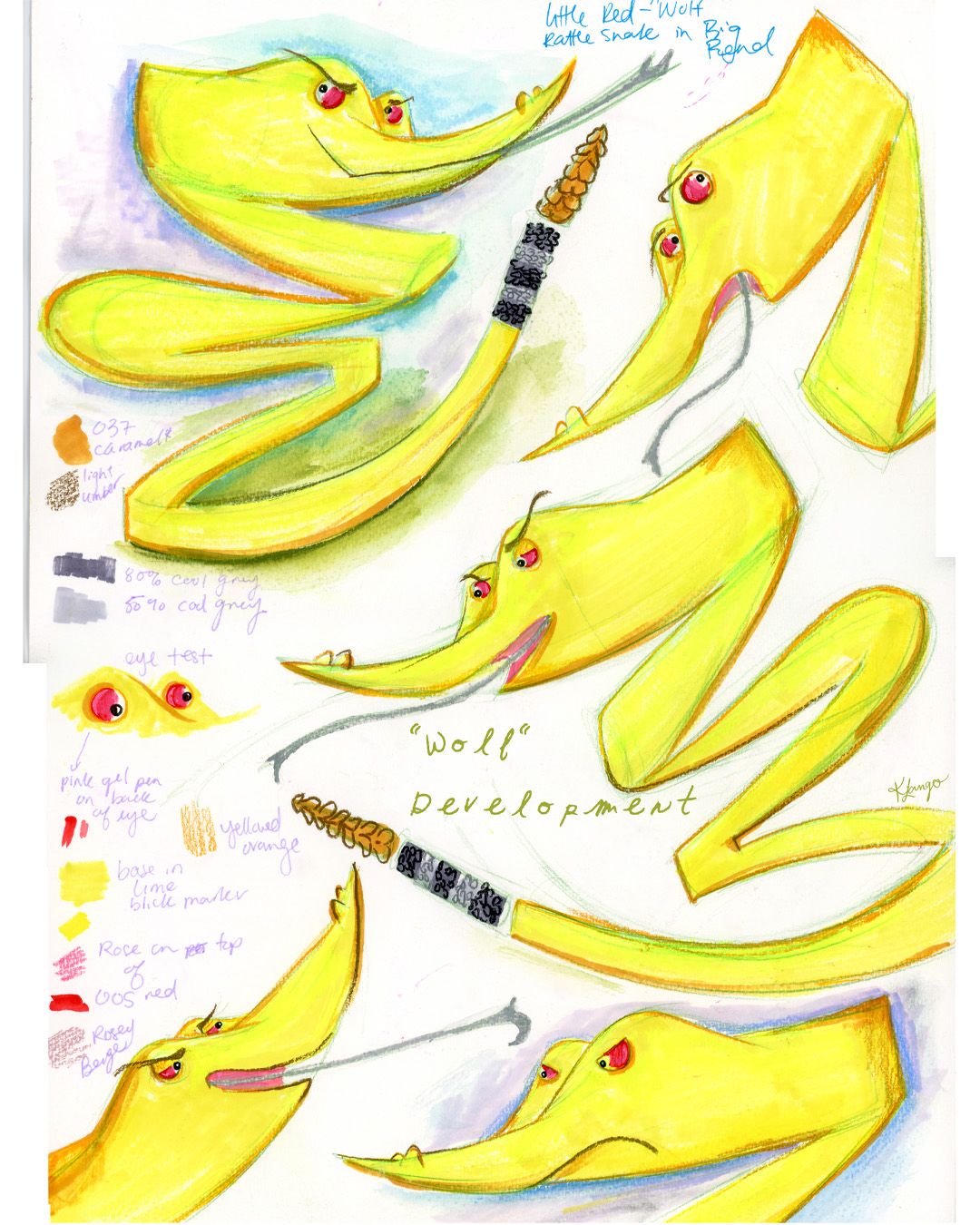
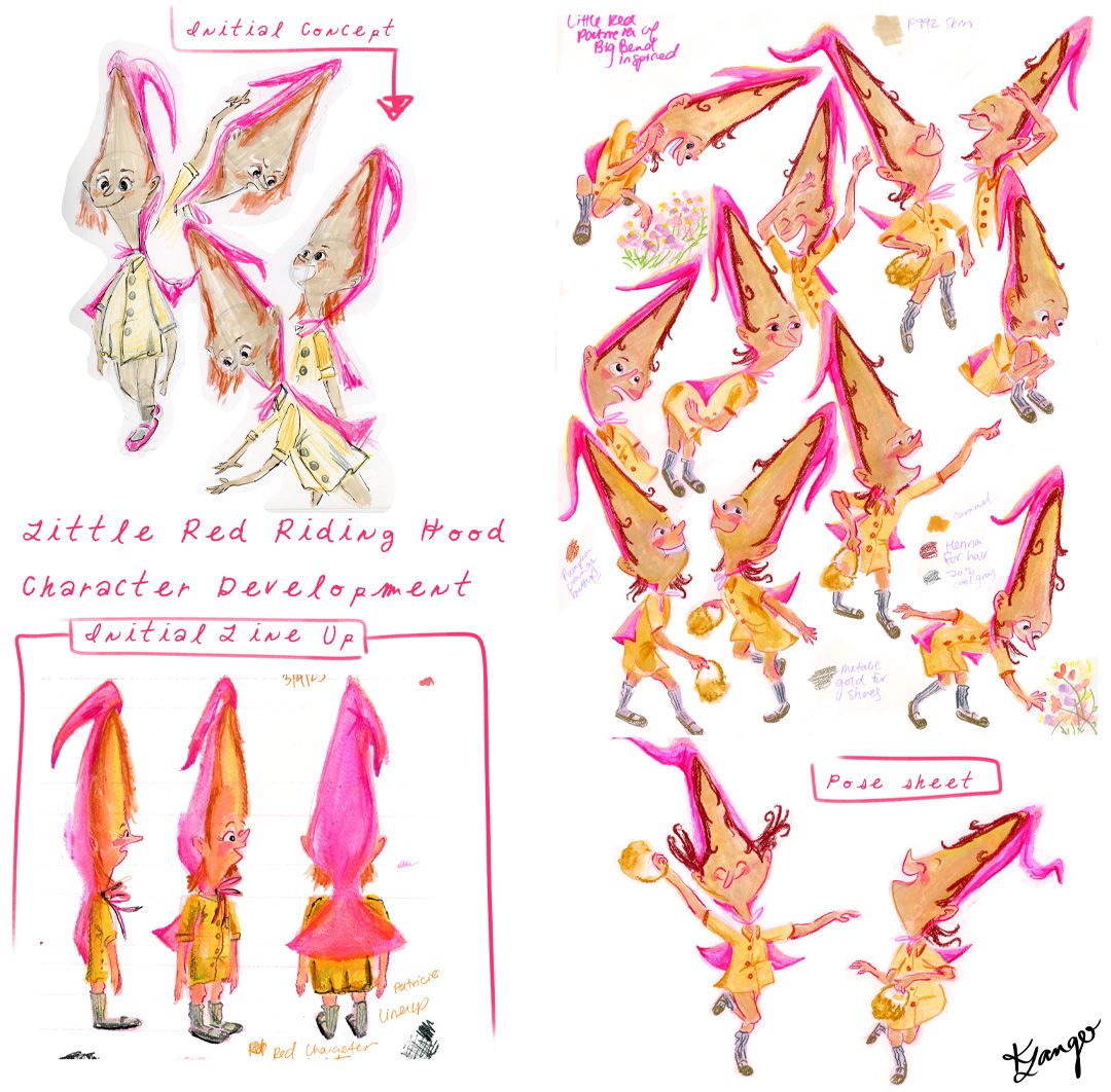
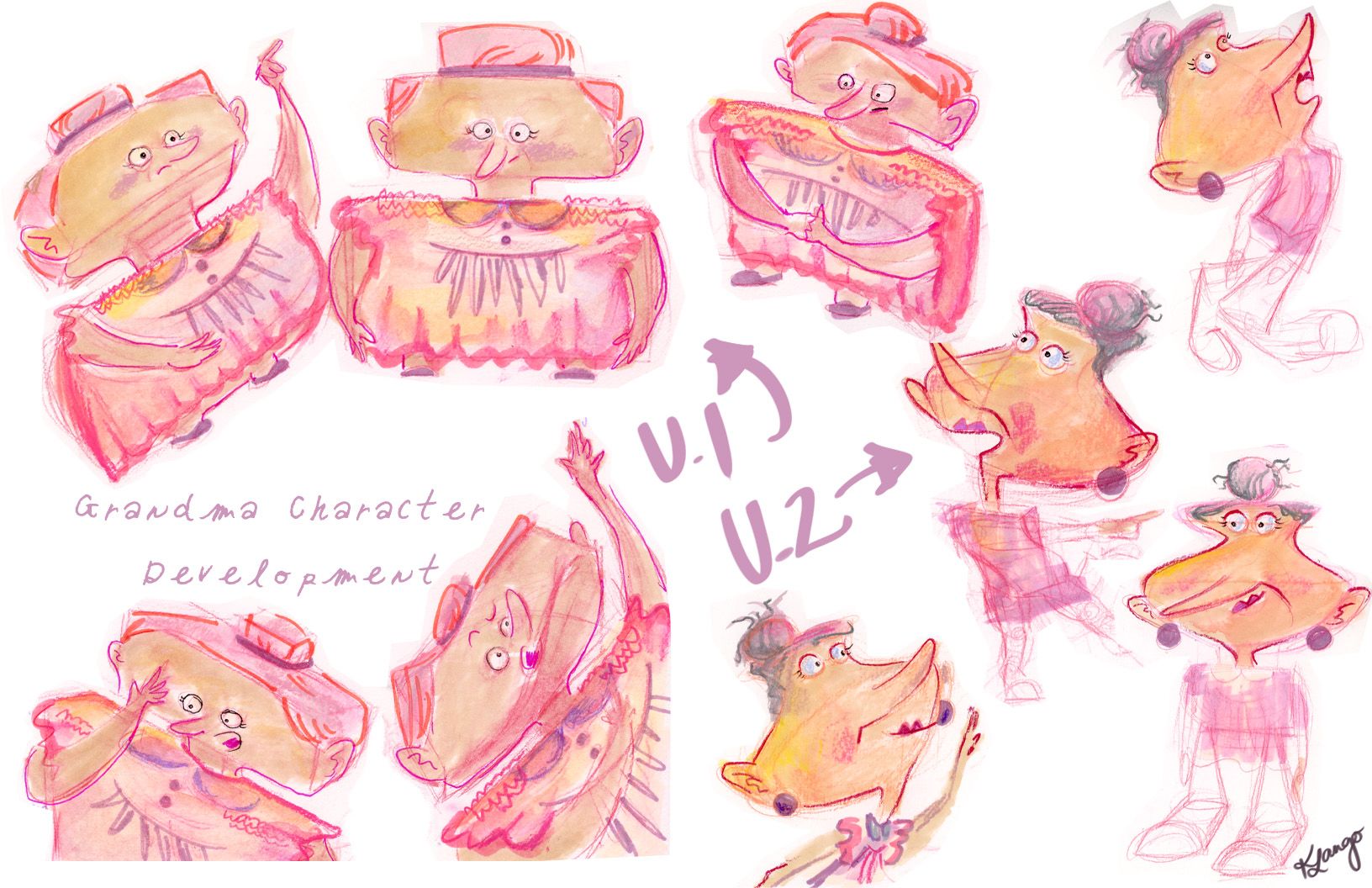
Hahaha kidding, it's a wonderful course but it makes you realize the insane amount of work that goes into making a book for kids.And with that, here are my first designs for Little Red

