WIP for title page spread, please give feedback :)
-
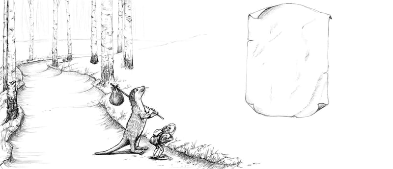
Hi all! Here's a sketch for a title page spread for a book I'll be submitting soon. I'd love to get feedback on my composition. There will be more trees including one that the title and by-line will be on (parchment). But I didn't want to draw more if I was just starting over.

Thanks for any help you can offer! Cheers!!
-
@JessicaLinnEvans beautiful!
Question: what is the trim size? Where is the gutter going to be?
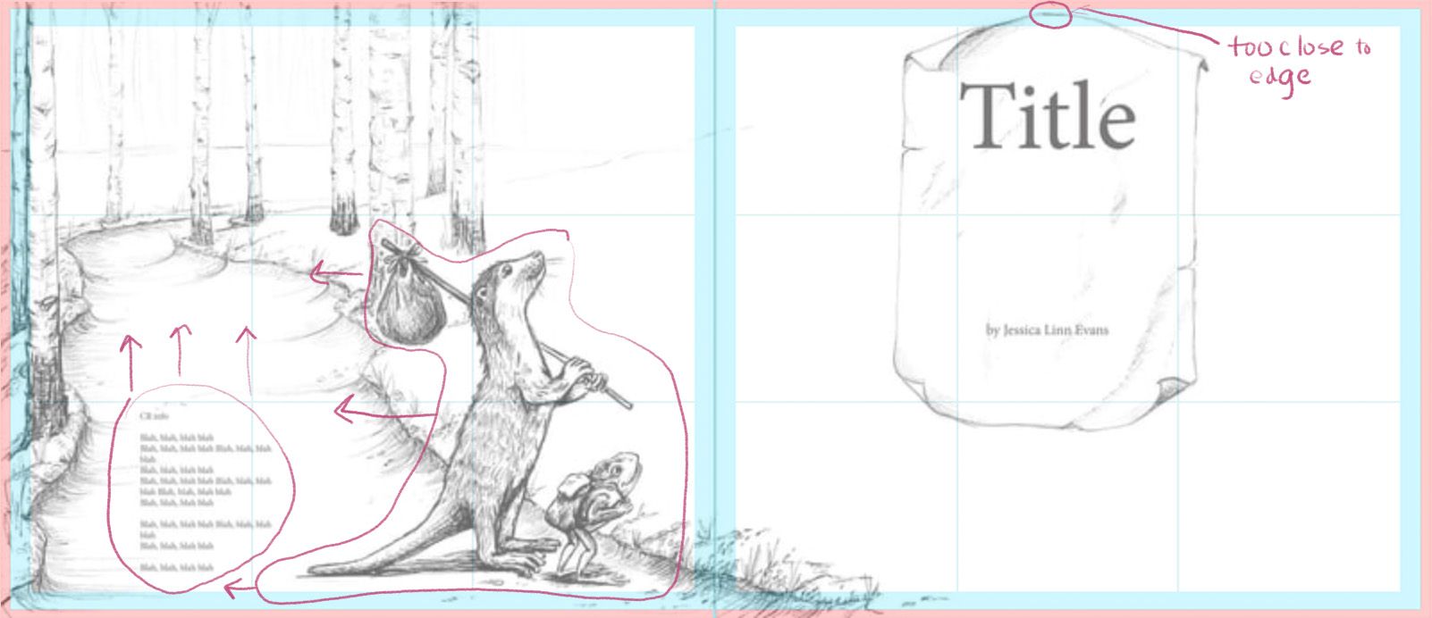
I have a feeling that your otter and frog are going to be very close to the gutter. The frog might even be inside the gutter. Can you move the characters over some to the left, more on the path? That way they'll be far away from the gutter, and also show up even better as they'll be framed by the path.
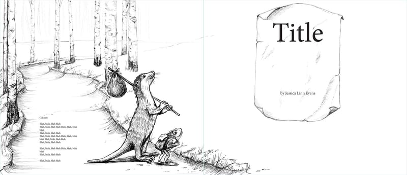
Although, now that I say this, I can see that you might be leaving that spot blank for the copyright and dedication text. What text is going to be going on these pages? Seeing some guide lines and placeholder text might help us give feedback on the composition, since that is such a big part of the spread.
-
This post is deleted! -
@Melissa_Bailey Okay, here we go with text holders...
title with text holder.pdf -
@Melissa_Bailey Okay! Here are the text placeholders...
-
@JessicaLinnEvans I think it has a good balance as is... I'd be weary of adding too many trees. I think the amount you have currently is just fine. I'd be worried about cluttering things up with more foliage.
I say go ahead with value and color studies! But that's just my two cents

-
@JessicaLinnEvans thanks for doing that!
Yes, if you could nudge the characters over just a smidge, that would be better. They won't get lost in the gutter, but they will be close to it.
Your parchment is very close to the top of the page. Could it be centered more? If this sketch also includes bleed, the top of the parchment will probably be trimmed off, or it will look like it's touching the edge the page.
To me, the right half of this spread looks quite sparse in relation to the left side. For more balance, what if you put the characters on the right side too? Possibly interacting with the parchment or title in some way -- that might be fun. Just a thought.
-
@JessicaLinnEvans Thank you for the feedback! Value/color studies are next!

-
@Melissa_Bailey Great! Thank you for the feedback. I'll move the characters around and good call on the parchment. Thanks again!
-
@JessicaLinnEvans if it helps, here are some visual examples:
The image as it is now, with a spread template placed on top, to get an idea of where the gutter, margins, trim, and bleed will be. (Bleed is pink, "unsafe" areas are blue, along with the gutter. Horizontal and vertical blue lines divide each page into thirds.)
Here's what the composition would look like with those adjustments:
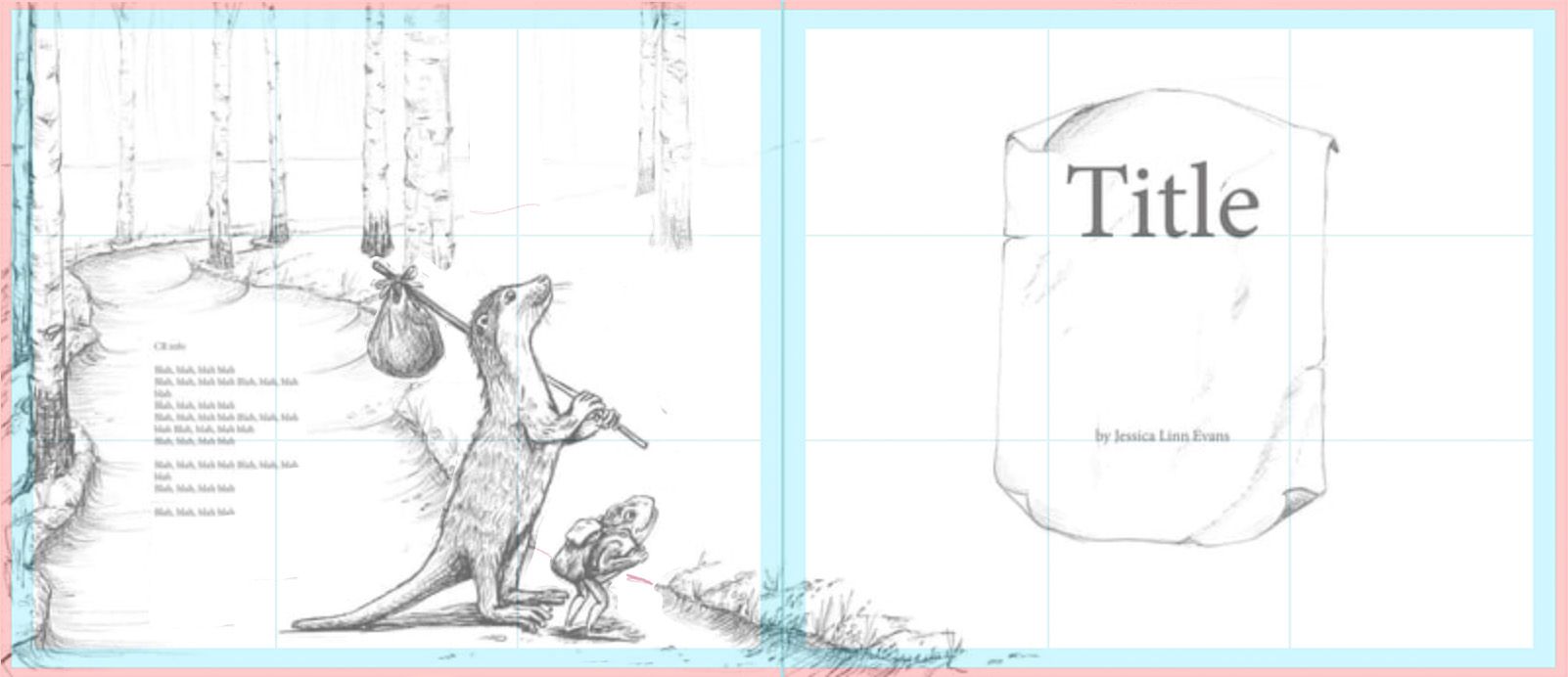
And here's a way you might consider playing with the characters and title -- have them interacting. Adding more trees might make the scene more cohesive and balanced (which is what you were planning anyway and I think it's a good idea).
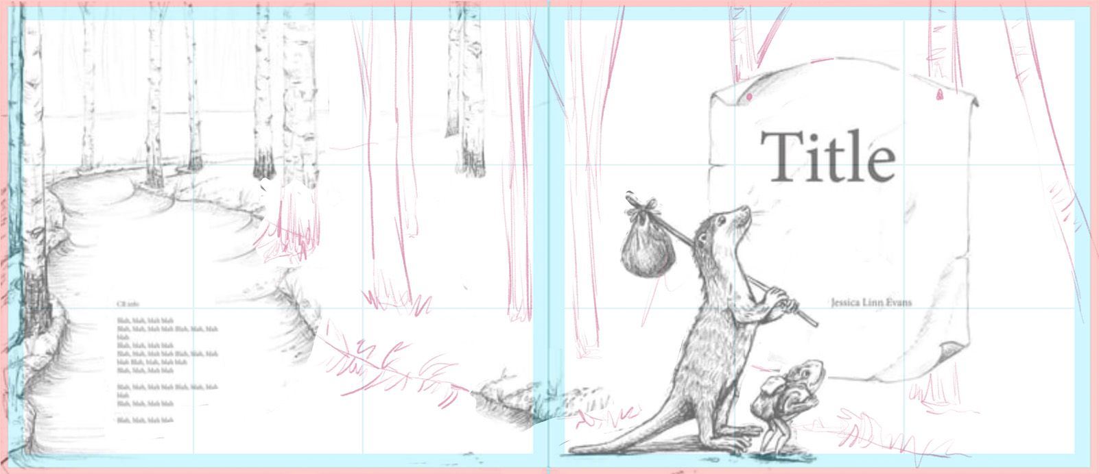
Hope these visuals help!
-
@Melissa_Bailey Yes! Great! Thanks again! I'll be working on that today.
-
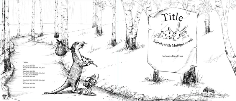
@JessicaLinnEvans Okay! Here's what I came up with!
-
@JessicaLinnEvans looking nice!
Is the title one word? You don't have to show us if you're trying to keep it confidential, but it might be a good idea to actually test out the title on the parchment, to see if you have enough room.
You have space to expand it horizontally, if need be.


-
Wow!
Very excellent work and inspirational. It looks like the adjustments you made really enhanced the illustration. Nice work!
-
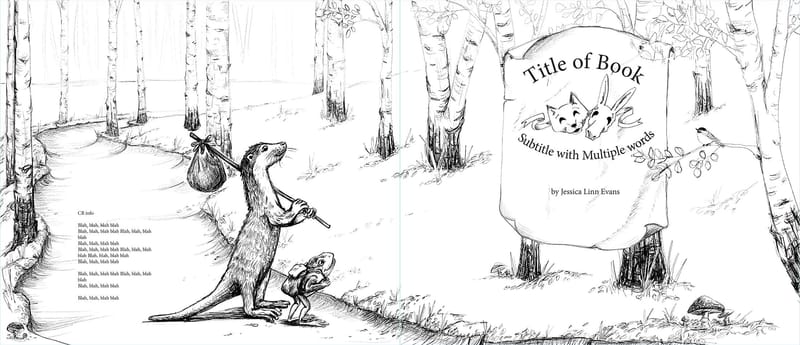
@Melissa_Bailey Hi! I added more words to the title. Not sure what it will be yet.

Also, I put a bird on it (because I'm from Portlandia, LOL!)
-
@Robert-Henderson Thank you, Robert! That is encouraging!
-
@JessicaLinnEvans This is really looking a lot better and I love your pencil work, beautifully done.
-
@JessicaLinnEvans Really lovely job on this Jessica! Isn't @Melissa_Bailey so helpful?!
 she just helped me to work through the color composition of a piece and it made all the difference.
I'm excited to see this cover spread in full color

-
@PenAndrew Thank you! Sometimes I like my pencil drawings better than my finished work. Ha!
-
@Kristen-Lango Yess! @Melissa_Bailey is so generous with her comments and her time! Thank you!!