Finding Your Palette (Colours) -Traditional Mediums
-
@LouD Thank you.

I have certainly considered it but trying to find the exact colour that I located in a image with the teardrop vs. finding it in my colour pencil crayons have rather intimidated me, as well as possible disappointment if I cannot find the colour in my pencil crayons.
However, I will look into it further. There are possibilities in what you've said could help.
-
@AngelinaKizz Wow thanks, I am so not practised in pencil crayons lols. How do I avoid burnishing too early? I tend to do that.
-
@Kristen-Lango Thank you. It's also helpful that you've noted the first layer and overlayer.

-
@Lee-White I would love to simplify to 6 colours! If you haven't already answered this, I haven't read everything under this post yet, how many out of your 6 are base colours? And do you tend to use only one additional colour overtop of the base layer or more than one? I apologies if these are the things in your Patreon.
-
@Lee-White Critique for students from teachers is what I miss from school and in many ways what I wished SVS had but understandable. I know you mainly work in digital/watercolour, would you still give critique help in other mediums?
-
@Heather-Boyd said in Finding Your Palette (Colours) -Traditional Mediums:
but trying to find the exact colour that I located in a image with the teardrop vs. finding it in my colour pencil crayons have rather intimidated me, as well as possible disappointment if I cannot find the colour in my pencil crayons.
^This would be where mixing colors comes into play, and having a color wheel handy is really helpful. You can make the entire color gamut by having primaries,
black and white (i like to additionally use magenta, and cyan in the mix for brighter tones). Layering the colors will help you create new colors. Using a light touch in tight ovals is how I work. I would suggest setting up a whole page of thumbnails, and on one side have your first color, the other side your second color, and work at blending them to the middle for the smoothest gradation you can achieve. You'll see the new color you can create and you'll have a great reference guide to work from.If you're into pastels, I would get the pastels you love and then add the 8 additional colors. The same with earth tones. Get what you're drawn to in open stock plus the 8 and you'll have the entire rainbow at your fingertips.
When it comes to burnishing, I burnish when I can no longer see the tooth of the paper.
-
@Heather-Boyd First I colour the line of squares up the vertical and at the top horizontal- my example here i kind of did the wrong way around so the space was on the wrong side so it looks visually better if you start with the first line of mixing as the left vertical,
2. You then can apply your red(for example down the whole vertical as your first base colour.
3. Then add the additional colours one by one.
4. After you have mixed the first colour with all the colours for the second vertical row- you realise there's no need to repeat the same mix so gradually you get the triangular form of the chart. So for example if you were mixing 8 colours your first vertical would have 8 mixes, then 7, then 6, 5, then 4...
I hope this makes sense! -
@Melissa_Bailey Hi and thanks! I wouldn't say I have a colour palette. I have a lot of colours I like (3/4 of what I have I like) which feels like not enough and when considering Lee White uses 6 colours, quite too many lols.
I think I prefer Faber-Castell anyways. I have there 24 set of student grade and only a few (from my father's old set of 24) of their Polychromos. Honestly though I generally go with colour over brand/grade. But yes I'd like to sell origionals so I have to upgrade which is why I am considering how to choose colours I want.
-
@Heather-Boyd Yep, I've worked in every medium and tested them exhaustively! The new patreon is here, check it out if you like: https://www.patreon.com/leewhite
-
@AngelinaKizz I sort of agree about the primaries. The problem is finding the color palette that gets you the closest to what you want without extensive mixing. For example, using cyan, hansa yellow, and magenta will get almost any mix, but is too bright and requires a lot of touch to really get the palette that I like which is a bit more muted. So I lean it one way or the other, but the principle is the same. It's just finding the right mix that gets you there quickest and easiest.
-
@Lee-White I absolutely agree with you. It's just not necessary to buy the biggest set available. A set of 24 or 48 can be a great start, especially if cost is an issue. I know that in the US pencils are much more affordable, but in Canada they're wildly high. My local art shop sells luminance for $13.99cad per pencil open stock. Meanwhile Blicks Is $2.36usd per pencil. I've tried ordering from blicks to reduce my cost, and between shipping and customs I ended up higher than my local art shop. I've lucked out where friends were traveling to the US and willing to buy my supplies and bring them back as part of their trip allowance before being hit with customs, but with covid there's just not as much travel happening yet.
For me personally when working with my colored pencils, I very much have a palette that is my go to. I've bought complete sets, and have more than half that have rarely been used, because I go back to my favorites.
-
@AngelinaKizz I think you need to hook up with other artists and swap your pencils at those prices! Start a trade! Yes, I have colours that I love and those that are dull and boring that sit there. Their length really says it all, the pencil stubs a sign of love!
-
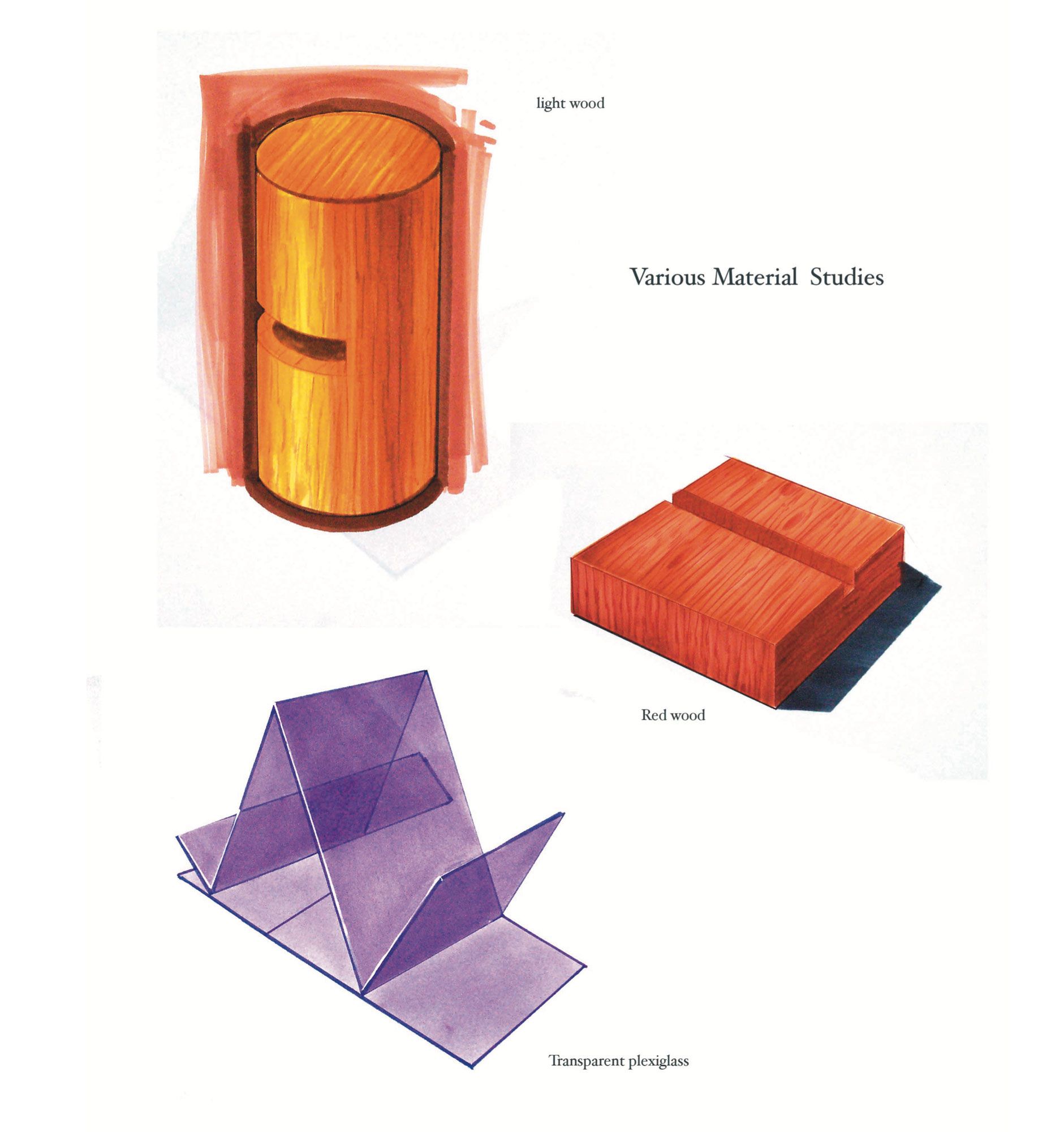
I've got some great tips for speeding up with colored pencil. The easiest and fastest way to really up your colored pencil work is to lay down a base color at about the same value and or color you are doing with the colored pencil. I use marker for this step because it is so fast. If the texture is too much for marker, i just lay in a base tone of watercolor (flat). Then I add slight lightening or darkening with the color pencil. It gives the work a much more substantial (pro) look and like I said, will easily double your speed.
-
@Lee-White Yes! I stumbled upon this approach intuitively for last month's prompt as I had found I liked the added texture that a base of watercolour gives to the pencil. Thanks for this tip about marker as I have not seriously tried that as a base apart from in Jake's Prop Design course.
-
@Lee-White This is how I've been working with that base watercolor layer, then layering wax colored pencil but I've been curious about laying marker down first instead like you mentioned - it seems like it would be faster.
I can get caught up in the watercolor layer for arguably too much time.
I just worry about seeing that streaky-ness of the marker, since I don't own copics but rather the less expensive blick brand.
-
@Kristen-Lango another option for your base layer, is pan pastels.
-
@AngelinaKizz wow I'd never seen those, they are beautiful! Thanks Angelina!
-
@Heather-Boyd hi! I think u can buy individual colors from prismacolor pencils.
-
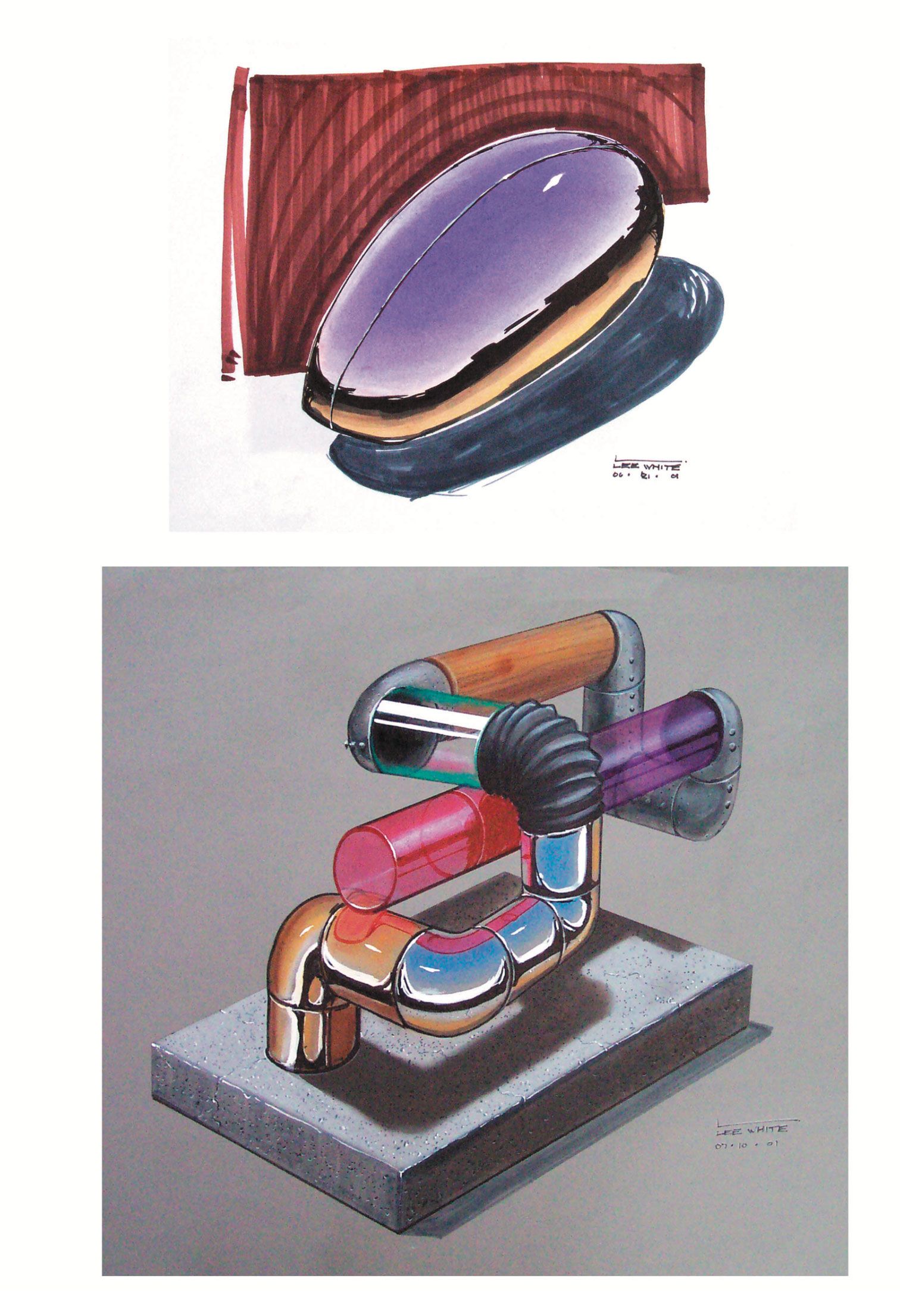
@Kristen-Lango you have to use relatively smooth paper and brand new markers to avoid the streakiness. Another option is laying down the local tone with marker, then putting down a LIGHT layer of pastel (scraped into a powder with an exacto knife or using pan pastels) . Then go on top with the colored pencil. This technique works GREAT with toned paper.
Here's a few VERY OLD samples I did in this technique back when I was an industrial design student

 .
. 
-
@Lee-White what great tips! And love your drawings! So awesome.