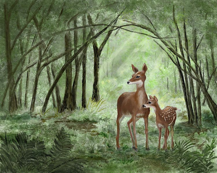
Attempt at digital watercolor — suggestions welcome
-
I am working on this in Procreate using the Max U watercolor pack. I’m not finished — I especially want to delineate the trees a little more — but thought I’d ask for your thoughts and suggestions for improvement as I try to finish it up.
I drew this from some photos I had taken of the doe and her dawn, and the woods around my house. I drew freehand from those but then I also took a bunch of closeups of grass and foliage which I mushed together to use as a multiply texture layer for the background.
I suspect I need more contrast in light and dark, and the deer look a little pasted on to me. Any suggestions would be helpful. I’m pretty much a novice at digital. (And not much better at traditional!)
Laurie DeMott
instagram.com/demotlj -
@demotlj This is so beautiful, Laurie!! I'm not sure if your aim is to make it look more like real watercolor - if so it could help to leave more white. For example the background grey color could instead be left as white "paper". When I do digital watercolor my trick to make it look as realistic as possible is to leave some areas of looser, more "watery" paint. I start with broad "wash" brush strokes, then add details on top, but not everywhere to let some of that original texture shine through. But it really depends on what you want to achieve - if it's not important to you to look as close as possible to a real watercolor, it's already amazing as it is so you don't have to make any of those stylistic changes.
-
@NessIllustration My aim is just to paint a good painting but I thought if I was using digital watercolor brushes, it should look like real watercolor so that people don't say, "Well, that's so obviously digital." It's funny -- I've been learning watercolor for two years and am not that great but people seem to give someone who works traditionally more latitude because they are just impressed that they are working traditionally. I also have a good friend who disdains digital art so all in all, I'm more uncertain about my digital painting. Your support is really encouraging to me.
Laurie DeMott
instagram.com/demotlj -
Beautifully done! The level of detail and the way you've set up the composition makes this work a pleasure to view. I think you've hit on something - if you add more in the way of values, you'll make the painting even better. Great job!
-
@abbottcartoons Thanks. I agree I need to pump up the values.
-
This is looking so good! I love the framing and how you handled the background. I think you could leave it as is!
My one suggestion would be to add some foreground elements that are handled in the same was as the deer. I see you have some of that already but I would make them larger/ darker and more opaque. I think this would unify the image more.

Really beautiful work though!
-
@demotlj this is super good already! Yes, with a little more value and contrast, it will be perfect. Have you try golden light instead of white light on the dears? Of course it depends on what atmosphere you want to convey. Warming up a tiny bit the light and the brown of the fur could be interesting!
-
@demotlj If your aim is not to mimic watercolor then disregard everything I said! The way you're painting now is amazing

vanessastoilova.com
instagram.com/vanessa.stoilova/Check out my Youtube channel for tips on how to start your career in illustration! www.youtube.com/c/ArtBusinesswithNess
-
@NessIllustration I may disregard it for this painting but I took notes on it for future paintings because I love your illustrations
")
-
This is nice. I would add a little reflective green light to the deer to help them be IN that environment more. =)x
-
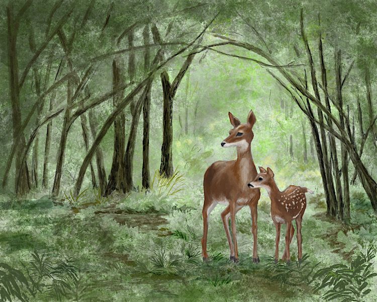
Here is my finished piece. Thanks everyone for the help.