July WIP Thread
-
@jdubz Great studies! I can feel the appeal for the dark version of the story! I would love it see that

In case you do plan to go ahead with it, I'd suggest a little more character designing. I think you've nailed the expression and mood, but the girl reminds me of Wednesday Adams
Also, I know this is only a rough sketch, but her proportions seems a little off. -
Thanks for the feedback - yeah these are pretty rough. I've got about 10 pages of these similar 5 minute doodles and I'm trying to nail down what direction to go. Looking for that "rabbit hole" that feels right

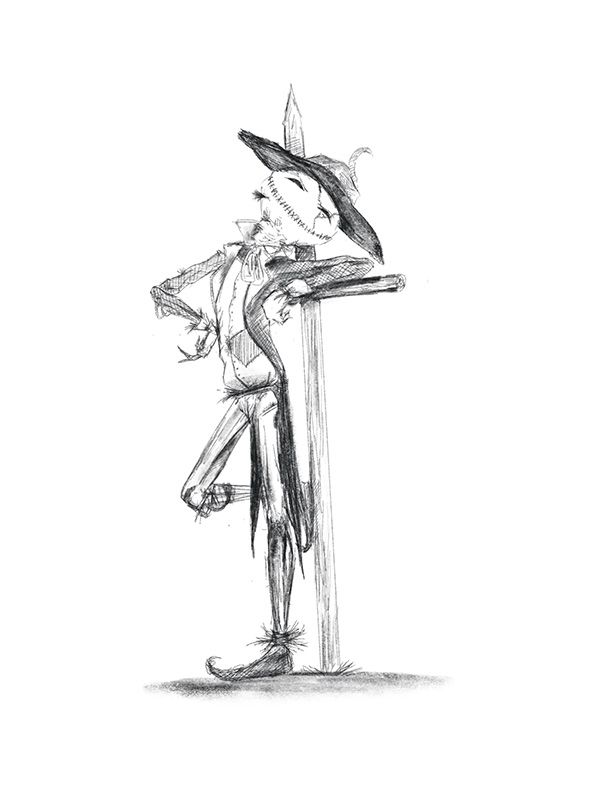
The one that's going to be most challenging one I think if I go this way is the Lion.
-
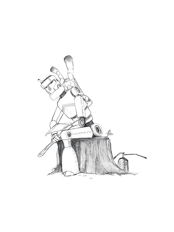
Whew finally had some free time to work on these again. I did quite a few different sketches for the Scarecrow and the Tinman and these are the ones that I feel like are starting to look the way I want. Still not happy enough yet with a Lion or Dorothy but maybe finishing these will help that process forward.
-
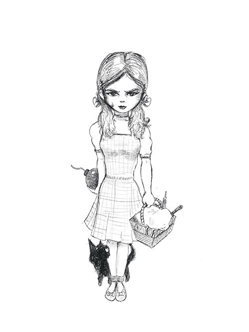
Working on Dorothy today... I think I like the direction this is going so far.
-
Love these Josh! The have so much personality. I'm really digging Dorthy's body design. It's not a design you really see very often for girl characters- but it's working for me and I want to see how she looks in different poses!
-
@TessaW Thanks so much! Working on sketching the layout with some different ideas on how to lay stuff out.
Unfortunately my FB got hacked so anyone that's experienced that knows it's a time hole, so hopefully I can actually get these knocked out

-
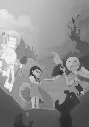
Began work on the actual cover and really tried to come up with something that would be attention grabbing. I got the initial cover sketched out. It might be too busy, but I think I'm going to try and make it work by controlling the values. I really wanted a dark right side and light left side duality kind of thing, with the protagonists taking on this sort of like "chaotic neutral" vibe.

-
My main question - does the perspective actually work? It's a bit weird because you kind of have 2 layers of perspective with the foreground and background coming behind it. I may not have time to fix it if it's just really distracting but I wanted to ask all the same
-
I had a stretch of free time so I just went with it
")
I'll post the next couple steps in case anyone wants to see it. More than likely the rest of the month will be a sprint at work, so hopefully if I have time I can refine some stuff but it's not looking likely so we'll just go with what we have!
-
I wasn't sure if I was going to do pencil or ink for the base, but since the idea was to do it more like a graphic novel kind of thing, I really wanted to show the linework. So here's the inking. The right side gets pretty busy so I did about 4 value mockups to see how I can push that back and ultimately I ended up making the forest pretty dark and pushed the scarecrow up being one of the lighter characters.
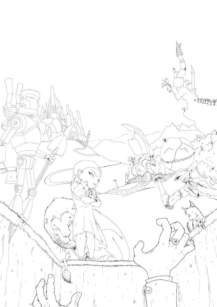
Here's the value breakdown I ended up going with on the colored version.
-
@jdubz this is so interesting to see your progress!
I really dig the concept. You have mixed up the perspectives but I think it really works.I do have some feedback, please take it with a grain of salt.
- I like the left-light, right-dark idea and I feel the contrast could be pushed a tad more to be made evident.
- Right now the tin man is standing out too much.
- Since you're going for a graphic novel style, I would like to see more variation in line width within each element. I can see that you've used thicker lines for the hands vs dorothy vs tinman. But the line width across each character is the same. It'll be really cool if you can vary that.
- I still feel Dorothy's proportions are a little off, her legs are too short.
-
Wow its rely cool to see your progress Josh. Framing your image in B&W rely helped. I think it is going in a rely unique and interesting direction, the one thing that I would rearrange is the Tin man, he is too far of ans cut off in a non strategic way, I think it would help bring more focus to the center of the image if you would move him a bit more towards the center.
Cant wait to see your progress! -
Good comments thanks. I probably won't have time to fix some of those issues before the end of the month but likely I'll get them done at some point. I might try and bring this into photoshop and solve some of the problems with liquify, but the Tin Man might be stuck where he's at just due to time constraints. I can already tell his legs should be longer as well just due to the perspective.
Originally I had tried to move him over, but he was covering too much of the Emerald City, then it was a cascade of needing to move EVERYTHING over and I just didn't have the time so I figured I'd leave it be since there was so much other stuff going on in the piece.
Appreciate the feedback! I always end up seeing tons of stuff that I need to fix after I submit it and people have had a chance to comment on it heh.