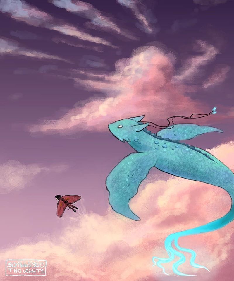
Art Critique please: How to to make this artwork better?
-
Hey guys! I hope everyone is doing well during this quarantine. I've started painting digitally quite recently and have seen myself getting comfortable with it since last year and I'm thoroughly enjoying it.
I was wondering if you guys could tell me how I could increase the depth or make this piece better. Maybe I should work on the lighting? Idk, would appreciate the help!

IG: https://www.instagram.com/_scribblistic/
FB: https://www.facebook.com/shafrin.scribble/ -
@Shafrin-Islam This looks great - for critique i would maybe say to remove the black lines - i think this has the potential to be fairly dramatic - The light looks purplish pinkish and coming from left. The local color of the clouds is most likely white but the light from the sunset is making them appear purplish pink - this same effect would happen to the dragon and the figure with the wings. It looks like the light is actually coming straight from the left, parallel to the top and bottom of the page - the lighting on the cloud right in front of the dragon makes me think this....so i'm thinking that same light would hit the underbelly of the dragon at that she angle where you have modeled a bit of a shadow and blue bounce light. But painting out the lines would fit with the rest of the painting i think...you could go in the opposite direction and add lines to the clouds
 Feel free to ignore - nice work!
 -
Hi, the texture on the dragon creature is really nice! You could increase the depth of the shading on that creature to make it more dis-similar to the clouds in value. Also the little character wearing the wings is so cool - it’s a little hard to tell what is going on with him cause he is so small. I know you are trying to make them look small next to the blue creature. You could have parts of the blue creature move off the frame and try layering the creature and the character so they overlap a bit to show more depth. Nice work!
-
What I noticed, and am thinking about is how in composition you want peoples eyes to travel around in a circle.
but here, we have both characters facing the same direction. So I look left just like them and get stuck.
I would arc the human so they're swooping back towards the dragon. And use the dragons tail to swoop vaguely back towards the human. boom circle. -
I love the color palette! It's very calming. These are a few personal feedback. Please take them with a pinch of salt.
-
The crop of the dragon's tail is drawing my focus. With so much empty sky, and only 2 characters, I personally would like to see the whole of both of them, unless there is a reason for cropping for the storytelling.
-
I agree with Kevin about the outlines. You can try removing them, or changing the color so that it blends in more with the illustration.
-
It "feels" right to have standalone characters facing the right since we read from left to right. Try flipping the image and see if that works?
-
The tip of the dragon's tail is almost florescent. I'd lower the saturation/brightness on that a tad.
-
I'm assuming that beautiful blue is the dragon's local color. But when put in an environment with purple/pink light hues, it's color wouldn't remain such a bright blue. Mask the dragon with a similar purple and try different blend options to see which looks best.
Overall, lovely illustration! The way you've drawn the clouds really shows depth and vastness of the sky

-