Help with a sequential scene
-
 HELP!
HELP!
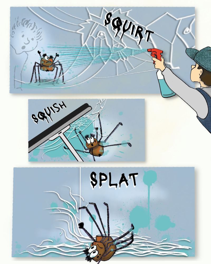
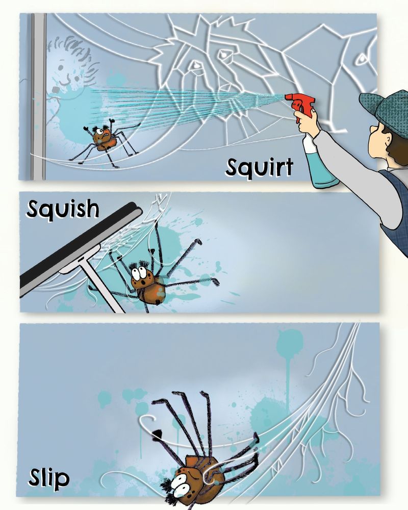
I'm trying to show a sequential scene with a window washer wiping out a spider's web. This is the left side of the spread. The right side (not shown) is a full page of the spider falling through the air, hanging on to one strand of web.
Does this page read OK? No text, just the onomatopoeia shown. -
@robinleigh49 I understand the action that the man sprays onto the spider and the spider slips down to the ground. What confused me was the spider web with the shape of a lion. Why is that?
As well confusing was that boy behind the glass staring through. It isn't clear on first sight. You could put a window frame and cut the boy, so it's easier to notice on which side he's standing. Showing a part of the window frame in the third panel could be good to see the spider reached the bottom line.
Also, you could add a right hand to the man in the first panel and already give the squeegee to him (had to look up this word!). This way it's easier to relate the action in the second panel to him. -
I'll just pour out my thoughts into bullet points to help keep them organized! I hope you find them helpful!
One overall thing:
- I think that the font choice just a tad distracting. I think the drips are what's throwing me off. The only reason why I'm mentioning it is because I find myself looking at the text more than the spider

The first panel:
-
I really like the spiders expression in this one.
-
It looks like the spider is standing on a flat floor rather than up on a window pane. I think this is mostly because of the shadow beneath him but his legs could also be attached differently to the window (like they are in panel 2).
-
I think the "SQUIRT" text might fit better below the water stream to the left of the spray bottle. That way it won't block the design you did on that web

The second panel:
-
I think this one reads well. Have you tried to make it the same size as the other panels? I think it would still read clear and would help organize the sequence. Even if the window cleaner guy overlaps the panel, it will still be clear his spray action is meant for panel 1.
-
Your squeegee reads really well!
-
Maybe make his pupils a little smaller to show his shock/surprise?
-
I like that one leg is out of the scene - It's helping transition into the next panel and makes the falling believable

The third panel:
*Maybe change his expression in this one? He looks mildly uncomfortable when the scenario seems to be asking for more of a shocked look.
- The spiderwebs feel a little dead in this one. The one's in the air make more sense. I think it would be nice to have all of the spiderwebs at a diagonal like the one in the air. It would really show the impact of whatever he's splatting against
Here's what I'm trying to convey
You see how the impact of whatever hit those rocks made them fly up? That's kinda what I feel like the webs should be doing in this panel.
*Or is he still falling? If the next page is a huge fall scene then maybe I'm not reading this last panel right. If that's so, the confusion is with the word SPLAT which makes him sound like he's landed on something like a tomato.
Overall It's hard to say what's better or worse because I don't know the story these illustrations fit into. As a sequence I think it's a success! I think that some of my suggestions might help make it stronger but I don't know the story so do whatever works best for that! Good work!
- I think that the font choice just a tad distracting. I think the drips are what's throwing me off. The only reason why I'm mentioning it is because I find myself looking at the text more than the spider
-
@SFischer Wow! Thank you so much, your comments were incredibly helpful. I made your suggested changes and gave more thought to design. I think it's a much stronger illustration!

-
Just saw your comment after I posted the revised image @Meta
Great point about the boy being on the other side of the glass, maybe an edge near the left side of the frame would separate him from the glass better.I see what you mean about the landing in the third image, he needs something to splat against. I was hoping the bottom of the page would work but since I've floated the window scenes I'm not sure.
The web design is part of the larger story, this is only the left page of 15 spreads.
This one is a challenge, I'll play with it a bit more!
-
I think this works better with the boy in the top frame. The word on the bottom is also more descriptive in leading up to the next scene.! Thanks for the feedback!
