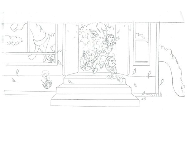
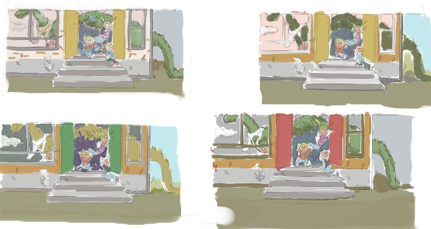
New wip for september , looking for help with color studies.
-
I restarted my sept entry. Twice lol. I had a dragon initially, and switched to a girl with a tuba and a mouse jumping out of it, (had trouble with the drawing I have to figure out) then back to a dragon even tho I wanted to not do a dragon, composition kind of called for it! I needed a long huge land animal so.......the blue shadow behind the kids running that I'm trying to just suggest and not detail. is just a bunch of kids and chaos
I have my drawing done , now looking for color study help. First time really doing color studies so advice welcome on what I'm doing. ! In the illustration it is supposed to be autumn. Going to be out of town for a few days now so I am might be in the last few hours of Sept trying to finish lol. This contest nearly killed me lol. of course it is not over yet either.............lol


-
@Coley Hi I dont know much but I think the last one looks best the red door draws my eye to the kids.
-
@DOTTYP thanks for your input, I think I like the red doors the best too for that reason.

-
@Coley I have a question before color, which might drive you crazy because you’ve finished the drawing, but I think it’s an essential question.
It looks like the kids are running outside, but there is a cloud next to the dinosaur that makes it look like it’s outside too. And because we can’t see the second outside wall it reads almost like just a wall that looks like a building.
I don’t think you need to go into perspective to address the question though. Some classroom interior elements inside and some glass shards breaking out or a broken window frame hanging on his tale could be all it takes. Just some little details to tell us the Dino is inside and his tale is coming out the window.
With the color studies I would just make sure that
- you have a clear focal point.
- that important subjects are light on dark or dark on light.
The white scarf is a little distracting from the kids, that I assume is the focal point.
Just for color, I’m drawn to the bottom two. Like bring over the blue sky into the bottom right one. And if fall is important to you some piles and stray leaves and maybe a tree in that open sky area would an easy sell.
Your clearly putting so much work into your entry. It’s gonna be great!
-
@Shara-Mills thanks so much
 I can tell you took some time to look! I will be adding some reflection/lighter shades to the windows, I actually had it on my first study that I threw out but I didn't add it on these ones but it will be there on the final, thanks so much great point
  I hadn't figured out scarf color but will make it non-distracting! So good to get people's input as to where their eye goes!
I'm also liking the bottom two, and I think you're right on the sky. I have a few leaves scattered but not into the sky area so I will consider that! The only reason I was thinking fall is because it's currently sept and back to school and I wanted a bit of a color theme to start working with mostly! Sky leaves are a good idea I'll give it a try