Snow Happens Bologna Fair Submission
-
Hi all,
This is my submission for this years Bologna Book Fair Illustrators Exhibition. I mailed it today because the deadline is 10/9 but I'd still love feedback on them if you get a chance.
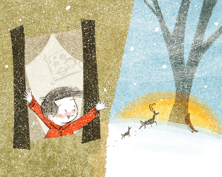
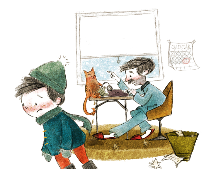
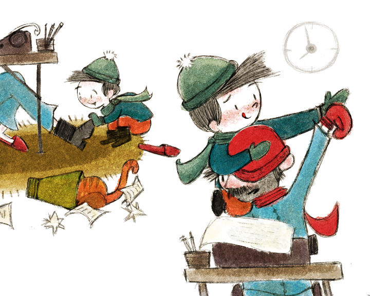
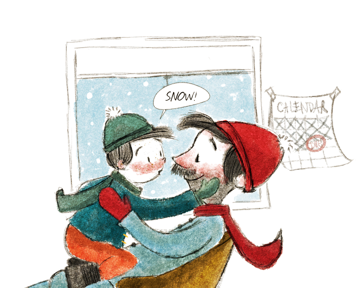
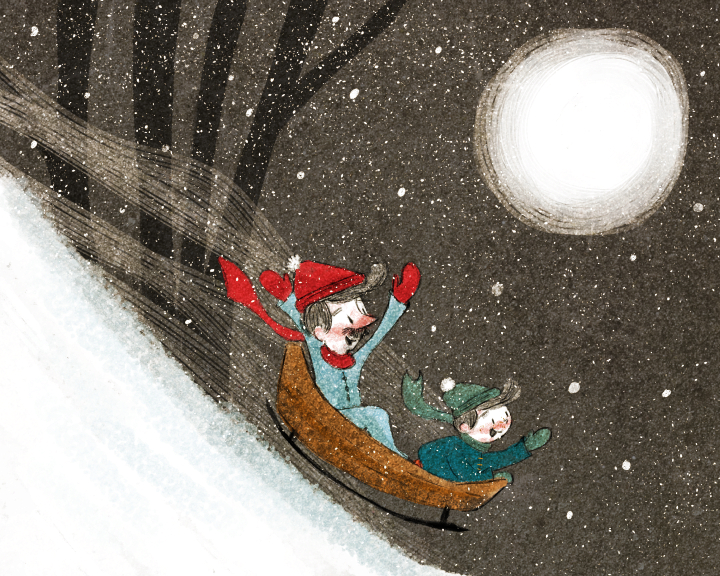
It is called Snow Happens, a mini story (mostly wordless) about a young boy who wants to play in the snow but his daddy is too busy with deadlines.
(/uploads/files/1444079371424-snowhappens01sm.jpg)
-
Very cute story, and beautiful style!! Good luck! let us know how it turns out

-
@Charlie-Eve-Ryan very nicely done! Your poses and expressions are great and I love the dad's 5 o'clock shadow hehe Also, the last one in particular has fantastic action with the vertical composition.
Do you do your work entirely in Photoshop? You have some really great textures going on! Do you use both brush and images of textures to get that effect?
The first spread is the only one I find could use a little work. I think it's the house in particular I'm not liking the colour of - or maybe it needs more of a definition around the window pane, but the window and house all blend into one for me. Also this spread doesn't seem to quite connect with the rest of the pages in terms of colour palette, although you've reused a lot of the same colours. It's just the yellow of the sun I think that makes it seem out of place. Maybe if the sun was more on the orange side (like the colour of the cat) then it would be more cohesive. Also - I think the window is lacking a sense of depth which is throwing me off.
I do like your colour scheme overall though - and I must say, I love that you used a dark brown for the sky in the last one, I wouldn't have thought of that but it works so well! Weeeeeeeeeeeeeee!
https://danettebyatt.com
Twitter @DanetteDraws
Instagram @DanetteDraws -
Really nice work! There is so much to like. I too love the brown sky in the last image. Great characters.
-
Wow these are all so wonderful! And that last scene brings so much joy and happiness to me and I also love the dark sky tone you used as well. Good luck!!!
-
aww these are very cute! nicely done! I would make the boy head bigger on the 4th image, his different proportion really stands out for me.
-
@Lynn-Larson Thank you!!
It's a loooong shot and I'm pretty sure I fouled up the label system for the submission lol but it was a fun project. I may expand the story. -
@DanetteDraws Thanks Danette, you are so right about the color on the first spread and lack of detail. I did it last and I think it shows. The other spreads seem to mesh better. I'll adjust the color and add more detail to the house so it does not look so flat.
I work in Manga Studio 5 and scan in textures that I like and build my own brushes. I add texture to most of them. I also look for free use high res textures online too. I put texture on everything lol, I even add textures to my custom erasers. It's a bit overboard

-
@Rob-Smith Thank you Rob!
-
@Rich-Green Thanks Rich!
-
@Naroth-Kean Thanks Naroth, good eye..I'll adjust the head too and I just noticed a small inconsistency in the rug. I must not have drank enough caffeine
Thanks for the feedback, much appreciated! -
Your image a so cute, I love them.
Never give up, always push yourself two steps further than you believe you can go.
-
@Steve-Young Thanks so much, Steve!
-
These are awesome (as always!). I love your compositions and would love to see this printed and on the shelves!
The one thing about the characters (especially the boy) is the horizontal band of red going across their face. I like adding the rosy cheeks and nose, but it's just too even and looks like a stripe on them. Maybe break that shape up and lighten it just a tad. Don't want to make it look like they are hitting a few beers before going sledding! hehe!
Really great! love the work you are doing. : )
-
Wow @Lee-White thank you so much!! Your encouragement means a lot to me. I will definitely take your advice on the character's red faces! Though a few beers before sledding sounds like an awesome idea just not for a PB ;D! LOL
-
These are fantastic !.. the drawings just pull you into the story and you start feeling it right away - transported - great job!
-
@Kevin-Longueil That is very kind! Thanks so much..I am glad you enjoyed it
-
Wow! I'm a little late to comment on this, but I must say these are fantastic! I love how dynamic they are, the expressions, colors, everything!
There might be two things I would point out (keeping in mind that I am far from being a professional illustrator)
- I agree with the first image not fitting perfectly with the others... maybe it is the color, but I think it is mostly the contrats. Your darks aren't as dark as with the other images. I think you might have toned it down on purposed because of the snow, but I would still try it with a little more contrast
- On the third image, the feet of the little boy jumping on his father doesn't read very well, especially the one right around the neck. Maybe if you would push the leg out a little more to the side ?
But other than that, I just love it! I love the dad unshaven beard and I LOVE the cat!!!
noemiegionetlandry.squarespace.com
noemie_illustration on Instagram -
I love the simple and traditional feel to these. I think they are fantastic!!!
-
@NoWayMe Thanks so much for your kind words! And thanks for the feedback about the color and his foot. I can make some adjustments on that to help it read better!