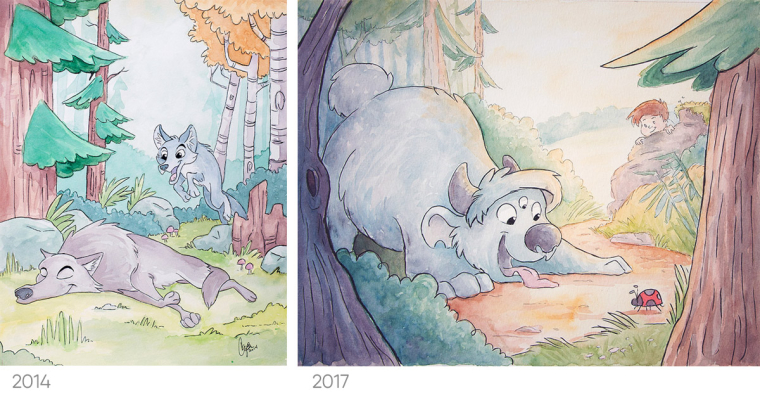
Watercolor level up!
-
I'd love to share an old watercolor piece with one I just finished. (Not sure if it counts as a Slowvember piece because I was working on something else and this project came along.)The lessons I'm learning through SVS are showing through I think:
- Better composition and focus.
- Better changes in value - the old one is nice colors but in grayscale it's almost all the same value so it feels flat. Though it is still difficult for me to get dark tones with watercolor because of its transparency.
- Color! In the past I painted like Will Terry would mention often - painting things the color that they are. This time I experimented with how light would play off of the subject to give it a morning-light feel.
The new watercolor is done traditionally and "finished" but I would appreciate any feedback so I can learn for my next work.

-
I think it looks good! I like the progress that you've made. I will make one observation that I hope is useful.
The object that draws my eye in the most is the lady bug. That's great, but the fore-tree on the right also catches my attention and seems to draw my eyes off page. I think it is because the colors are warm and saturated. The monster and the boy deserve more attention and if you saturated them more, they might stick out above everything else. I also think the tree on the right should look more like the one on the left, darker and cooler. Does that sound right?
-
Very nice!
If you are struggling to get darker values in watercolor, it just means you are using too much water.
Think of watercolor as having three consistencies.
-
water consistency: this is for light very light tones and glazes. you are mixing a lot more water than pigment for this type of wash
-
milk consistency: This is a much thicker mixture with a lot more pigment than the first one I listed. This one has about 40% water and 60% pigment. This is good for mid values and opaque washes. NOT GLAZES
-
Yogurt consistency: This is where you are adding very little water to the mix. Just enough for it to flow smoothly. With this mix, you can get very dark and saturated colors.
It seems like you are probably using mostly the first kind of mixture I mentioned if you are struggling to get true darks. Try going for more pigment and see how it works out. : )
-
-
@cory-shaw The focus of the illustration is supposed to be the monster playing with the ladybug. If it was a whole story, it'd probably be about a monster in the woods, enjoying his life, until he notices he's being followed. Is a new monster following HIM? But the reader can find the boy in each picture and knows something the monster does not. Eventually the monster discovers the not-actually-a-monster boy and they become friends.
-
Hmm, great story! I think you accomplish that with the boy in the background (he doesn't have the main focus, but he is still very clear.) Certainly the size of the monster brings some focus on the monster too. The only place I have trouble focusing is on the monster. I wish I knew all the correct terms better, but I think deemphasizing the tree on he right side, either by making it darker or less saturated would allow my focus to remain in the center where the monster and bug are. You could also add emphasis to the monster by giving it a warmer color or saturating the blue (add less water). I know you're done, but I'm telling this to myself as much as I am to you, because trying to analyze it will help me in the future as well. Anyway, I'm not necessarily correct either. It is very good!
-
@cory-shaw Thanks for your feedback! I want each piece to get better. I had a lot of fun adding colors to show warm light hitting surfaces. Making the tree on the right darker and cooler would better frame the focus of the picture. I'll have to experiment with this "less water" watercolor too! I've always done it so subtle and light that making a bold or dark stroke is intimidating sometimes.