Evil's Inktober 2017
-
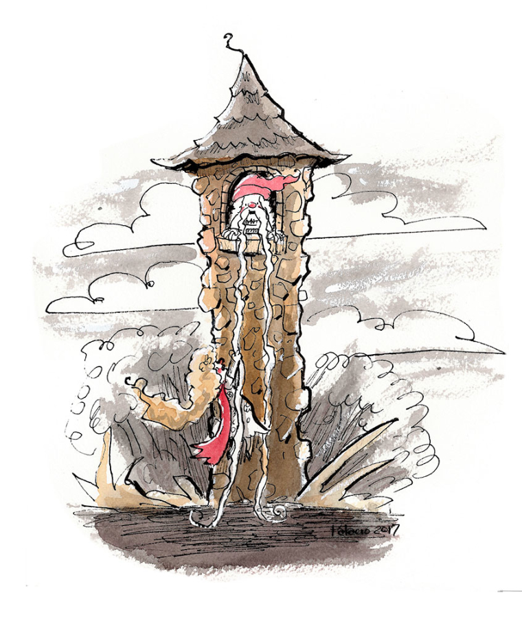
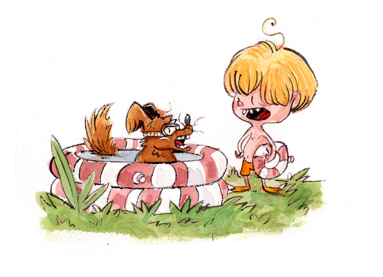
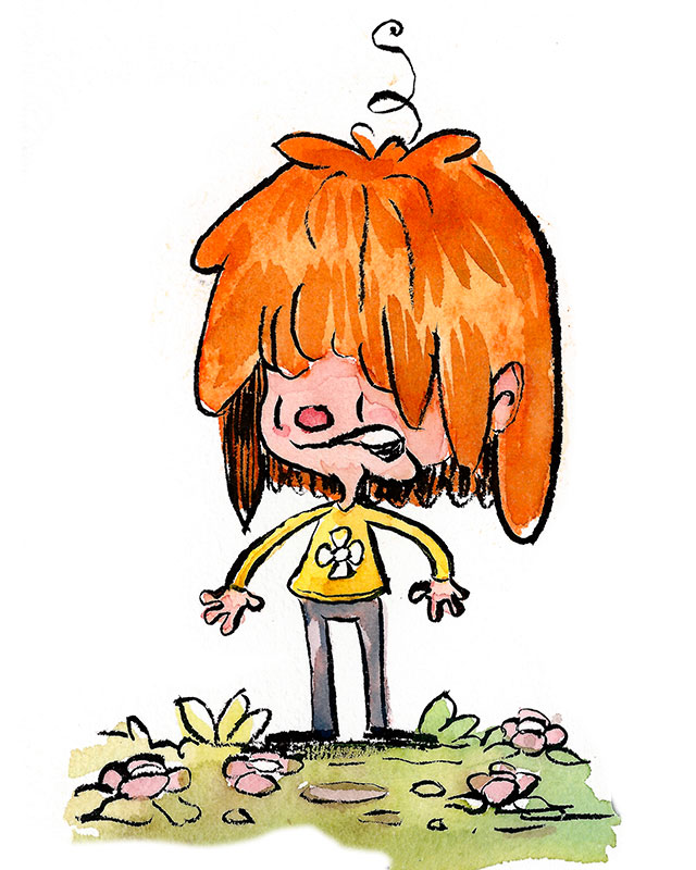
Day #5
Prompt: Long
-
Love your work so far! Very energetic, and funny!
-
Really cool seeing you sticking to your style.
-
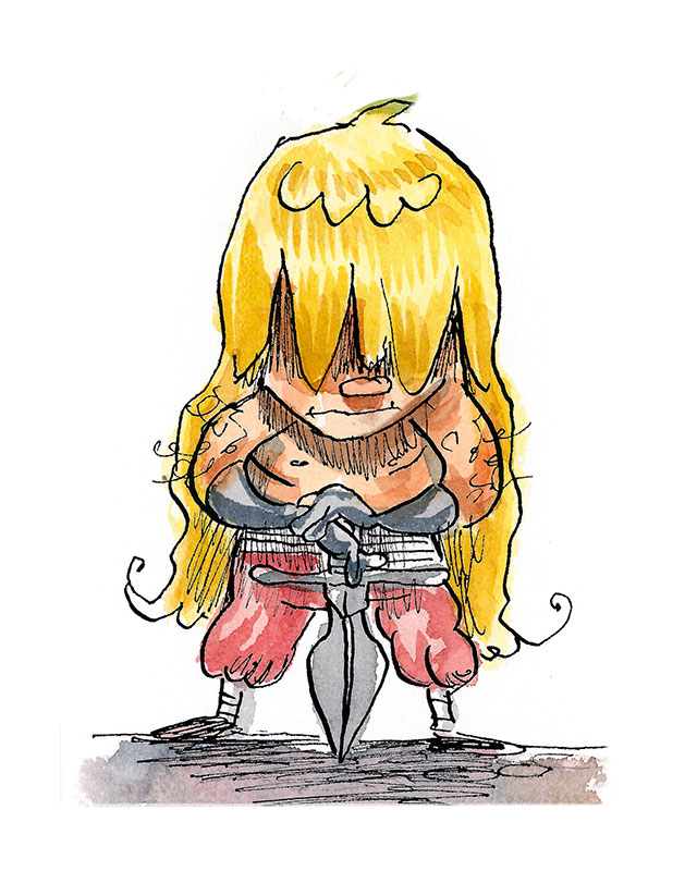
Day #6
Prompt: Sword
Ink, watercolor, coffee (because when you have hundreds of dollars in paint why not just use some cheap coffee)

-
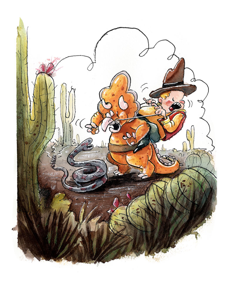
Day #7
Prompt: Shy
ink, watercolor, and coffee
-
@evilrobot Your style is so awesome
-
@evilrobot super dig this one! Feels very Shakespearean
-
I love all of these! Are you using colored inks?
Marsha Ottum Owen
-
@marsha-kay-ottum-owen No just FW acrylic black ink, a little bit of watercolor, and some regular old coffee.
-
@evilrobot said in Evil's Inktober 2017:
Day #6
Prompt: Sword
Ink, watercolor, coffee (because when you have hundreds of dollars in paint why not just use some cheap coffee)
This one wins! Great work.
-
I’m really enjoying your use of the white in the pictures too.
-
Day #8
Prompt: Crooked
Ink, watercolor, coffee stain, pen white,
-
@evilrobot Very cool.
-
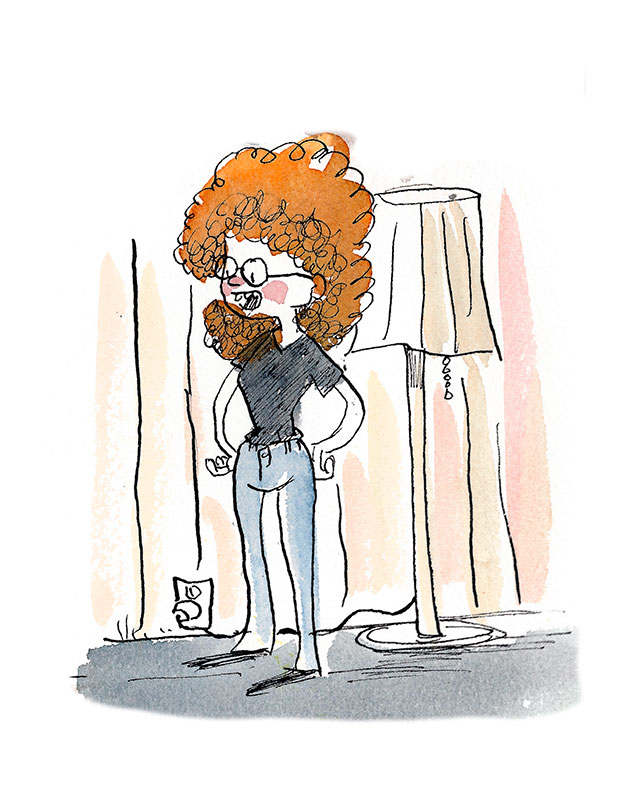
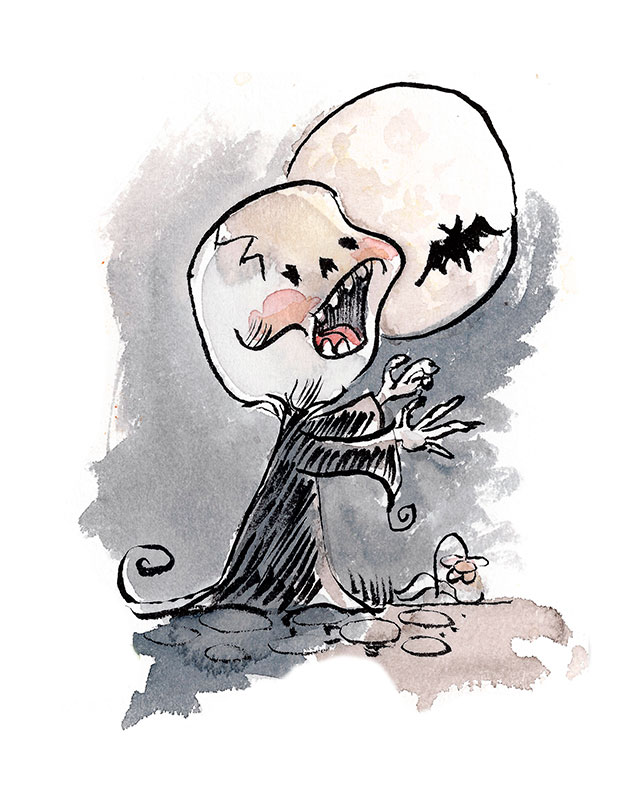
Day #9
Prompt: Screech
Ink, coffee stain, watercolor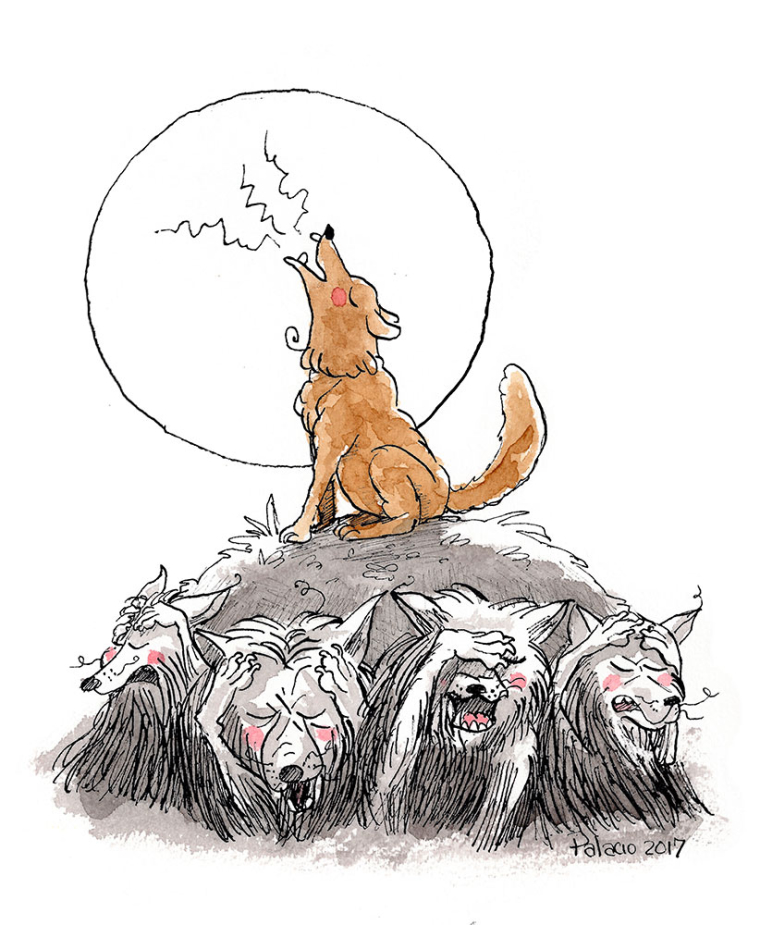
-
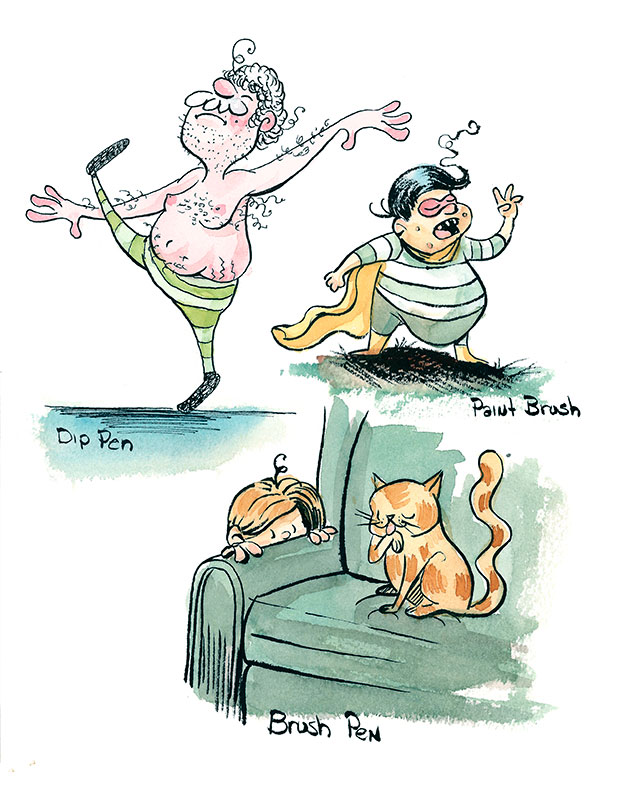
Inktober dump for this week. Missed a few days so the time I did have I worked on some watercolor process and different line rendering styles. Also tried to do a follow up to my last months challenge drawing.

-
my goodness do i ever love that rocker with the nose ring and the vampire. hahah pure enjoyment
-
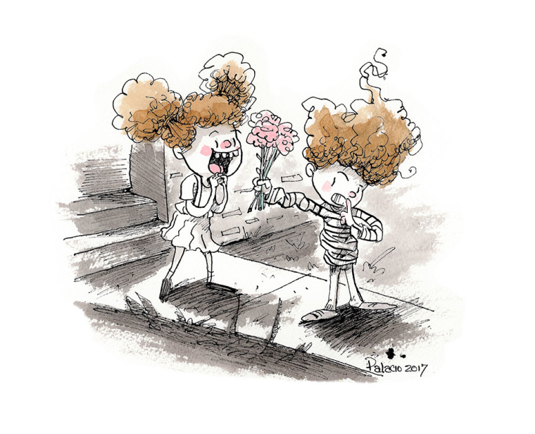
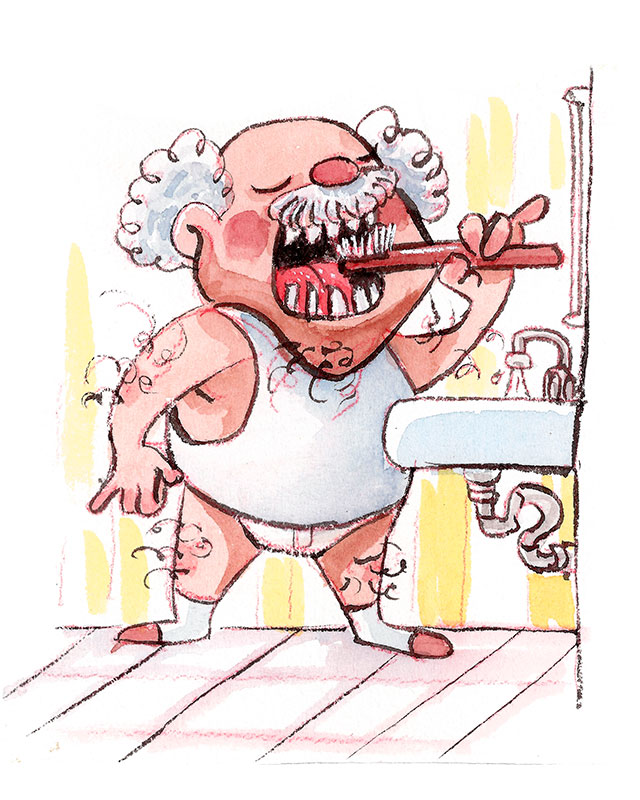
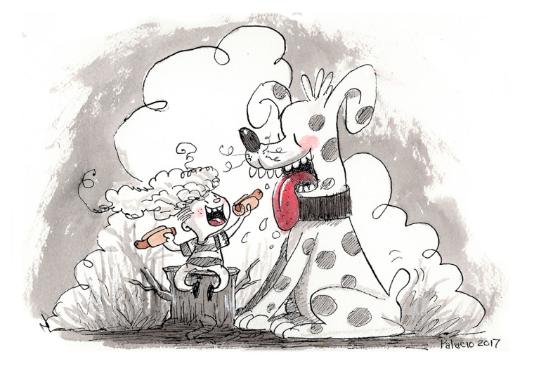
And a few more.
-
After the inktober stuff I've been thinking a lot about the style. I've been thinking about ditching all my full color pieces and changing my whole portfolio with a more stripped down style. Messy ink line, tonal rendering, and just one or two spot colors. Any thoughts on this? Wondering if it's a good move or not to get rid of all the full color stuff.


-
@evilrobot I really enjoy your pen work. Nice line work!!
-
@evilrobot said in Evil's Inktober 2017:
After the inktober stuff I've been thinking a lot about the style. I've been thinking about ditching all my full color pieces and changing my whole portfolio with a more stripped down style. Messy ink line, tonal rendering, and just one or two spot colors. Any thoughts on this? Wondering if it's a good move or not to get rid of all the full color stuff.
I'm not the best person to give advice on portfolios, but I personally would include the color stuff- just because your work is very well suited to the children's market and I can imagine you getting more jobs if you show you can handle color. I think including a good chunk of these limited color pieces is a good idea as well though, because they are really attractive- and I can see where it might inspire someone to hire you based off of the aesthetic. I would maybe think about having a signature color look. Rebecca Green may be a good artist to look at. She includes a fair amount of almost black and white pieces in her portfolio and all her color stuff looks very "her".
Anyway, good luck! I'll be interested to see where you take your portfolio.
Website: www.tessawrathall.com
Instagram: www.instagram.com/tessawrathall_art/