3rd Thursday Drawing/Value Study (Charlie)
-
@baskin Hi Jason, btw nice website.
-
Thanks again for the kind words, everyone. Leontine, I agree with your suggestion to push the value range in this piece. I work in watercolor a lot, and often have a hard time pushing my dark values, so your comment is a great reminder. Here's one final value study which seems to have better value range (on my monitor at least).
I'm starting in one my final drawing and color studies now, but feedback is always welcome!
Thanks again,
Jason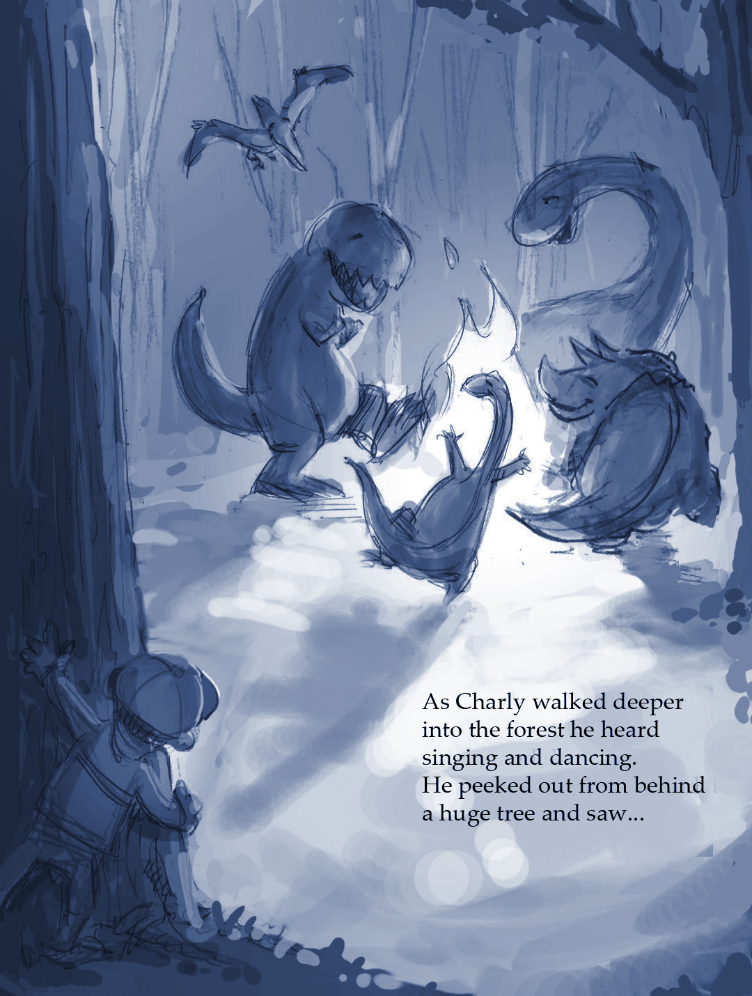
-
Something about that smiling pterodactyl puts a big smile on my face each time I look at your works in progress here. Such a great piece and I am really looking forward to seeing how it all turns out!
-
Thanks very much for the encouraging words, Rich! Here is my final drawing. I always worry about tightening up at this stage, which is probably why I tend to avoid all of these studies and digital tools, and just rush into my pen and ink final too early. But I've been trying to remind myself of Quentin Blake's advice this time around - "draw, don't trace." Feedback is always welcome. Thanks again!
Jason
-
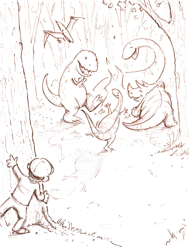
I'm probably oversharing here, but figured it would be fun to post my progress as I develop this piece. I'm still very new to digital illustration (though I've used 3D tools for many years), so I'm following Will Terry's fantastic step by step process (thanks Will!!). Here's the drawing with occlusion shading added, along with a minor adjustment to the shape of Charlie's foot.
Please let me know if you notice anything else that I should be adjusting along the way.
Best,
Jason
-
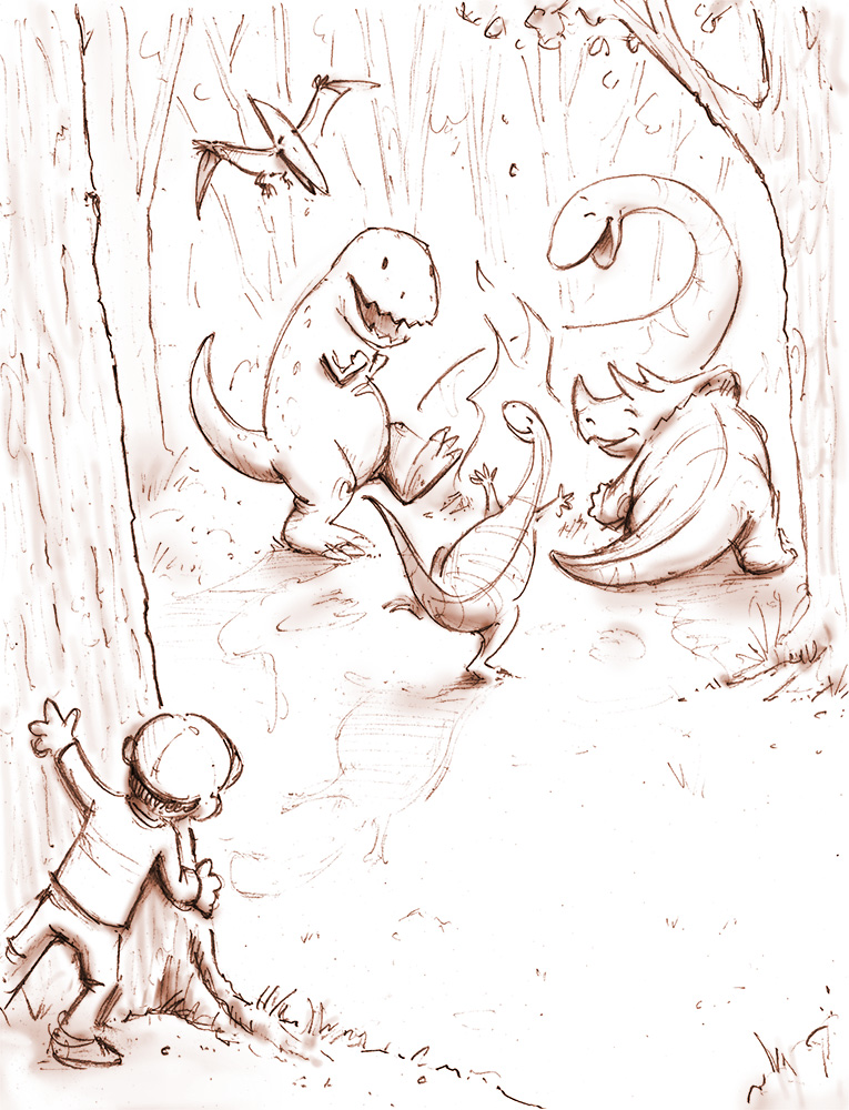
Hi again, all-
Here's another update with shadows and tone added. I'd love to hear any additional suggestions you have for improvement. Color studies are up next!
Thanks in advance,
Jason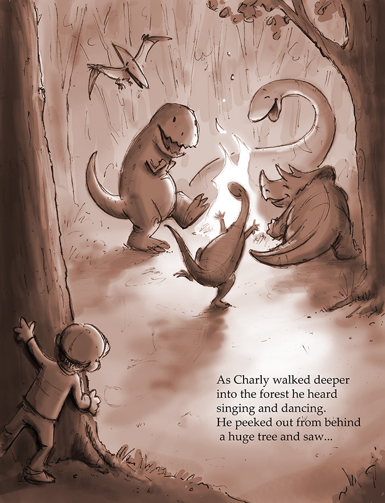
-
Those are some beautiful action lines...
-
Hey, thanks Jason!
")
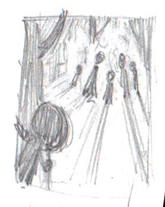
Here's my original thumbnail, btw. I ended up deviating quite a bit once I settled on the dinosaur idea and started playing around with character poses. I also felt that pulling the camera back to show the boy's body would help make the dinosaurs seem larger, and better convey Charlie's surprised reaction.
-
I really like the mood and line work there.
-
Thanks very much, Naroth!
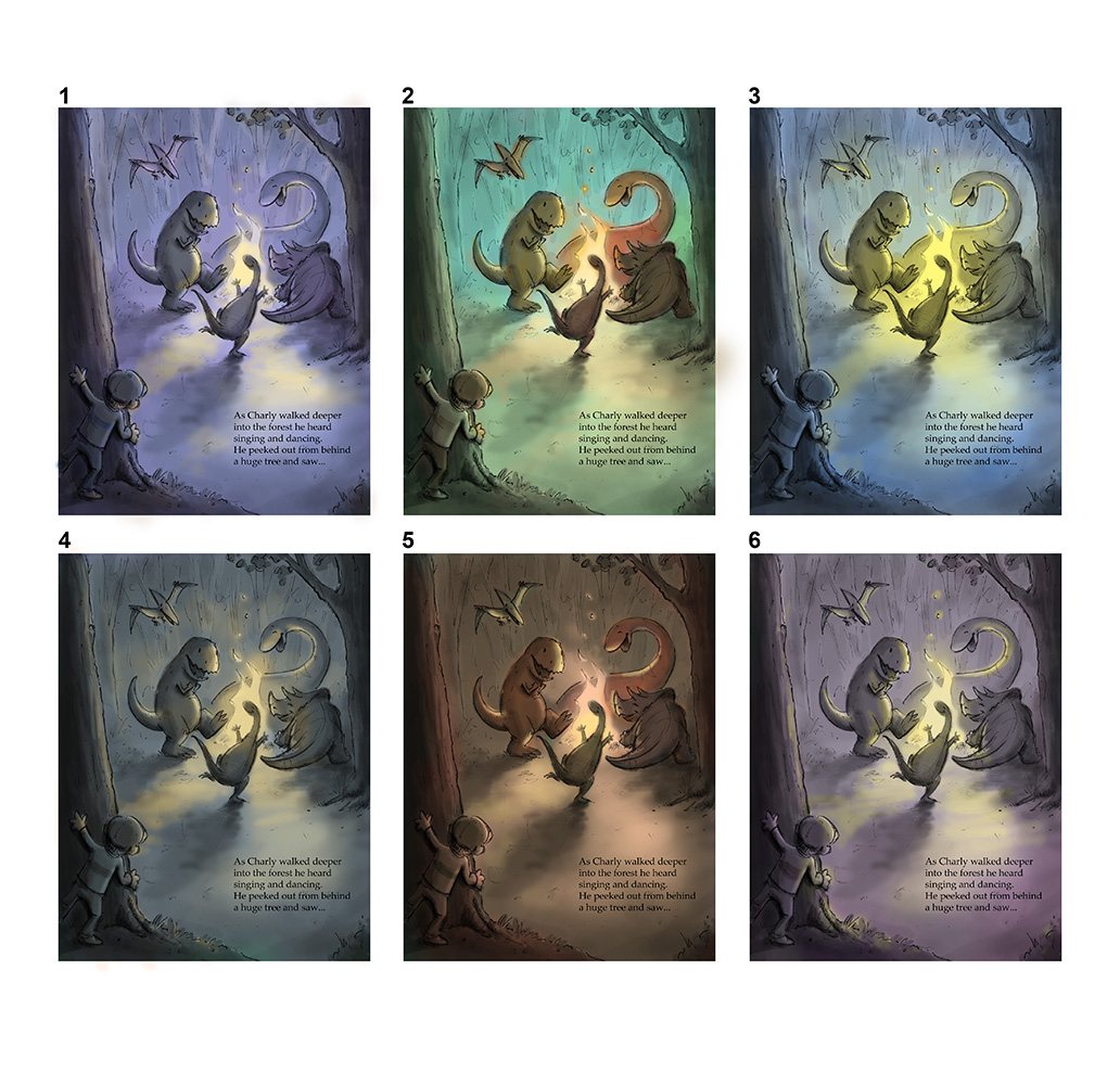
Here are a few color studies. I'm thinking I should slide the text over to the left a bit on the final composition.
As always, I welcome suggestions/critiques.
Best,
Jason
Twitter @baskindraws
www.baskindraws.com -
i like 2
-
number 2 for me1
-
2 seems like early evening where as 5 is much later. I like both!
-
I like no I mean I love number 3 because of the strong bright flame shining and sharing its light at its surrounding, warm meet cool and clearly draw your attention to the image right away. Other images also do the same thing but number 3 is being more dramatic. I personally think it kind of fit the text! My kind of mood I gotta say :D. Great job!
-
Thanks for all the feedback, everyone! Sounds like #2 is in the lead at the moment, but I'll hold off for a day or two before committing to a final color scheme. The upper left corner of the composition felt a little too linear to me so I roughly sketched in another branch. Do you all think this is an improvement?
Thanks again!
Jason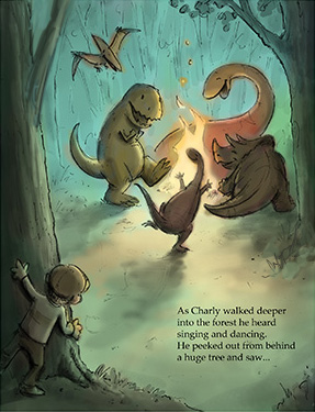
-
Yep I think it is.
-
I wonder if you did a little color shift to blue near the edges of the green if it would cool off and push the distant trees into the background (like the blue in 3 and 4) just an idea, looks great though! You never stop inspiring me to do great work, thanks Baskin!
-
@baskin Hi Jason, Love the illustration! What I really like is the effort you put in it to see what works! Now you can pick your favorite, or let your audience pick the best. for now I like nr two best. Maybe its nice if you give the dinosaur on the left some sparkles in his eyes? My Youngest son would love to have a print in his bedroom, I am sure!
-
Great suggestions - thanks, Jason and Leontine! I'll be sure to explore those options too.
All the best,
JasonTwitter @baskindraws
www.baskindraws.com -
@baskin XD