A Special Letter to Aunt Umi
-
very nice image! Your work has such a nice feeling to it.
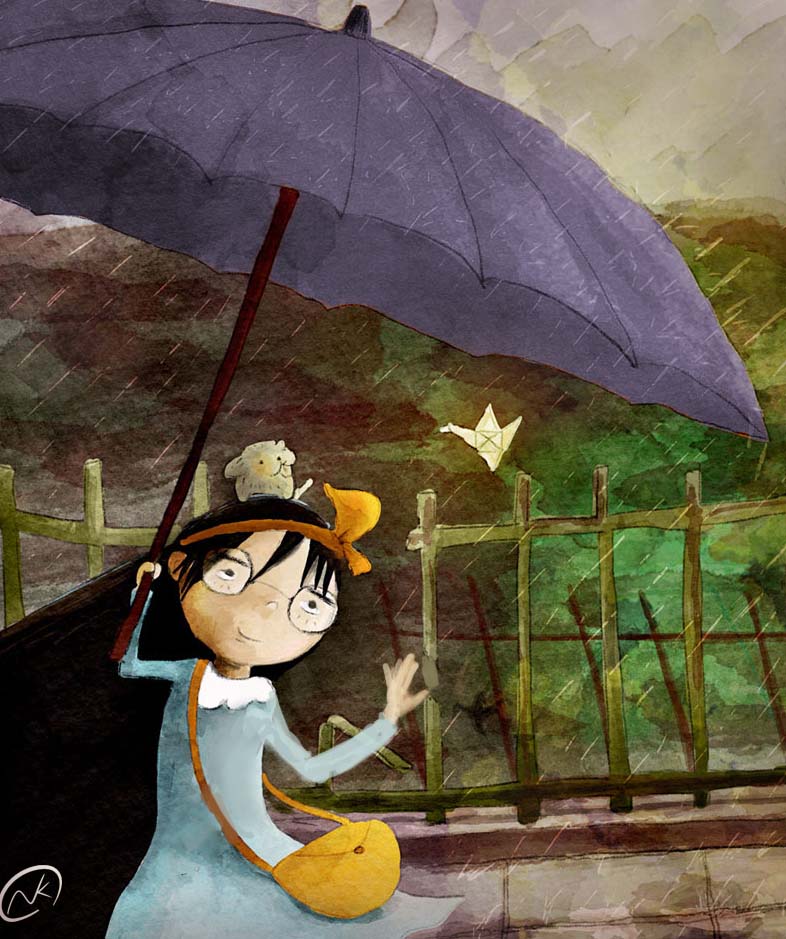
I couldn't help but wonder if it would be nice to crop in and make this scene more intimate. Right now that hard orange light and bright umbrella really pull the eye upward (away from the focal point). So I tried this simple solution. I think it puts more focus on the relationship between the girl and the note. Her hand on the umbrella should be addressed because it's not as strong as the rest of your drawing.
-
@Thrace Shirley Mears, Thank you

@ Lee White. Thank you so much, Lee. I was really having troubles with focus on this piece. Part of me wanted to show the sky/street light and other part of me wanted a focus point, I confused myself haha. Thanks again I'll go make some adjustment now. -
@Naroth-Cow another stunning piece! I am blown away, and the fact that you achieved this look digitally is amazing! Love it!
-
lol, really like the way you do the watercolor effect!
-
@Lynn-Larson @Steve-Young Thanks
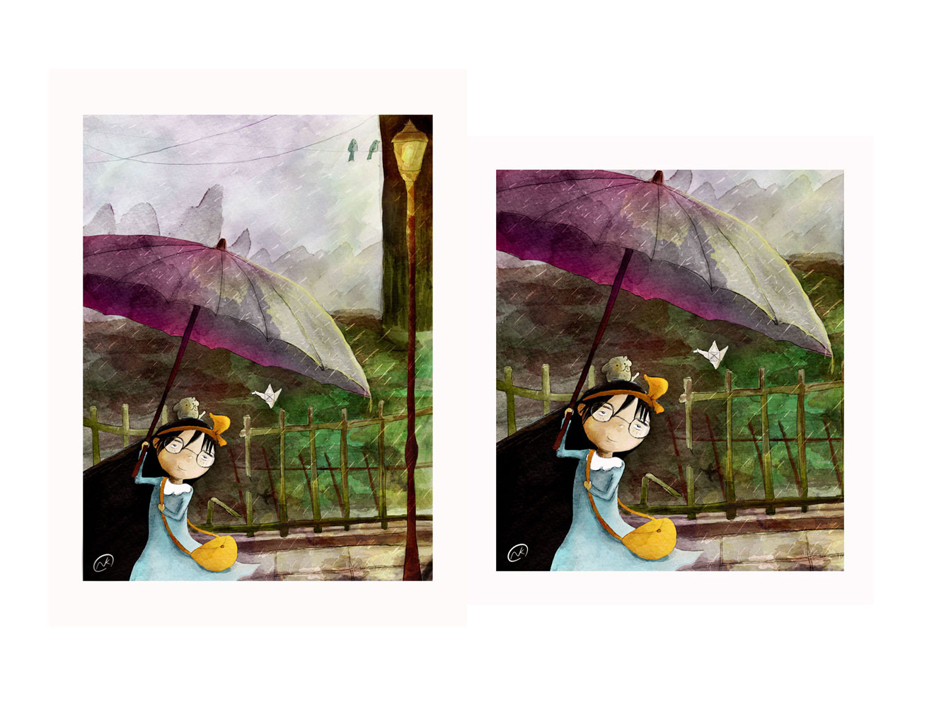
 took me a while to figure out this effect. Here a version with better focus.
-
H Yes that does feel better.
-
Thats great. Love the color change of the umbrella! Well done!
-
Really nice mate. Would you be able to share any tips for achieving the watercolour brush effect?
-
@Naroth-Cow What a fantastic piece. I was immediately draw to it. Your digital watercolor skills are really working well. I haven't figured out the digital watercolor tools. Great job. Your such a talent!
-
Nice piece! I like the changes you made, it does make it more intimate. Love your use of colors too.
-
I think this is lovely! It makes me want to see more of what's going on. And am i seeing right that this is DIGITAL watercolour??? I'd also love to know how you got that look to it.
-
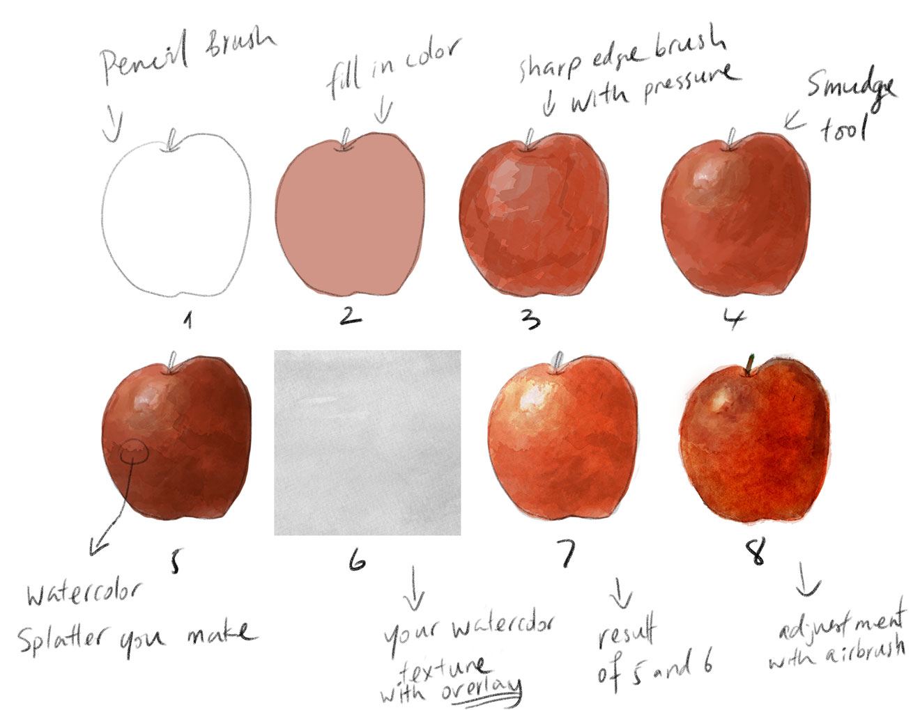
Thanks everyone! since everyone is curious how i get the effect here a simple tutorial I made, and hope it helps. Remember it's about how you handle the paint, let it flows and loosen up the detail a bit.
-
for number 8 also adjusted with smudge tool
-
@Naroth-Cow You are the best!! thank you so much! can't wait to get home and try this!
-
@Lynn Larson you're welcome. Let me know if it works out for ya. You might want to adjust your texture paper a bit. I painted mine with light gray watercolor then scanned in, and I adjusted in photoshop a little bit with Level Adjustment.
How come sometime I can and can not tag people names? -
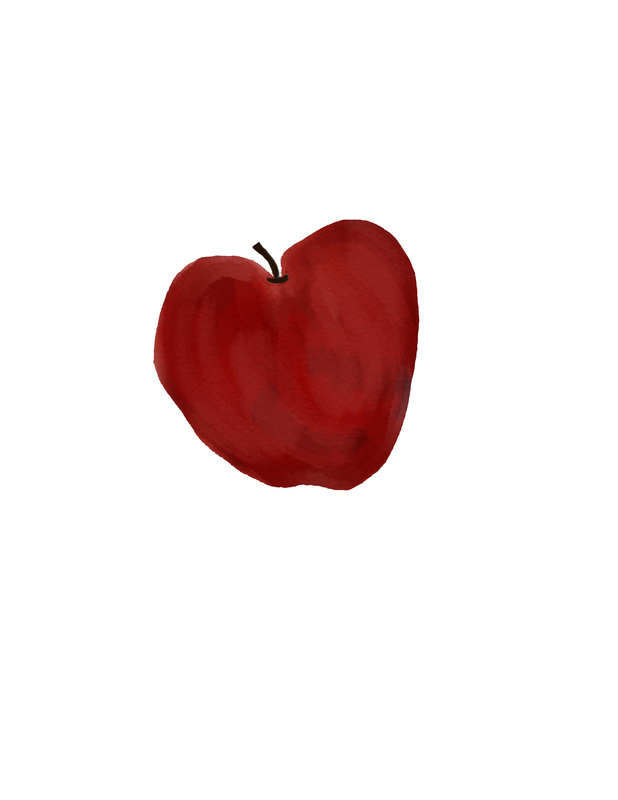
Is this close to looking like your apple?
-
you are between stage 3 and 4
-
@Naroth-Cow I will keep trying, thanks.
-
Where am I now or is it any better?
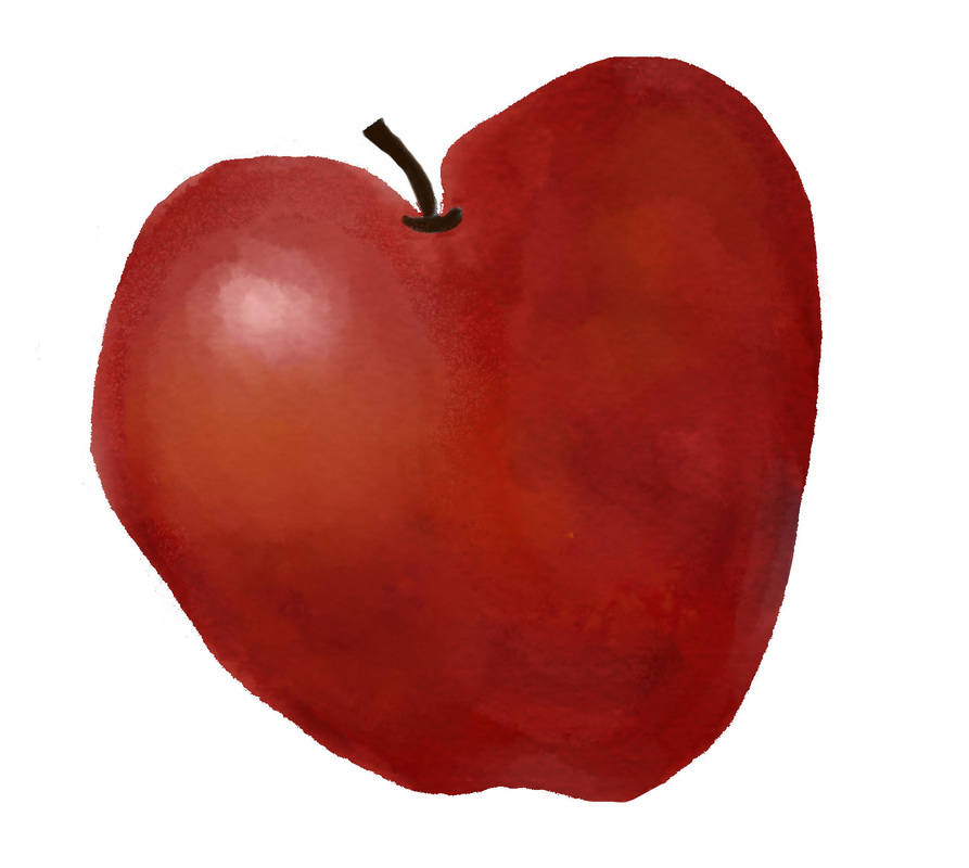
-
absolutely looks a lot better, I can see now you have the highlight on the apple and more lighter tone. All ya need to do is to find some watercolor splatters and slap them on the apple then use smudge tool to smudge out any awkward/weird line. Try to outline the apple with darker red or brown then smudge the outline a bit, just a bit to make it look as watercolor bleeding edge. Make sure the splatters are always on another layer, make it on top of the apple, hold Alt between splatter layer and apple layer then Right click; this will make the splatter layer only be colored within the apple layer area only, it won't stray the paint.