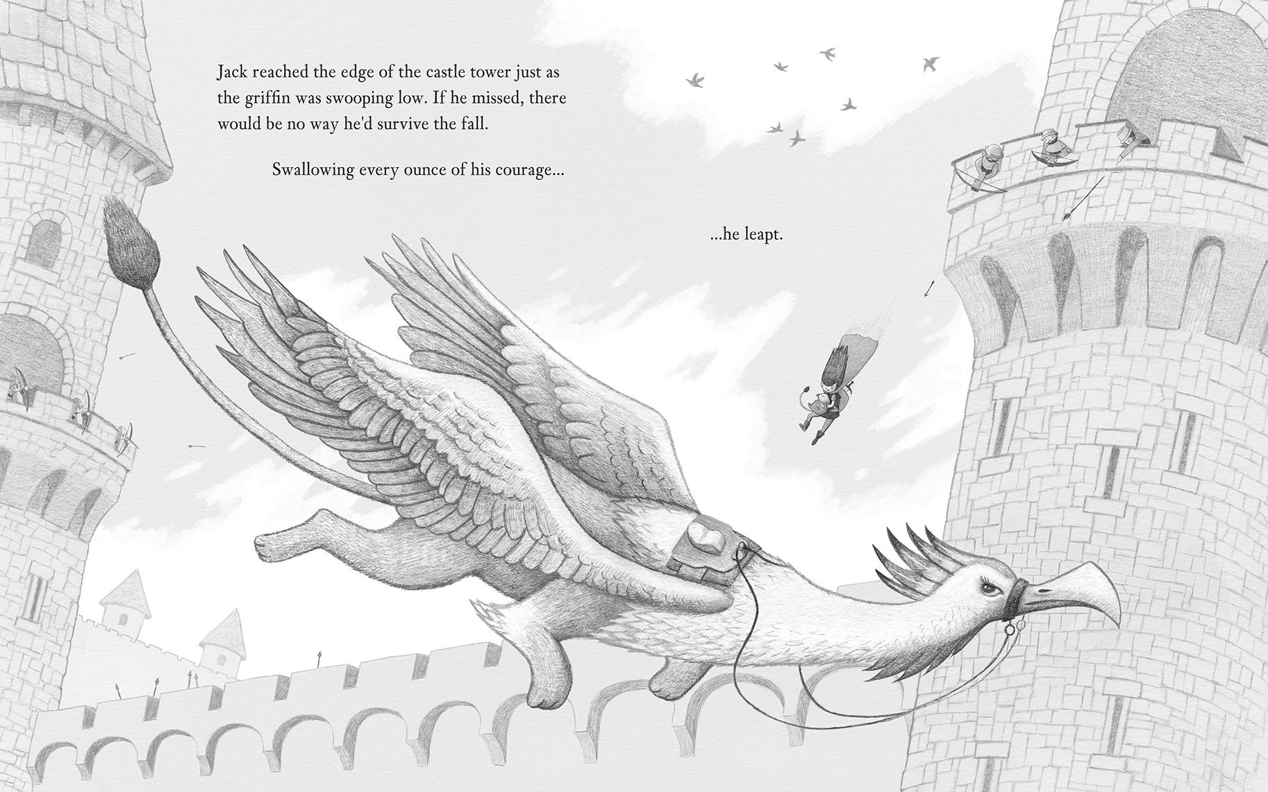
Jack Leapt: Lets share our inspiration and WIPs!!
-
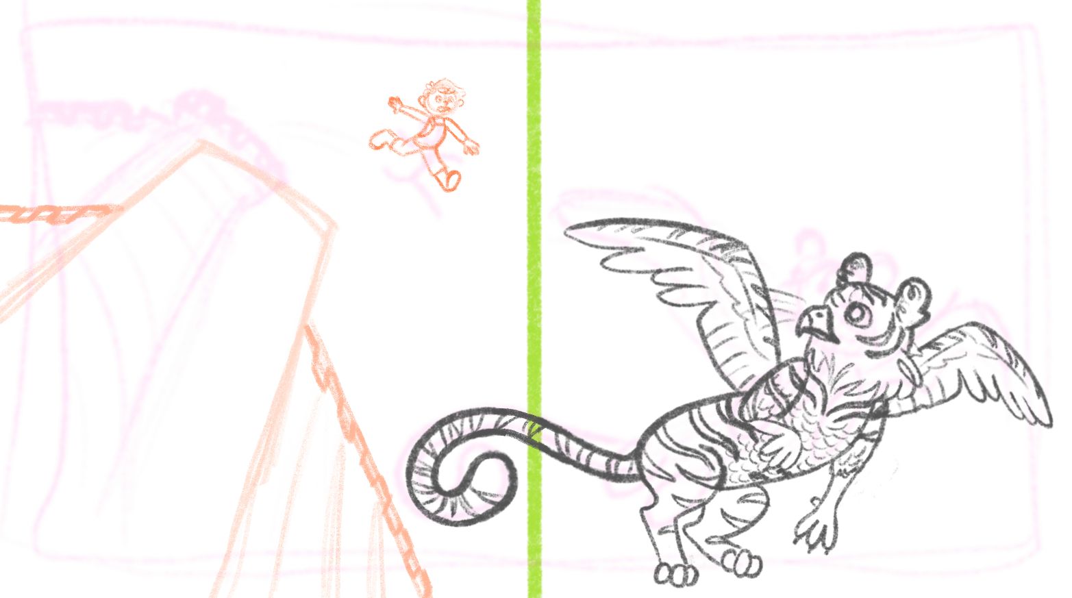
Just working on the griffin before make slight changes to the background. Thanks for all the comments and critiques
 ️
️
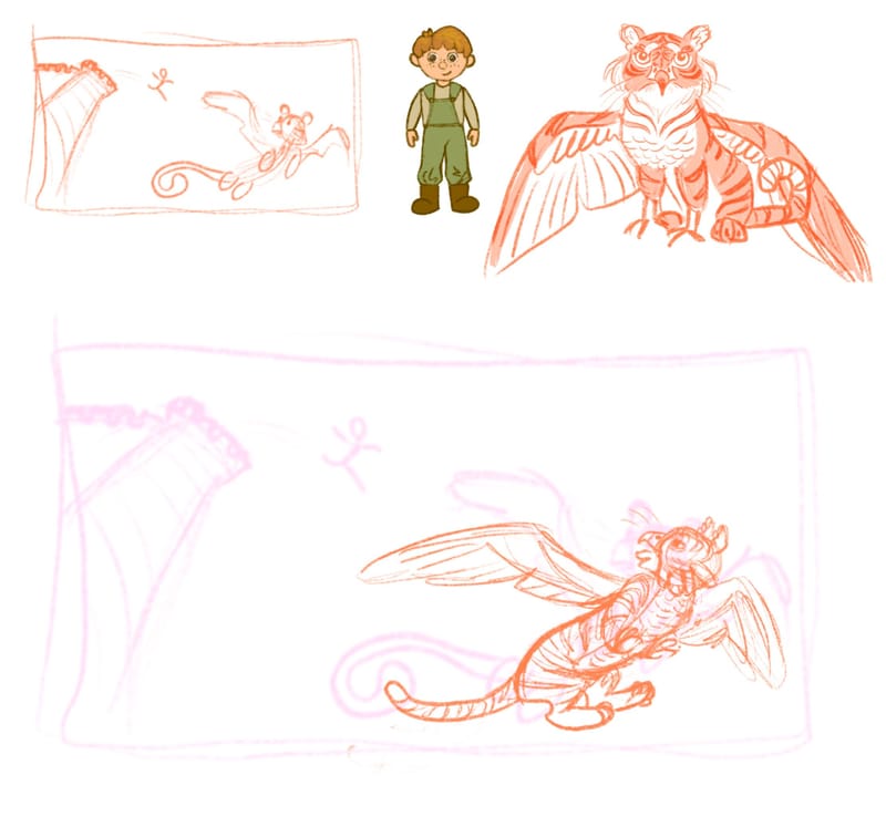
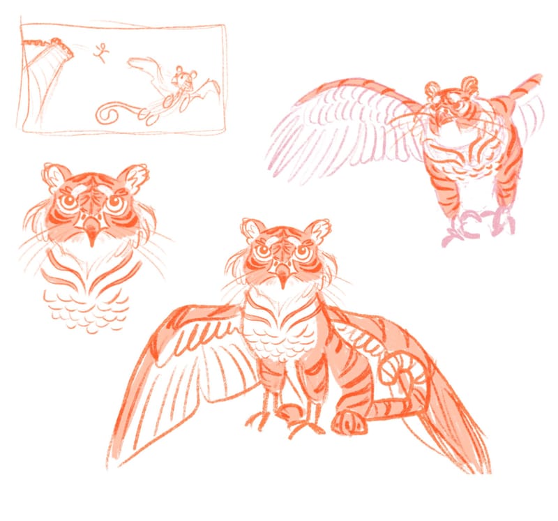
-
@kayleenartlover hi. I love yout tiger griffin design
-
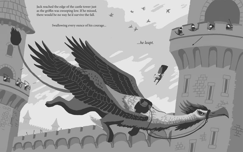
Here's my sketch before I move to the final. I'll be rendering this in pencil then scanning into Photoshop and colouring in behind in the pencil.
Sooooo much reference needed for me to get this basic looking image together, as I'd never drawn pretty much everything in the image

I wanted the text to mirror the 'falling' of the character by spacing it out in vertically staggered slices.
I've designed this to picture book dimensions and have accounted for the gutter in the middle so nothing of importance is cut off.
Some process stuff:
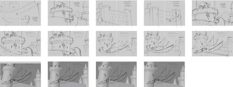
ThumbsI ended up doing a basic blender model of the castles to help me visualise camera angles and the like. I find this a super useful approach for interiors and buildings.
I flipped the composition eventually so the griffin is facing right and so that the text can be read left to right.
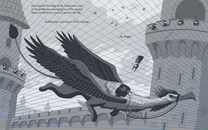
Here's the two point perspective guides put in place.
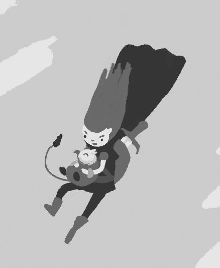
I wanted the reason that the character was escaping the castle was to save the captured baby griffin and return it to its mother. I thought about cropping this in so this can be clearly seen but I figure in the context of a book this would be emphasised in another section. I also felt that showing the griffin in full would make a more dramatic composition.
-
@Julia-Hegetusch Thanks!
-
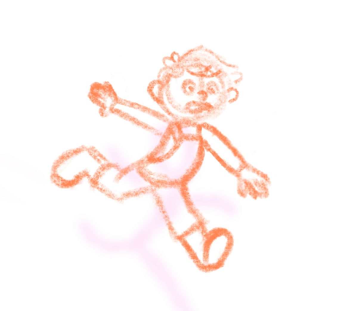
would love any tips on Jack if he looks too stiff,
I'm thinking the threat at the top of the tower will be the Giant from the beanstalk fairytale...
-
@Jason-Crowley
Looks like an adventure time character...love it! -
@kayleenartlover I love the low down angle of the illustration! It's super dynamic. Remember to avoid symmetry in the pose. Also keep the head off the centre line too. At the moment the character is very upright, and the limbs are out like a star almost. Try going "too far" with the pose, then reigning it back if you need to. Try having the head lower, more bent body and limbs all over the place. You might hit a fun pose by accident.
-
@MarcRobinson I think I was going for this being his jump but if his head is lower it would be more like the falling part of the leap. I had a hard time finding reference photos for the pose. If you or anyone else have ideas on what I can use as reference that would be great
-
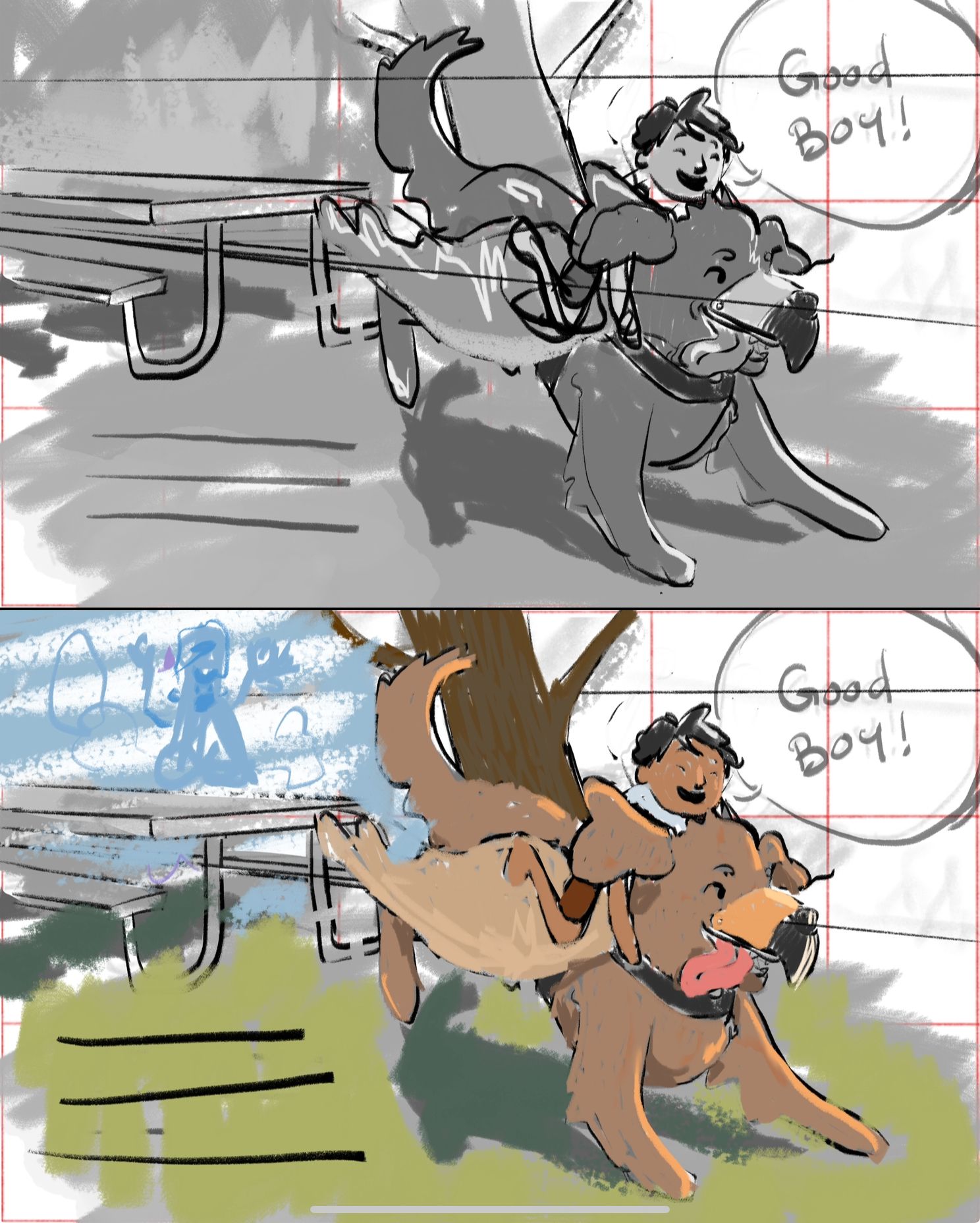
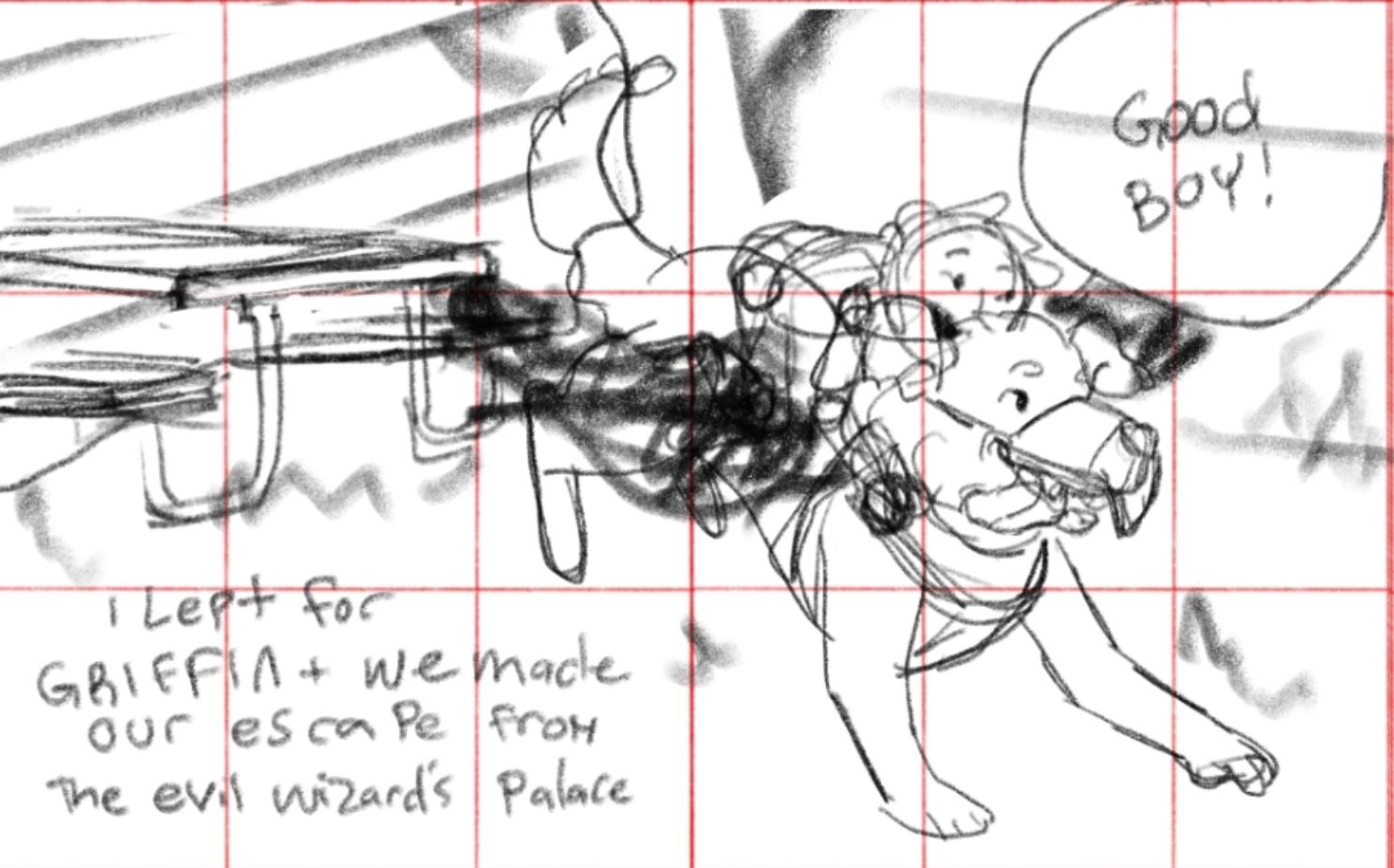
Hey yall after lots of internal struggles with my story this is the direction im going for my image— any feedback is welcome!
Text will read “I lept for Griffin and we made our escape from the evil wizards palace”
-
Hey guys,
I'm uploading my APril progress...I excluded my thumbnails and am putting up where I'm at now.
This is my second HTFYA, and doing this has actually been really helpful to see how fast/slow I work, where I get stuck, and also to be prompted with a storyline that isn't one of my 'darlings'. I decided also with April, I was going to attempt to return to some of my older more traditional styles (per the post i made about that here https://forum.svslearn.com/topic/13858/traditional-digital-disconnect-i-need-help-with-cohesive-art-style-and-direction?_=1711403790151.
I will be printing this piece out and adding some more watercolor and ink over the linework, but I just want to know what y'all think I can work on.*so some questions tho- should I flip the pic around, so the action is going left to right?
- is the cliff light/dark enough?
*I considered leaving some blank space for text
*and per Jake's critique, I gave the boy some fingers and a little more detail
Here is my '1st draft/sketch' of what I wanted to do...
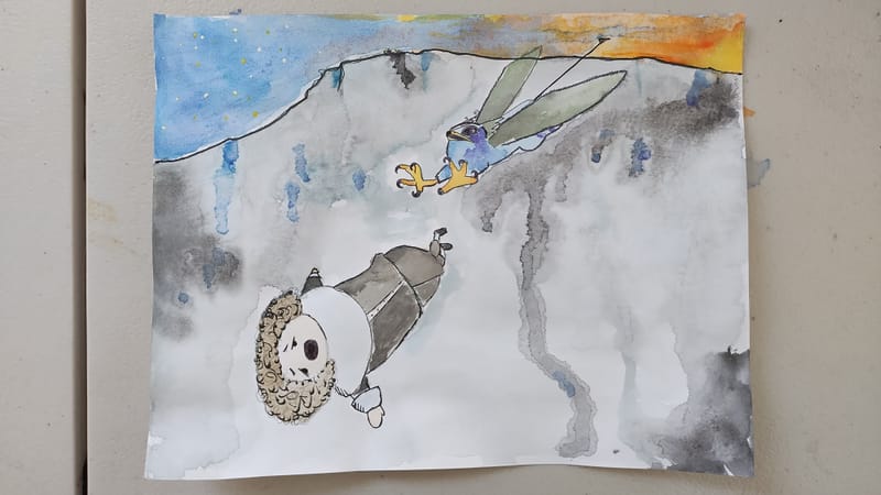
*and here is where I'm at now, with the exception of going over with watercolor and ink
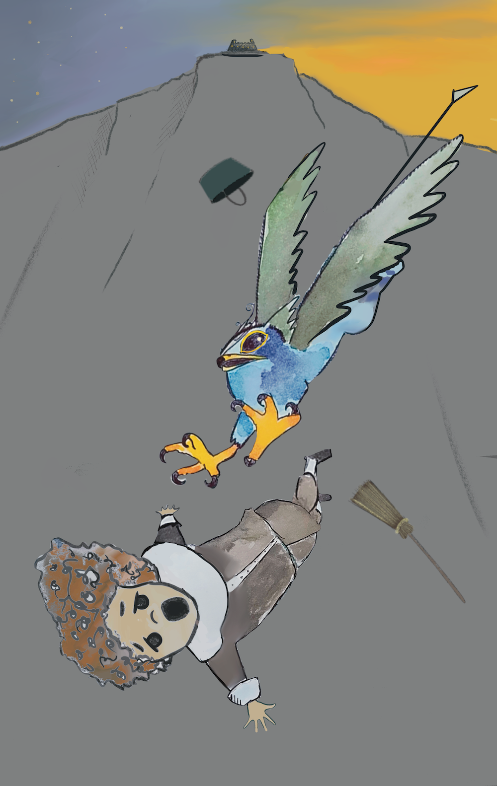
Thoughts? Things to improve? Thanks so much have a great week.
- is the cliff light/dark enough?
-
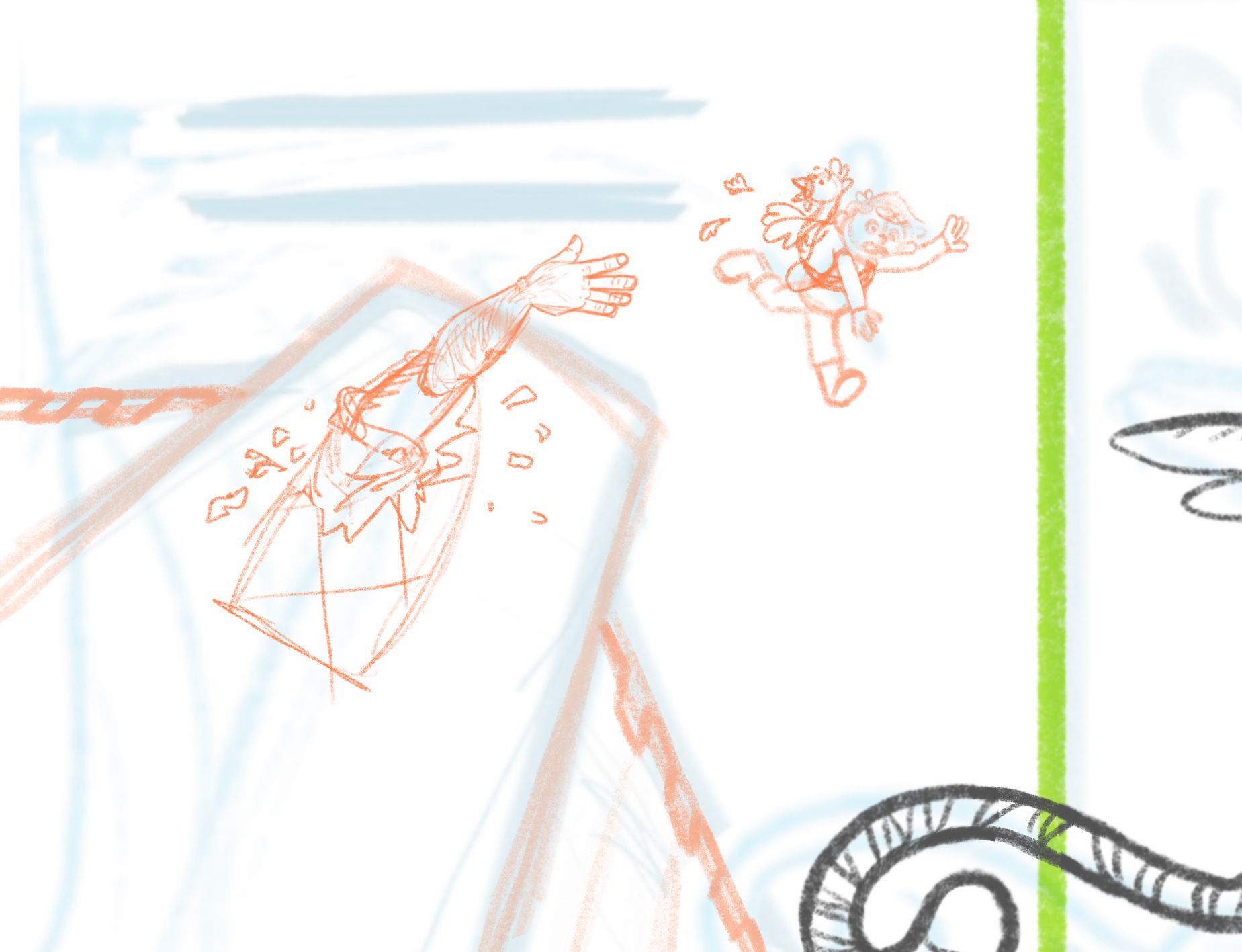
Is the giant a dumb idea? Does it work? Would love to know what y’all think…
-
@kayleenartlover i think its better without the giant personally
-
@R-Fey-Realme does it need anything instead of the giant? Should I keep whatever Jack is stealing with him? I drew a bird but it could be gold coins or the singing harp or something. Should it just be jack empty handed like before? I'm open to ideas.
-
@kayleenartlover if your story is rooted in jack n the bean stalk it would be important to have him stealing something, do you know why your jack is jumping and why there is a tiger griffin to save him? It could just be an escape, he doesn't have to leave with something. The perspective angle is low enough that you dont need to include anyone looking over the edge, and the whole story moment can be that jack jumped, and is falling, but the griffin might catch him. His pose looks a lot better now btw, great job! Since you refined the griffin its center of mass has changed and id recommend you move it a bit to the left so the two pages feel more cohesive, less split. Its perfectly fine to have on of its hind legs crossing the gutter
-
Hello fellow SVS friends,
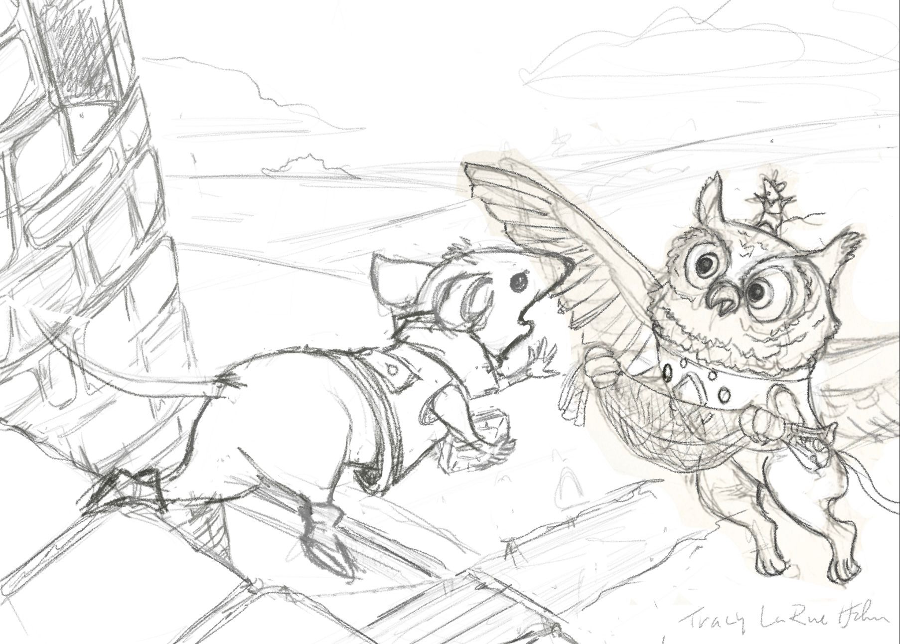
So this is where I’m at after several attempts of getting the point of view and perspective right. Backstory in readers digest form: (If you’re old enough to understand that reference) precious stone is stolen from Gryphons chest plate, he is friended by these two mice determined to retrieve it from the castle to return it to it’s rightful owner. Thoughts, suggestions appreciated.:) I know his left arm is at a tangent to his collar, I’ll fix.
-
@kayleenartlover
I think the giant is a good idea but I think it would be more effective if the “window” was an open turret and the giant is reaching out to him but he’s just out of reach, the giants face could show his anger and frustration! -
@Katt
Hi! I can definitely see the action and that your jack is tumbling to his death but I don’t see the story behind it? What is the purpose of the broom and bucket? Was he cleaning and fell out of the castle? The bird looks like it’s falling out of control as well, perhaps if his wings were out to the sides showing some control? Check some reference photos of birds in that position. His claws also look really sharp, perhaps rounding them a bit so they don’t look so scary? Also the cliff behind him would most likely be lighter at the top and darker as it goes down creating a good point of contrast. Right now, if you squint, Jack’s clothes blend right into the cliff, if you give him an accent color he’ll pop more. Hope this doesn’t sound too harsh, just trying to better your story! -
@R-Fey-Realme
Cute image, good show of movement but from prior critiques I think without your words, story isn’t clear. I know as kids we used our toys to create “environments” to play in so maybe, the table could have a pretend “scene” on it using figures/plush etc. or even another child in costume like in cosplay or perhaps jack is wearing a “costume “ to help present the story? -
@Larue the kitchen stuff is mentioned in the story above (from the march prompt, the kitchen where he works falls off the cliff, for a middle grade book), i was just trying to keep consistent with that story. As I'm writing this I think I might add some stones falling too...Yea, the clothes, dark brown or black are consistent with the character, maybe i will make the cliff lighter for that... not sure how to get around that and sabotage the character/story.
Thanks for the feedback
-
Here's the pencil render before I change it to multiply and paint colour underneath. It's mostly pencil on paper and about 20% digital pencil. I think I'm going to do digital pencil going forward as it's so much faster, my hands are super shaky when working traditionally.
