December Rock fortress Help!
-
Hey there Forum Friends,
Im here to share my early sketch for the Rock Fortress (December) prompt. Im shoehorning the prompt into a coloring ‘book’ project that i am starting to promote a picture book, and also my slow-vember project, so i want to make the composition something i want to spent time on.The actual rock fortress might end up just being a rock or a silhouette, but in the two boys minds it is definitely an abandoned (or not so abandoned) castle. The grogy troll they are standing on will eventually look more like a hill.
Is anything confusing or boring? Any composition thoughts?
Thanks in advance for the feedback!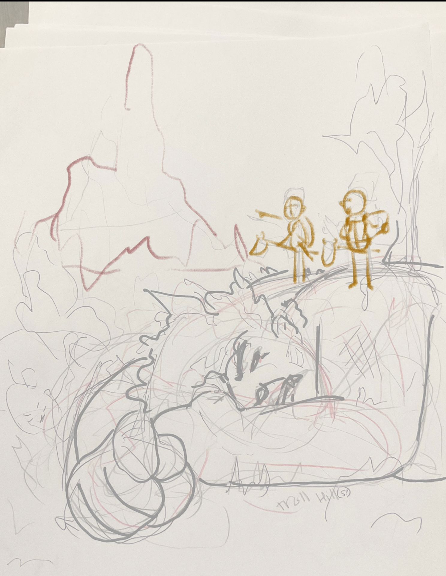
-
@R-Fey-Realme I like how its foreground, midgeound and background. Not too heavy on details. Just remember which will be the main focus and flow from there
-
@R-Fey-Realme
Love it, looks really fun. Personally, I would crop off the bottom through mid arm. No need to see the whole hand, it also creates a big negative shape at the bottom, the face and eyes are enough. -
You have a great start here. Nicely composed, though I would flip the whole piece so the action moves left to right.
You could have a stronger illustration and story if you go ahead and make the imaginary real. Keep the troll (disguised as a hill (been asleep for years)), make the rock an actual fortress, and put the kids either on real horses, or just have them walking. You should not have to tell us they are imagining anything.
In the triangle of space between the head and arm of the troll and the fortress, adding a path leading to the fortress would give a hint to the direction the kids are headed.
You have the beginnings of a great illustration. Looking forward to updates!
-
@tom-barrett question, wouldnt the action right now read more natural? Top left - mid right - bottom left as if reading word balloons?
Or is your comment because the main focus will be on the kids? (apparently)
Thank you for your help!
-
Thanks everyone for your thoughts and feedback! I worked on the troll’s shape language to read more like a monster and a hill, and took your advice about minimizing the negative space at the bottom of the page, and i added a club to make him look more menacing. I also pushed the kids up to make a less 50-50 split in the composition.

Thats an interesting thought about flipping the composition, so heres a version of the grayscale mock up i have do far both ways.

Im kinda terrible because i only did one
 so maybe ill try out other value/lighting options… i guess we will see.
Do the kids read as the focal point? Im fear the troll may be stealing the show… What do y’all think?
-
@R-Fey-Realme I do like the new flipped one with the kids on the left and the new sizing . It great!
-
@R-Fey-Realme The flipped one really works! My eye first goes to the children, follows them to the fortress, then I see the troll's face, who's eye brings me back to the children. It feels like it's going to look great when you're finished with it.
Good plan, I do recommend trying a few value variations, even if you go back to your first one. The experience of trying some other options is never wasted. -
@makekong The issue rises as you want readers eyes to automatically go to the kids. Having to look back left at the fortress, then down at the troll seems counter productive to the flow of the story. Not an absolute when making illustrations, but for this particular one, the composition would work better if the kids were on the left, leading over to the rock/fortress (oh, they're trying to get over there), then down to the troll (danger!). That seems the most natural flow to me. To increase the tension, I might also add a third kid who actually noticed the troll below them, maybe tugging on the second kid's shirt.
-
@R-Fey-Realme This is looking great!
I have some compositional thoughts for you!
The giant is taking up the bottom half of the piece. To some degree it takes up almost two-thirds of the piece. Which creates a little bit of imbalance, which could be why I feel my eyes drawn MORE towards the giant, rather than the goal of the kids being the focal point.
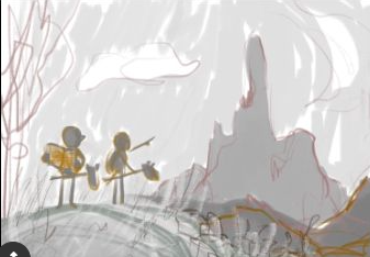
You can see if I remove the giant, I'm much more interested in the kids.
The other thing that I'm not entirely sure about, is that the kids are facing away from the camera. If you want more rienforcement to the kids, you probably should show their faces more. Maybe the angle is flipped. They're point towards us the view, camera is view towards the top, maybe 7-8 feet above them, and then below their feet is the giant. This does conceal the very interesting mountain in the background, so don't consider this if that's not what you want to do.
Maybe the giant isn't dead, maybe it's a statue of a person that's collapsed. You could easily remove the big arm which also takes up a lot of space.
OR
Bring the kids down to the middle plane of the composition, and frame the giant is darkness, but decorate his clothes and his face in a much more interesting way. So the piece is balance with "Interesting adventure top" "Interesting crushed victory at the bottom. If that makes sense. If it doesn't I can doodle something for you.

-
@R-Fey-Realme Having the sky lighter helps to frame the kids, and draws your eye to them. I would definitely make the troll darker to keep him hidden, perhaps with some highlights to give him shape.
-
I can’t thank y’all enough for all the awesome feedback! It has been really helpful, and has made me feel excited to share whenever I make more progress.
Here is where I've got to since the other day.
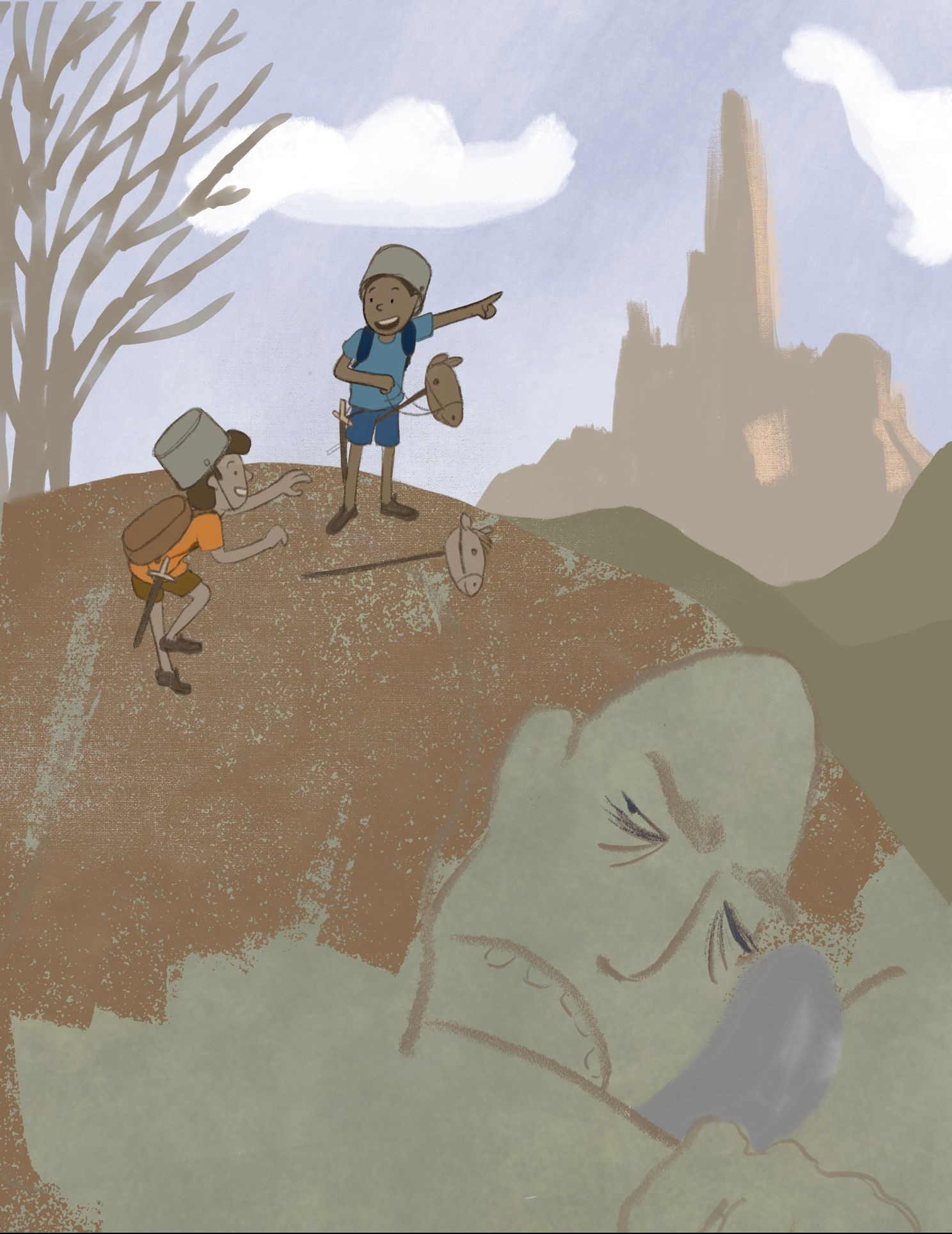
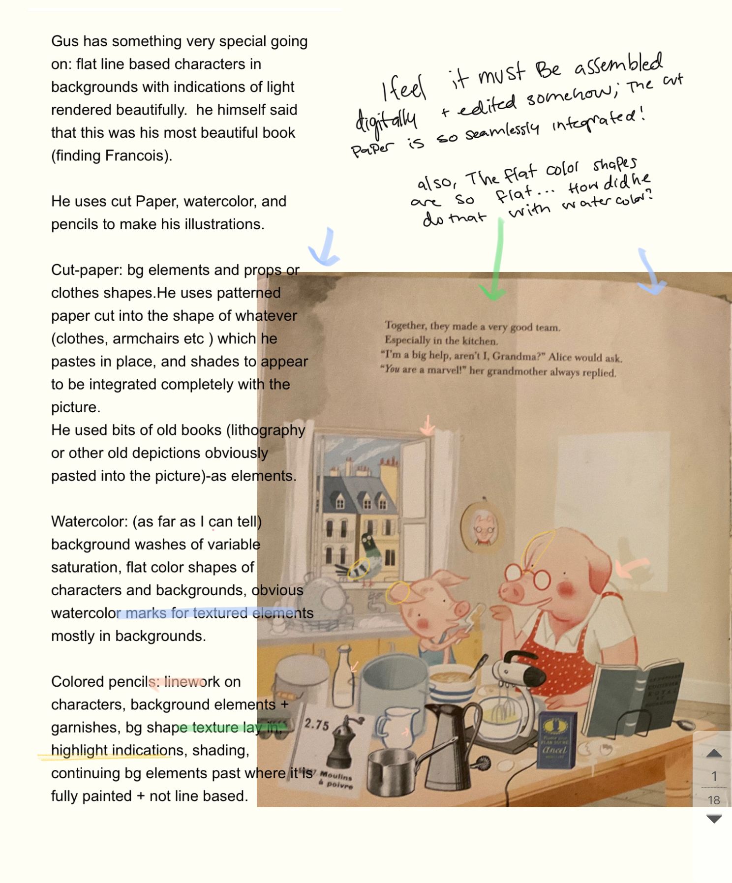
I have a lot of rendering to do to get the “kids imagining to be knights climb up an imaginary sleepy troll on their way to a castle and wake him up because he looked like a hill—honest mistake anyone could make” look I'm aiming for, but I think the skeleton is mostly there, what do you think? Any other thoughts on the foundation ive got before I continue? I think I’ve applied each suggestion in a way: kids on left, facing viewer, cut part of the troll arm… anything else for the shape placement and setup? Any thoughts on the children/Design/placement?Im studying an illustrator named Gus Gordon (specifically his book Finding Francois), and am trying to apply what I’ve learned about thinking in shapes and approaching the composition as a collage so each surface is interesting on its own. Im still figuring out some things about the colors i want to use, so colors aren’t final yet. Any thoughts, insights, comments, or favorite bit shout outs are welcome!
As a bonus, here is a page from my notes on Finding Francois: a story about the healing power of friendship by Gus Gordon (or as i like to call it, HOLY MOLY: a shining example of creating beautiful 3d environments for flat line based characters, using interesting and appropriate perspectives and plenty of props)
Seriously check it out from your library or buy it!
-
@R-Fey-Realme I think this composition is much stronger than before and is going to be great, especially when you add strong contrast between the foreground and background.
-
@R-Fey-Realme It's looking better, and kids look great. Good poses! But, I am still stuck on the real/imaginary part of the story. Does the text mention them pretending? Just looking at this as a single image, there is no way to tell the kids are pretending, other than perhaps the toy horses, but to have the troll be imagined already, and the "fortress" not yet be is confusing to me. And even if the text says they are pretending, then everything imaginary should already show as such in the scene. Would be so much stronger.
For example, the Gus Gordon image you included leaves no doubt as to what the pair are doing. It is up to the text to say why.
Yours should have the same clarity.
-
@tom-barrett thanks! Yeah that does make sense. Is this less confusing? I have been leaving rendering/decoration on the castle and troll for later in favor of getting the underlying shapes and structures right, so it has all been a part of the master plan.
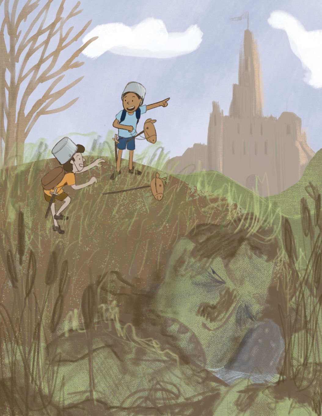
These are scribbles to indicate how I’m thinking about rendering it out, none of these marks are final. Any thoughts? The render philosophy is to show the effects of light on structures in the environment and on props and leave the characters almost completely flat except for a ground shadow, line weight +color, and an optional second tone wash that is so close to the original color its basically still flat. I haven’t really indicated the highlights on the troll or mud, but it will probably be mostly focused on the cat tails, doing something like this:

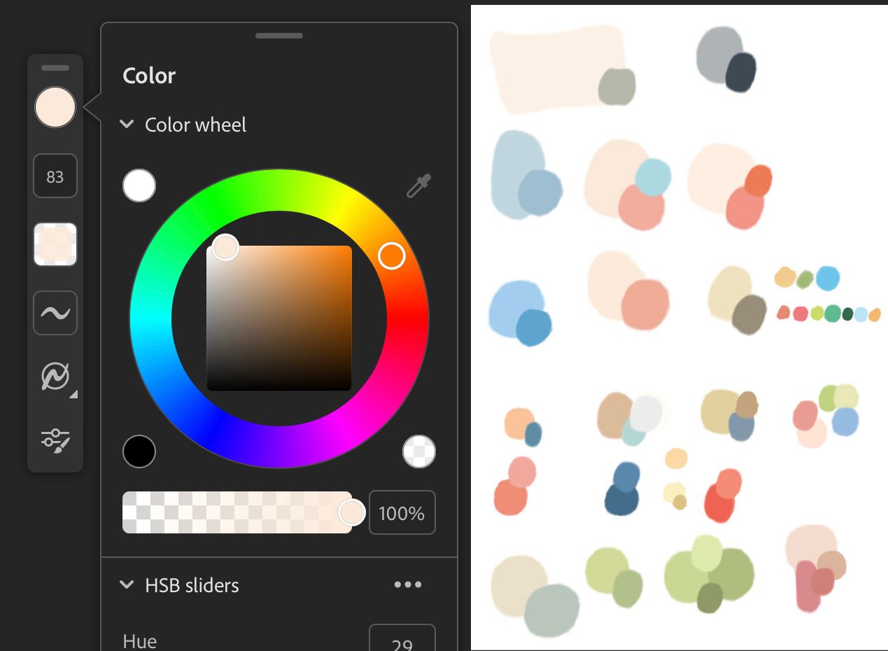
I found a digital preview for G.Gordons book which i updated my palette from (i was Color picking from photos i have of his book, which were all tinted orange/brown bc of the lighting i took them in). He uses really bright clear sharp colors, everything is basically in the top third of the color square. Fascinating. It made a big difference to not use muddy colors!
-
@R-Fey-Realme this is much better!
One thing I just thought of, since the prompt is "rock fortress", maybe think about making the fortress more of the focus. Not that you have to make it larger, but pull back the lighting on the kids and troll so your eye goes straight to the fortress, or create the lighting so as to lead you from the kids to the fortress. Just food for thought.

-
Ive been whittling away at it some more, and I've made some progress!
In comparing mine to the color correct finding francois spreads it seemed obvious Gus works very bright and i should try to lean that way too. I also have been trying to channel Will terry’s light on dark/dark on light advice and push readability that wsy.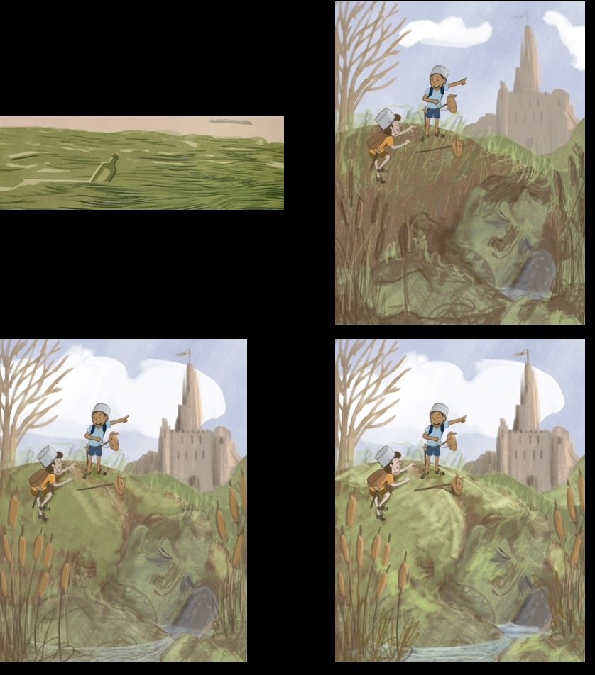
So i tried to push it brighter and make it look sunny.
I think its a lot closer to great now. This is still a color study basically, i have to figure out how im going to render it with interesting surfaces and lines.Do yall have any improvement ideas on shape/color grouping or anything?
I just have a hard time even imagining making something so high key
-
Here are some of my troll attempts for your amusement.
I was struggling to make a sleepy drooling face look and also struggling to render the face to fit in with what i had already.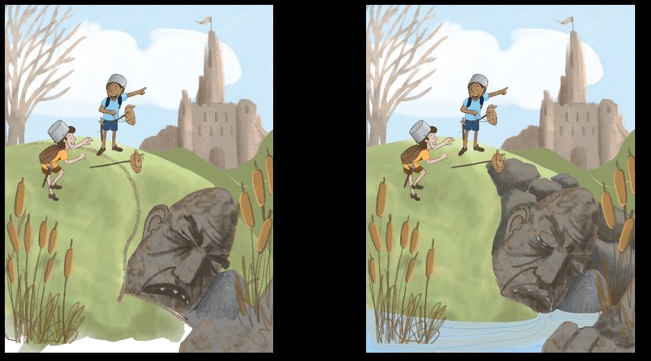
They really weren’t working, so i looked up drooling while sleeping and traced this face, which… yeah
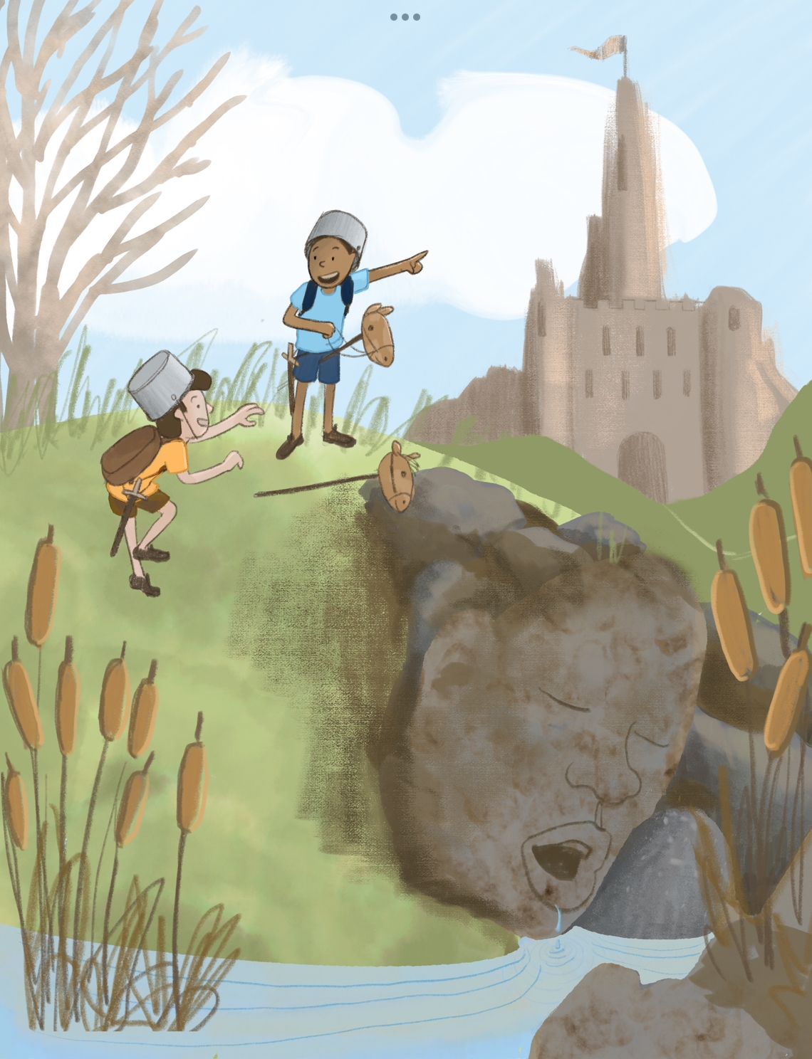
Really derpy haha, it didnt match the shape language or the story at all. So i looked up “troll designs” and found lots of help and inspiration. So mush flat, linebased examples with interesting shape language. Here are a few of my faves

And with that help and inspiration i made this version, which im going with. I think i could improve the eyes and the mouth a bit… enlarge the eyes, change the mouth angle? Idk let me know what you think.
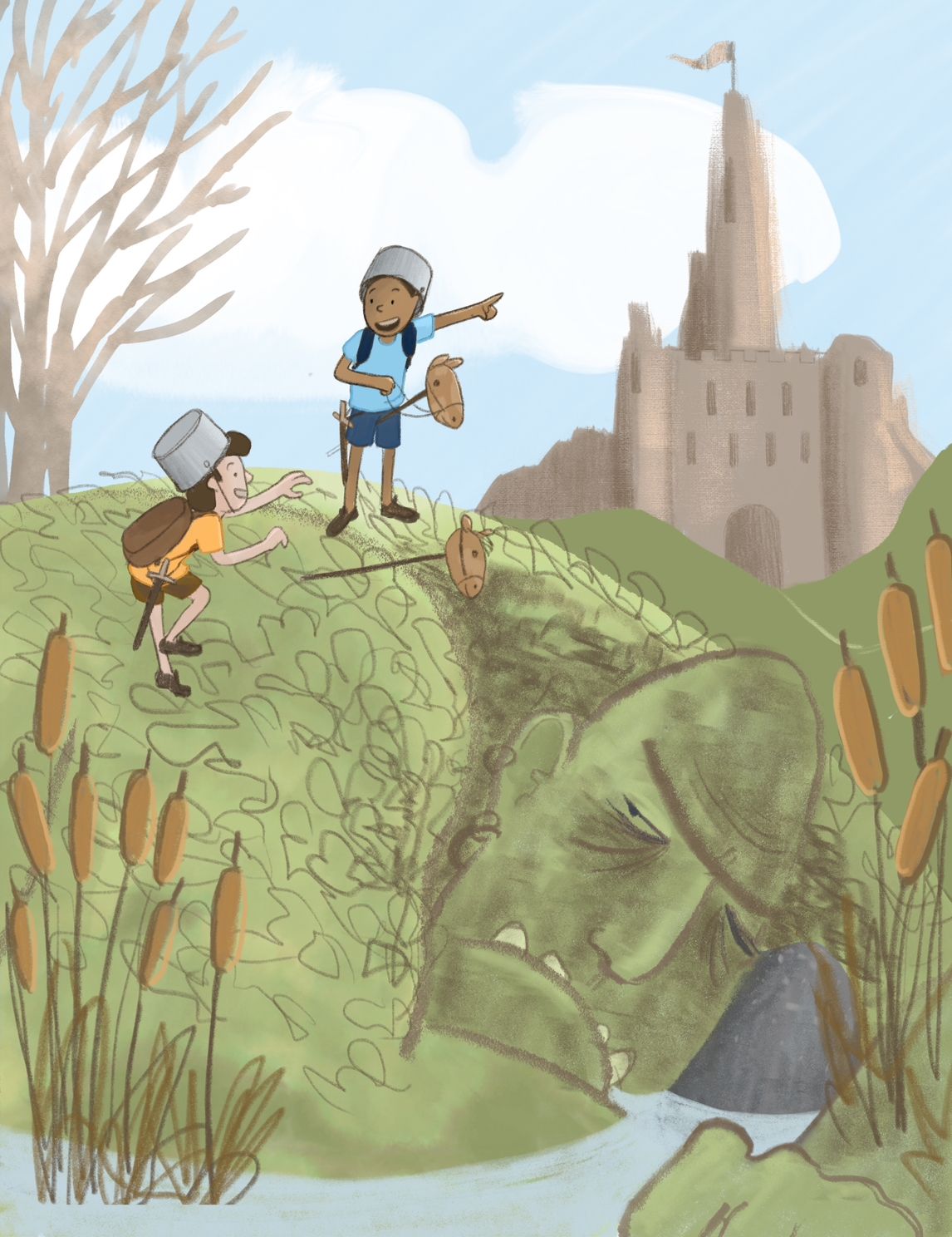
Next on my plate is shadows, grass, and more integration and hierarchy in general. I want you to see the kids first, then the rock fortress and then the troll. Just a few days before the deadline! It will be interesting to see the htfya for december bc so far there are much fewer subs than last time.
-
@R-Fey-Realme It's looking really good!
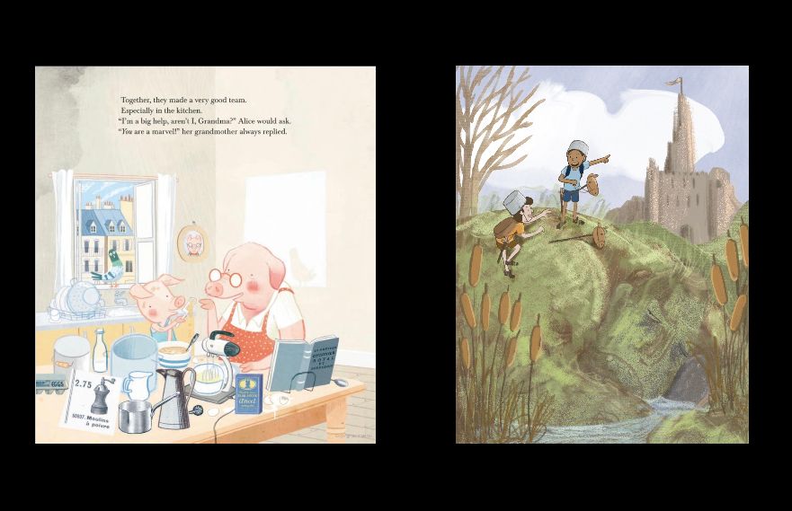
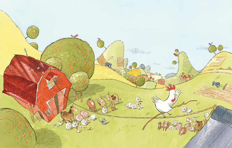
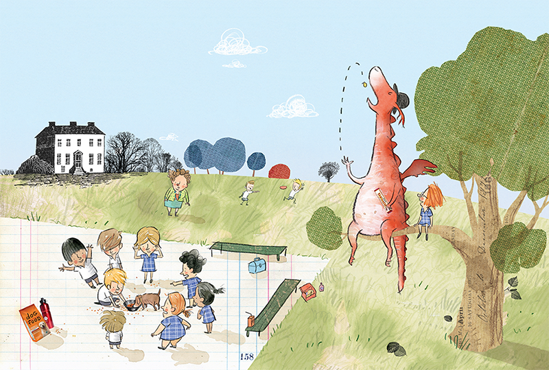
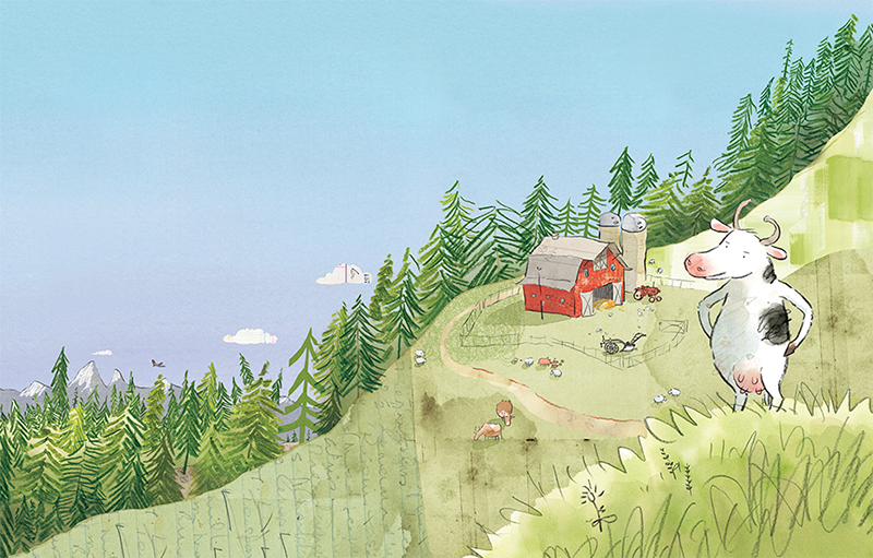
If you like the style of Gus Gordon's art, perhaps studying examples closer to your piece might help. You may have seen these before, but they are better examples of what you may be trying to do rather than the kitchen scene.
-
@R-Fey-Realme Is really coming alive! Thanks for sharing your process. Sorry I can't be of more help, but I think you're doing great work. I'm looking forward to seeing the final illustration!