A Dangerous Rescue - help me pick thumbnail
-
Hi SVS Fam,
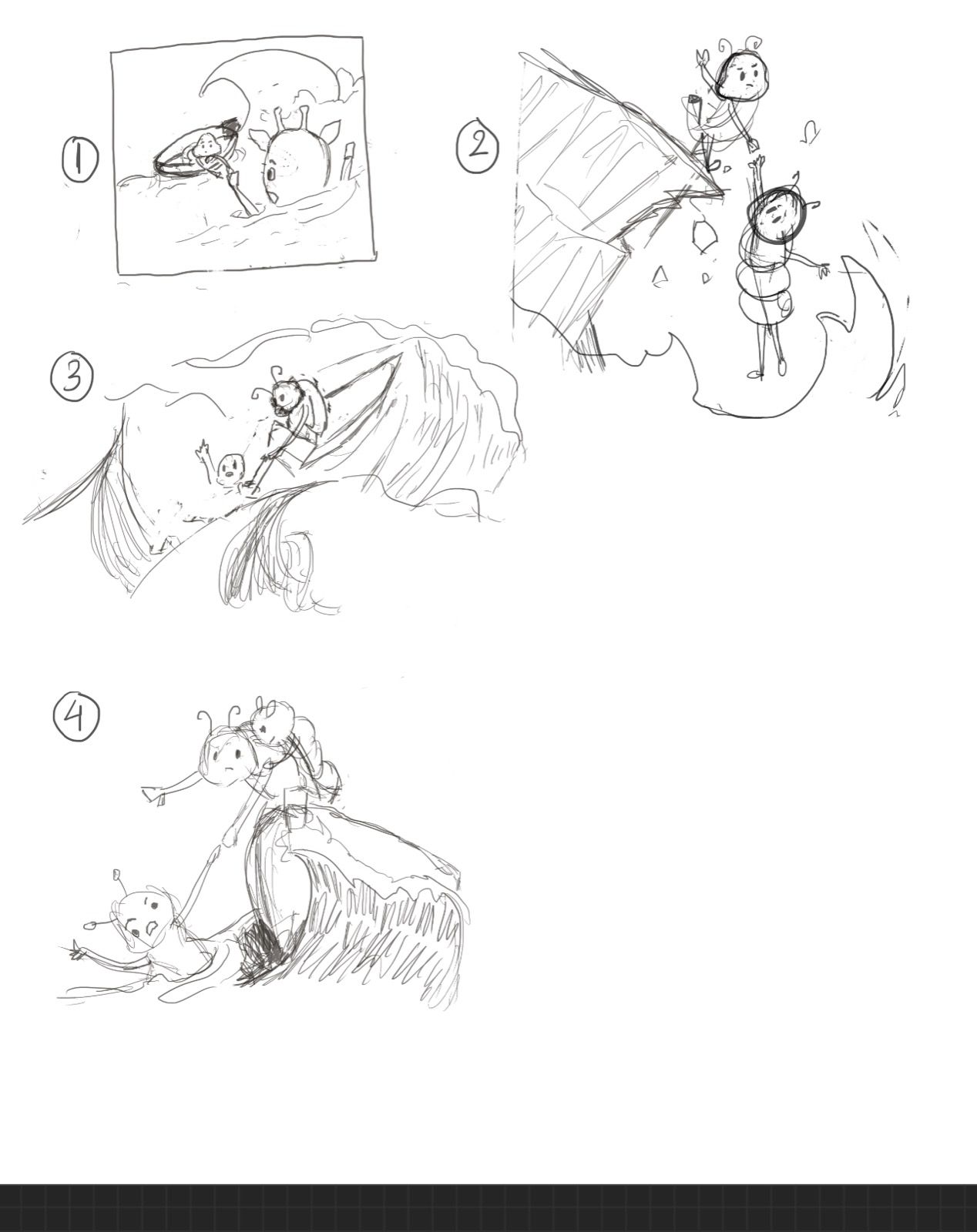
Please help me choose a thumbnail composition to further develop.
- It will be a simple spot illo and needs to be a clear read on phone
- The main character is a caterpillar who is a compulsive rescuer, often endangering his own (and the rescuee's) safety.
Thank you!
-
I think B is the strongest, and I lol-ed at the compulsive rescuing theme. Looking forward to seeing this one develop!
-
@ArtMelC agree with @Mia-Clarke . b has a stronger silhouette.
-
Hard to choose between #1 and #2 as they are both about before the rescue. That is, both scenes set up the danger of the situation.
With #2 though, I’m wondering if the viewpoint could change from the perspective of behind the one being rescued and looking up towards the cliff with the compulsive rescuer looking down?
I, too, like the idea of the compulsive rescuer always putting himself in dangerous spots. Wish I had thought of it!

-
@danielerossi thank you! I can definitely give your suggested pov a try.
@Chantal-Goetheer @Mia-Clarke thank you for casting your vote! -
@ArtMelC I like #2 best. I like the clean silhouette, and how much potential it has to really play with the character's body language and help further your story.
-
I like B, the silhouette is clear and easy to make out clear action and danger.. yet my question is how is he compulsive and what are you conveying to show he tends to put the rescued in danger? Not sure how much story you need (with it just being a spot, is there text to go with it?)
Just my 2 cents...

-
@ArtistErin thank you for your input. There will be a paragraph of text explaining the downfall of certain personality type and their tendency to want to save everyone to their own detriment. This little spot/story will be an accompanying illustration.
I struggle with the compulsive part too. My idea is him trying to rescue someone much bigger than him and his boat (thumb 1) but I feel the scale difference isn't working visually so I scrapped the size difference in thumb 2. Maybe I could apply the size difference here and see how it goes...
-
@ArtMelC I was turning this over this morning and I always think of the known phrase when referring to rescuers, "put on your breathing mask before you assist someone else in the event of a disaster in a plane", maybe you can demonstrate this some way, like the caterpillar is in a situation like this, where disaster is looming, others in the image could be putting their masks on before helping another yet this caterpillar is not? Just percolating a pivoting idea...
-
@ArtistErin great idea. I'll let it bounce around for a bit before I settle on something haha
-
@ArtMelC I think the only reason the size difference doesn't work in thumbnail 1 is because of where the characters are in space. Since the caterpillar needing rescuing is closer to us in space, the size difference doesn't really read. If you were to change the format so that we were looking at them both on the same plane, like you have in #2, then I think you could easily incorporate your idea for size. If you go that rout, just make sure you really exaggerate it. Mouse trying to rescue dog scale, or something like that.
-
@kirsten-mcg @ArtistErin @danielerossi @Chantal-Goetheer @Mia-Clarke

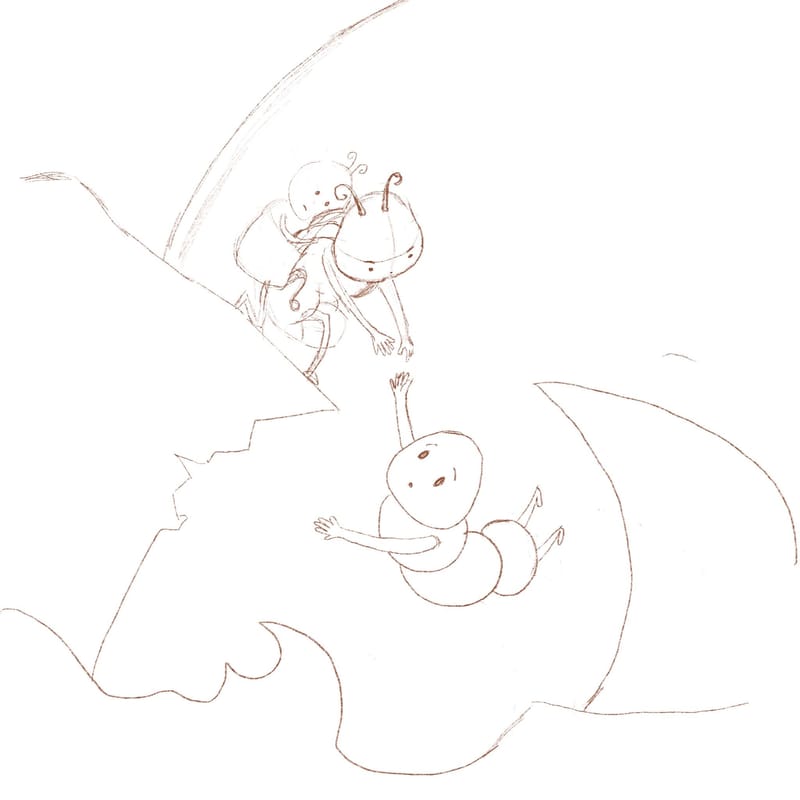
So...instead of a size difference I incorporate a version of #4 , so hopefully the idea that rescuer caterpillar is already carrying a baby on their back will give a little bit of worry / doubt on the viewer on whether the rescue operation will be a success, while maintaining the initial silhouette.
Also tried to fix the gaze of the characters so it all makes sense
Anything else jumps out at you?
-
@ArtMelC Nice!
-
@ArtMelC the baby on his back definitely has me worried!
-
@ArtMelC yes, the baby combined also with the slope of the cliff makes me envision a whole drowning scenario.
-
Oh for sure this is clear.. the shifting angles definitely lends to uncertainty and makes me concerned for the baby ! Great job

-
Colouring frustration

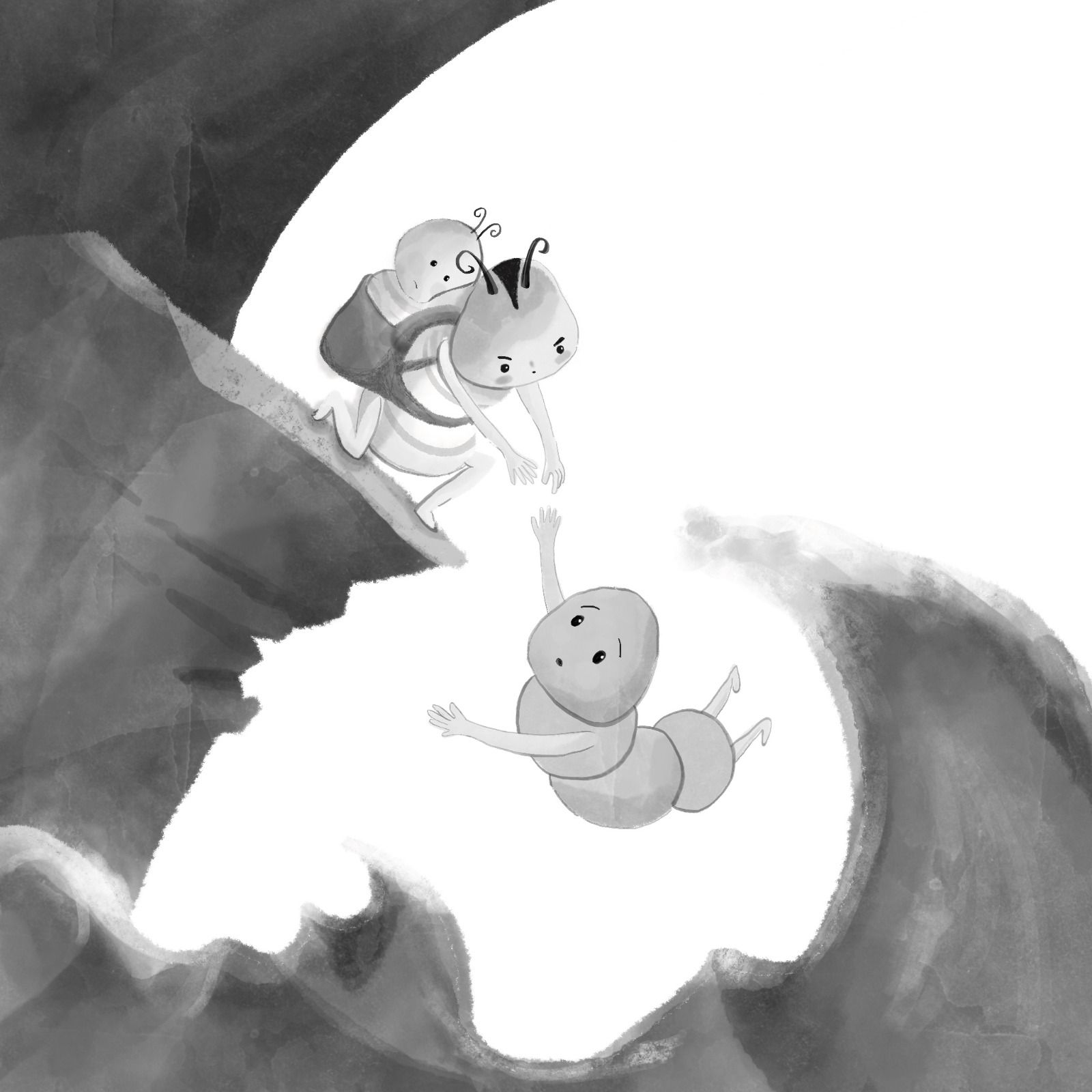
I thought the values look ok

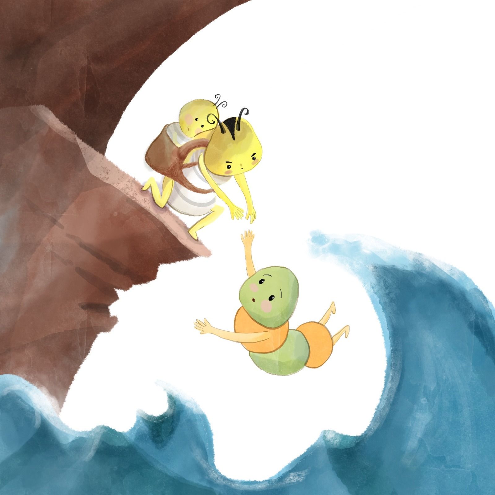
But the full colour isn't working. My eyes fail to focus on the caterpillars despite the framing. I think the yellow is too close to white BG but the design of the yellow caterpillar is fixed (he is the main mascot). Any tricks?

-
@ArtMelC Hmmmm.... I see what you mean. The story is happening with the caterpillar and the baby and the one being rescued, and your values seem to be competing with this as a focal point. So maybe you could reverse the saturation and deepen the caterpillars in detail/saturation and kick back the rest?
-
@ArtMelC I think that yellow and white might not be the best colors to use for the rescuing caterpillar and baby. It’s too close in value to the white background. You could try a different color for the, like green. It’s easier to make green a darker value than yellow! Another idea would be to darken the sky behind them. That would make the light yellow stand our beautifully.
-
@ArtMelC yes it's the white background that makes it harder to see the yellow of the characters. So i would try to change that when you can't change the caterpillar's colour. Maybe something in the way of a desaturated purple family would make the caterpillar stand out with yellow as a complementary colour scheme. No clue how that would look like. And maybe get the cliffs to also move more into that same direction of the desaturated colour scheme. Now the cliff seems to grab most attention.