Feedback request
-
This is awesome!
-
@SheerArt thanks!
-
@Asyas_illos thanks for taking time to reply.I use photoshop to color and I’m trying to find a brush that works like you described. Going to keep experimenting! I made some of my own that have the paper texture but still looking for the wet brush feel.
-
@Joe-Koz check out Etsy threats where I found a lot of the brushes that I really love give you some really cool effects!
-
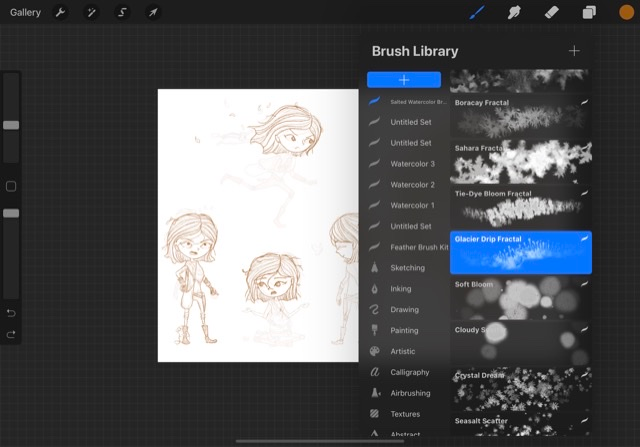
I use procreate but I’m sure you can find tools like these for what you use
-
@Asyas_illos I think you’re right I’ll have to break down and buy some brushes. I kind of think procreate has photoshop beat for watercolor brushes. Check out Adilson Farias on Instagram if you don’t already know of him.
-
@Joe-Koz yes he’s great I follow!
-
Well I couldn’t find much for photoshop on Etsy but these look great and priced good
-
@Asyas_illos I looked too. Never thought of Etsy.
Decided to go for Farias’s web course also, 65$
Probably serve me better than a bunch of brushes. Thanks again! -
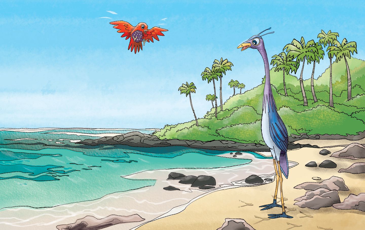
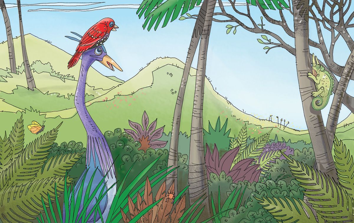
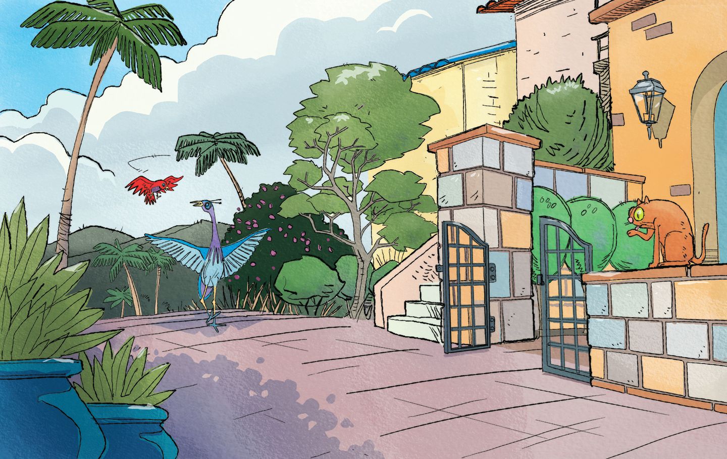
Hi Again. Updating this request for critiques of these images. I've challenged myself to draw an entire book's worth of images and would love to hear people's thoughts.Thanks!
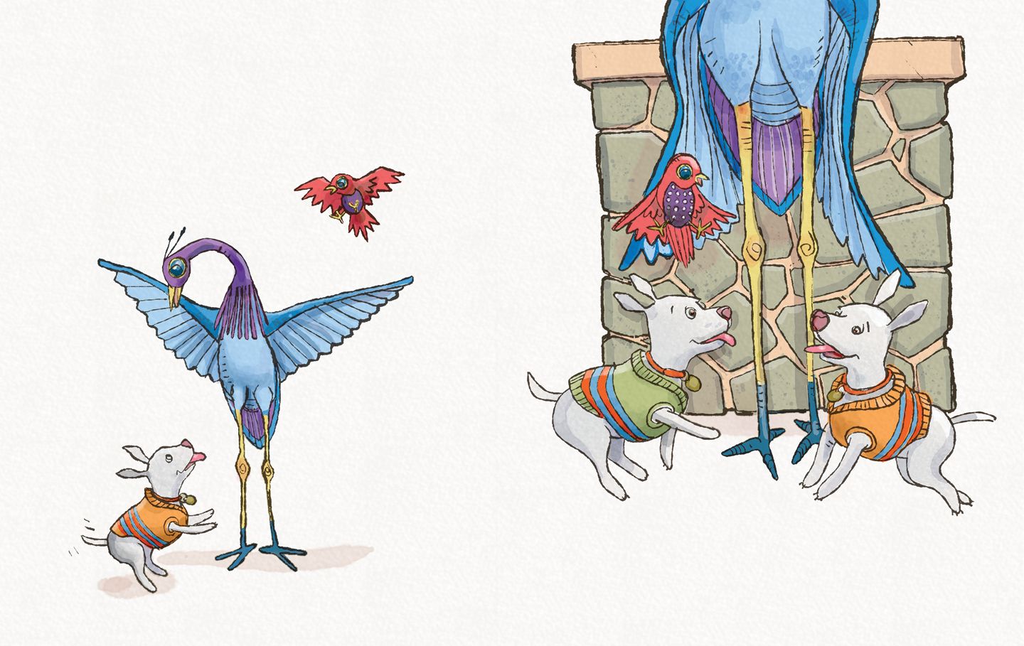
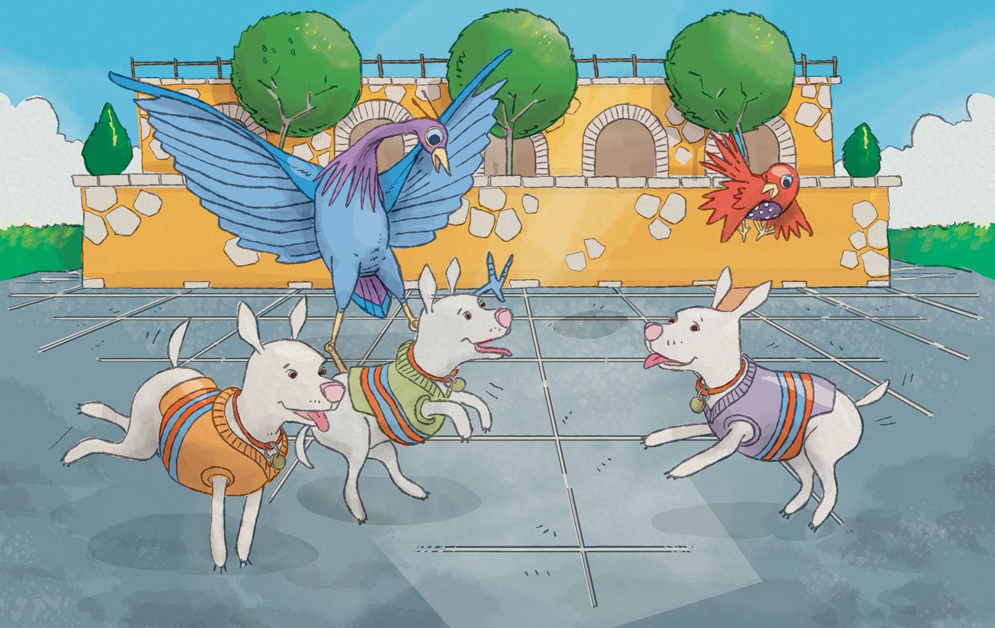
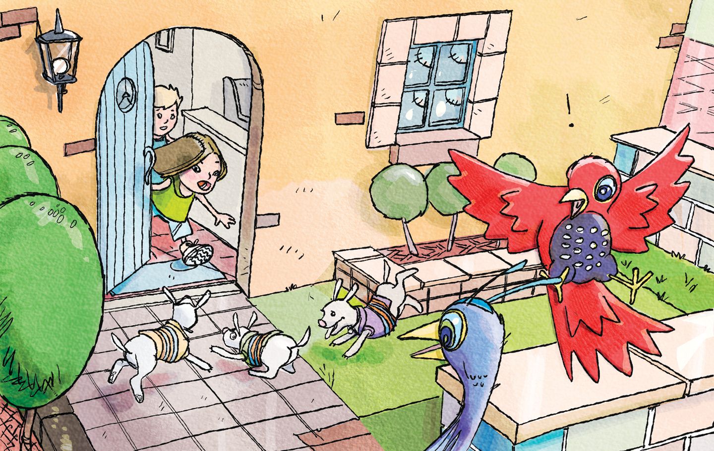
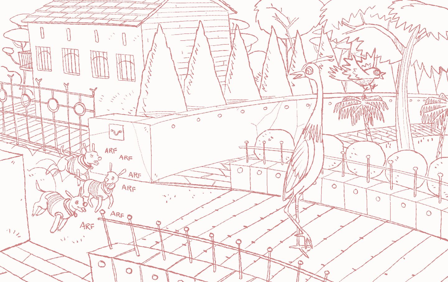
-
Hey! I just wanted to chime in and say these look great, especially technically. Initially, with the first few pieces I was thinking that 2 pieces back to back w exact side profile shots was an issue but you did throw in some great perspective shots in other pieces. I might still play w the perspective of the initial pages just to push them.
I think the biggest thing is that the style is being developed. It's almost there. It just needs to be pushed maybe? It's hard to put a finger on it without being subjective. Technically speaking it's excellent, I just want to see more character in the characters, I suppose. Hope that helps!
-
@Declan-Konesky hey Declan, this is great input. It’s easy to miss that kind of stuff. I was trying to put in different angles and move the ‘camera’ in and out Didn’t even realize the first two images were so similar just basically flipped.
The look of the characters and their expressions is evolving. I’ve already redrawn a lot of the characters along the way (not posted yet). Thanks a lot! -
These look great! If you’re still looking Kyle has free brushes for photoshop and has a whole set of watercolor brushes. Just look up Kyle’s brushes for Photoshop
-
@carlianne thank you Carlianne!
I didn’t realize that all Kyle’s brushes are available if you have a creative cloud subscription. Still need to figure out how best to use them! -
@Joe-Koz yeah I’m still figuring that out too
 I like his dry media pack a lot, still figuring out the watercolor one
 -
Really nice illustrations and I can almost see a story with out seeing any words so that's always good!. A few little things that caught my eye (thanks to watching instructional videos here) in the fourth illustration on the right the little red bird looks very stagnant. He looks to be cradled in the cranes wing but if that's the case I think the wing really needs to curl up under him, if not and he's meant to be flying perhaps a side view with flapping wings is better? Then in the 5th illo the cranes blue foot sticking out of the dogs head keeps catching my eye and then the red birds wing is meeting right up with the edge of that tree. Can you move it up or down? Again, just a few little things that my eyes got caught up on but I think you're doing a great job!
-
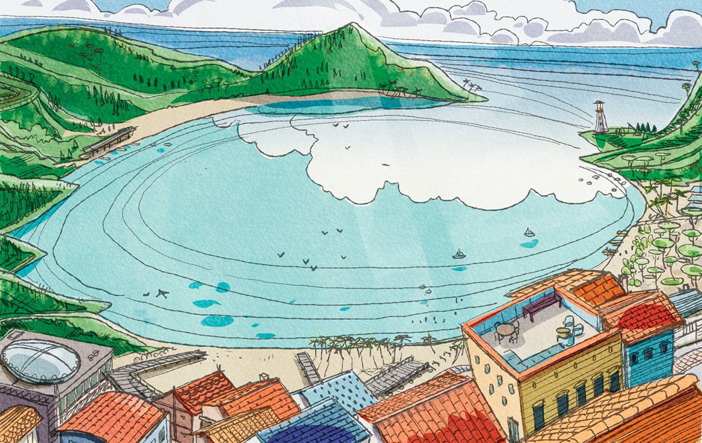
That last one reminds me of emerald bay on st Thomas good memories I was in high school when my dad took us. Saw a spotted eagle ray when snorkeling that nearly made me poop! Hahaha ! Ok now for business it looks really great, very consistent, clear style. I’d really like to see you stretch those wings in the spot with dog and bird. The other images there appears to more wing feathers and then in the one where you really could have played on that you didn’t it appears like less feathers in fact. I just think there’s opportunity there to really play with the gesture the silhouette would look really great!
-
@Joe-Koz this is a really interesting style you’re developing! Really love your line work in the last illustration.
One suggestion you may want to consider: have you viewed these illustrations in black and white to check your values? Because this is a rather flat style, it seems that color choice might be key in establishing focal point and helping your characters stand out when you want them to. Viewing the illustrations in black and white may help you see where values might need to be adjusted.
Lovely details, and again, really nice line work. Looking forward to seeing more!
-
@Larue thank you. These are really good observations. Great to get another set of eyes in the composition!
-
@Asyas_illos thanks, those wings do look puny in that spot. Definitely going to fix that!