Dream Portfolio Assignment Feedback
-
Hey all! With one of my big goals for this year being to overhaul and unify my portfolio, I've finally gotten around to starting Lee's "Dream Portfolio" assignment and I was hoping to get some feedback.
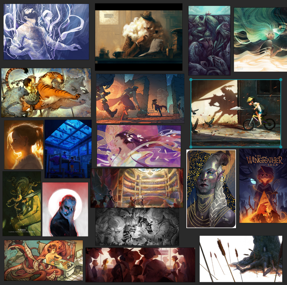
So far, this is kind of where I'm at with mine. Pieces have been coming and going so it may change, but I figured it was unified enough that maybe I could move on to the next step in the process: feedback with peers.

So far the themes I'm seeing are strong light sources, an element of fantasy, and (generally) a quasi-realistic rendering style. I'd love to hear if anyone else sees something I'm missing.
(also, if you're getting weirdly non-kidlit vibes from some of these, welcome to my conundrum. I can't seem to decide whether I want to do kid lit, middle reader, fantasy, or graphic novels, ugh. It's a big problem in my portfolio and most of why I'm doing this. My hope is that I can take the elements in these images and shape them to whatever genre I end up leaning toward.)
-
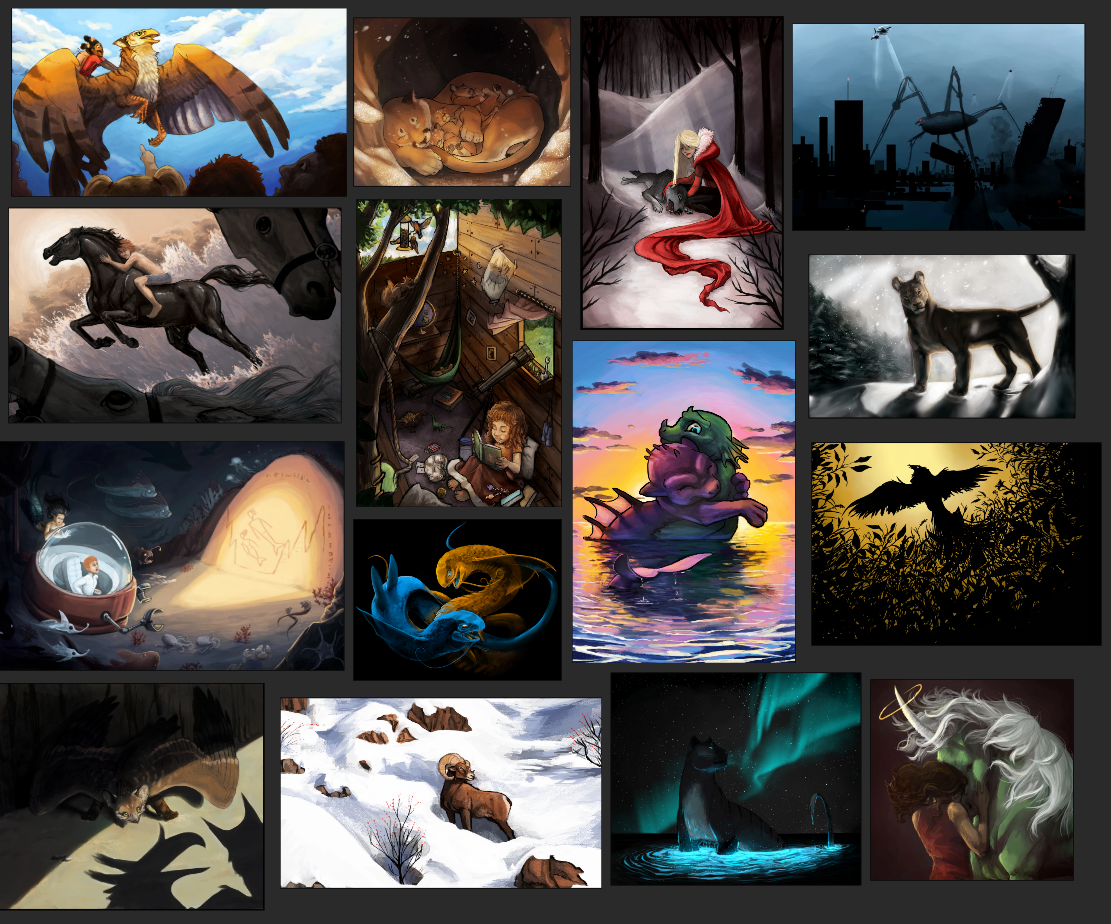
Here is my own current portfolio (plus some extra images to fill space on the right column that aren’t in my portfolio, but are images I don’t totally hate):

I can see some of those themes echoed in my work, but I clearly have a long way to go. I definitely need to do more involved environments as most of my images are pretty figure heavy with simple backgrounds.
I've struggled for years trying to find my "style" and figuring out what my voice is with my work, and I think it shows. A lot of the feedback I've gotten from ADs and agents is that I have a great variety but not really what they are looking for or they say that I should narrow my focus. So I'm trying to do the latter, I feel like too much variety is probably leading them to question my ability to be consistent and that's not a doubt I want them to have.
-
@Kasey-Snow
Overall your portfolio is really awesome!!I thought I'd rank the images in here, since you said the ones on the right are not really portfolio ones? Even though I think one of those is the best!!!
These ranking are super arbituary, and mostly relied on how the image/story felt, and was it impactful.
portfolio review.png -
Hi @Kasey-Snow! I can relate to a lot of what you are saying here, and to what you chose. Maybe it's obvious, but I would add that in addition to the commonalities you listed, you chose a lot of pieces with swirls, and I see those in your work. And perhaps there's a visual metaphor thread as well.
As for your portfolio, and the comment that you should narrow your focus: I can relate to how hard it is and how long it takes, but perhaps they do have a point in that some of the pieces are quite painterly and serious, while others are "cuter." I think particularly of the horse pieces and perhaps the mountain lion in snow one, as compared to the hugging dragons. Sometimes the pieces are so dark it's hard to see the faces of your characters, so maybe think about that when you're lighting your piece. It's not necessary to see expression in every single instance, but I'd say you should have at least a few that emphasize expression in a narrative art portfolio. (The girl on the griffin does this well.)
Hang in there! You've got a lot of nice things going on in your work and if you continue in this vein, your style will gel soon enough. I think the style quest is particularly difficult for people who like to work somewhat realistically, if for no other reason than that each illustration can take a long time to create! But you've obviously experimented with a lot of different design/thematic elements and with a bit more practice you will be able to put them to work.
-
@Frost-Drive Thank you for your feedback! The ones you ranked higher are all currently going through a paintover process to touch up some lighting and anatomy issues as many of those pieces are a few years old at this point and I have grown a bit skill wise. Your rankings tell me I'm on the right track with keeping them though!
As for the alien bug machine image, I do love that one too, haha, and it's still on my website under a subsection. The reason I'm not including it in my main "portfolio" (i.e. the landing page of my website) is that I am trying to gear my portfolio toward kidlit/middle reader genres and that image feels more concept art-y to me.
-
@LauraA Oh, that is interesting, I hadn't noticed the swirls, but you're right, I am drawn to more organic shapes and linework for sure. Thanks for pointing it out! That may be a visual theme I try to be more intentional about as I do thumbs for the new pieces.
And yes, the making-work-too-dark thing is something I am trying to be more intentional about as I push forward in this. I am actually currently in the process of lightening up many of the pieces here because, yeah, too much black, haha. Especially if I want to lean into the kidlit market for sure. I think it's probably because I am just drawn to that look personally. Hence my struggle with "do I want to do kidlit, or YA graphic novels?" Cause I feel like you can get away with more darks in a a GN.
I really appreciate the feedback! Next week I'm planning on really intensely doing some research and media studies to figure out what I want the focus/theme of my portfolio to look like. I've got a few ideas bouncing around, I just have to remember not to put too much pressure on myself since I'm at the stage of my career where I'm still finding my style/voice and my portfolio will probably change pretty regularly as I "get the bad work out," if you will, haha.