Feedback Welcomed - Sequential Work for my Website!
-
Okay I've been neglecting this thread for almost a month now. I'm working on "I am Maganda".
I'm going to work on 3 scenes I think might appear in the final (dummy) book.
- Maganda and her mother hugging next to the only photograph of her father.
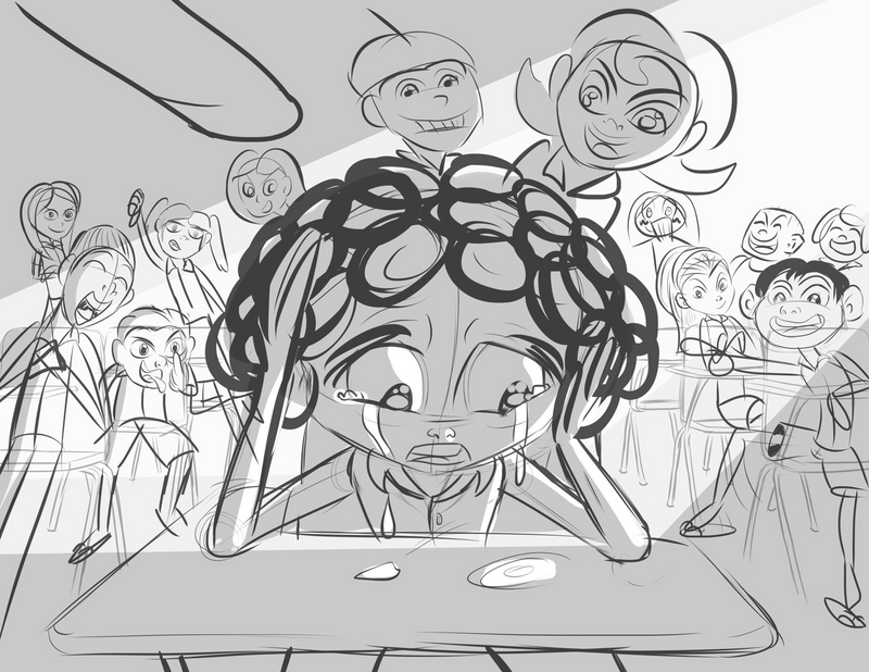
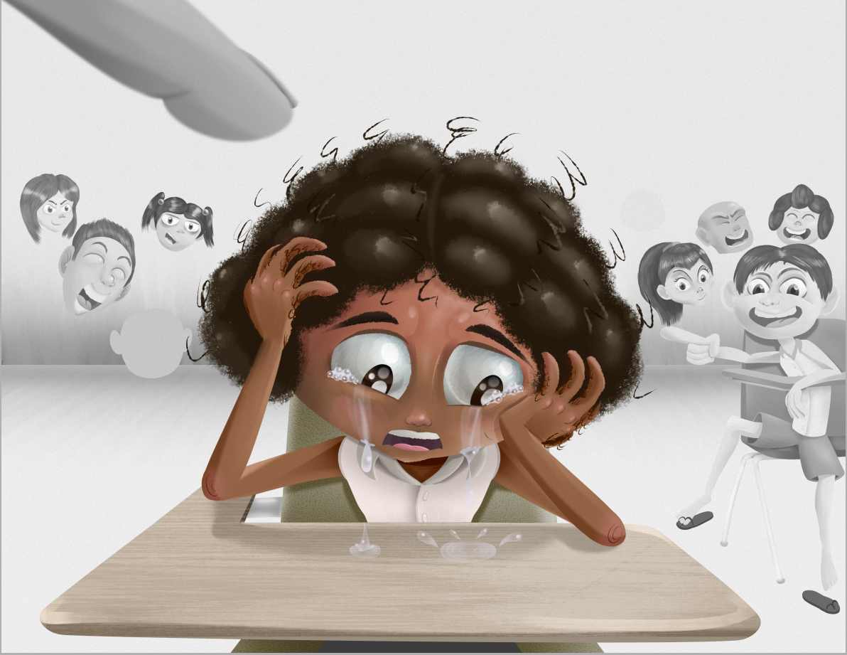
- Maganda crying in class as everyone is calling her ugly.
- Maganda winning the beauty pageant as the other contestants are jealously shocked.
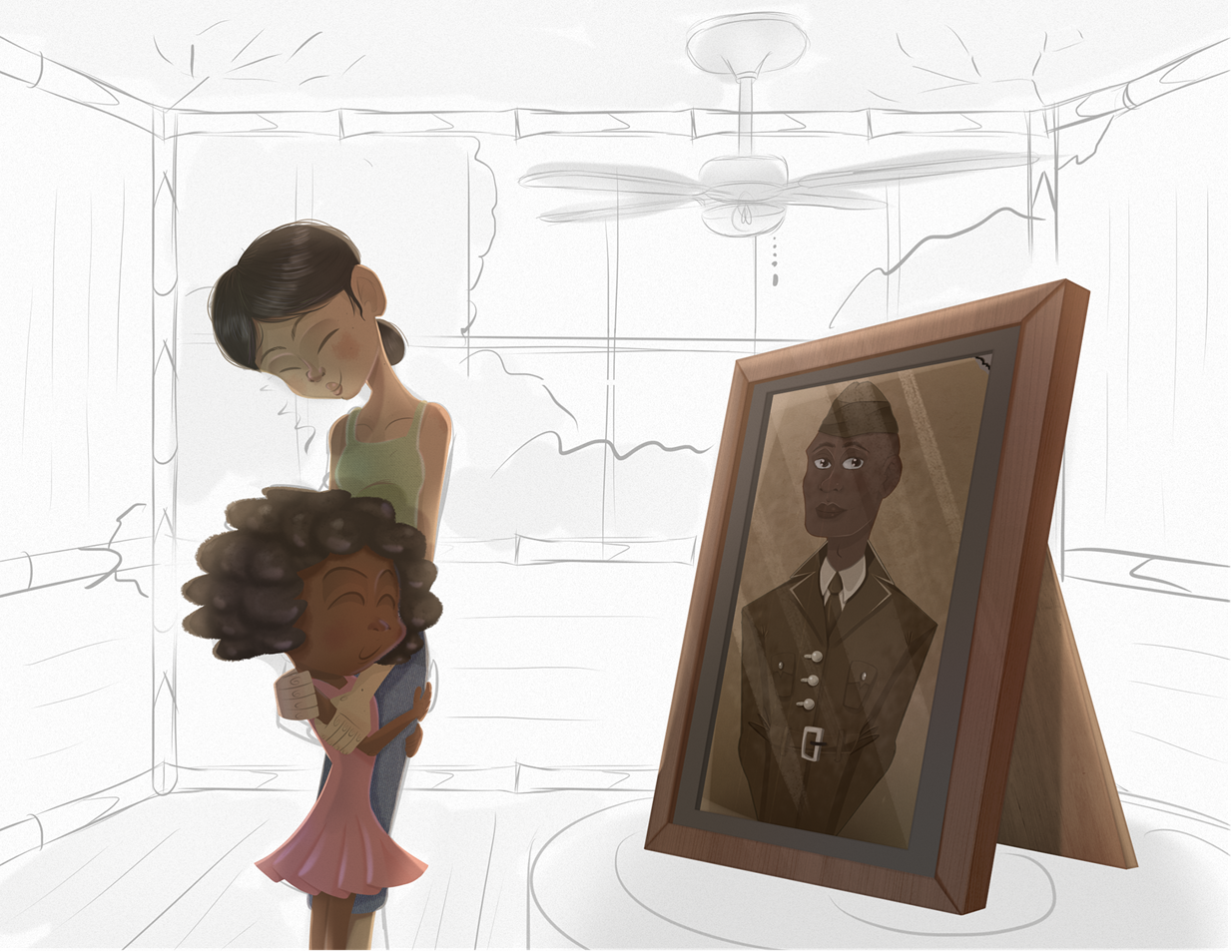
Here is the sketch of the first drawing for composition.
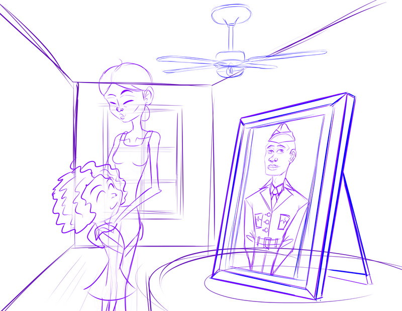
For this story I want to experiment with shapes, anatomy and perspective. I've always been inspired by Pixar but I've never integrated elements that we associate with their movies (fluid and exaggerated anatomy, cinematic views, etc.)
Maganda's dad looks sorta realistic because he's kind of a caricature. His body and her mom's body are really exaggerated. For her mom, I wanted her to look like the typically lower class Pinay mother who works very hard, gets very little sleep but still has enough energy to love her only daughter. I hope it doesn't look too grotesque though.
I changed Maganda's hair (again) because I felt like the afro just wasn't working for her design.
-
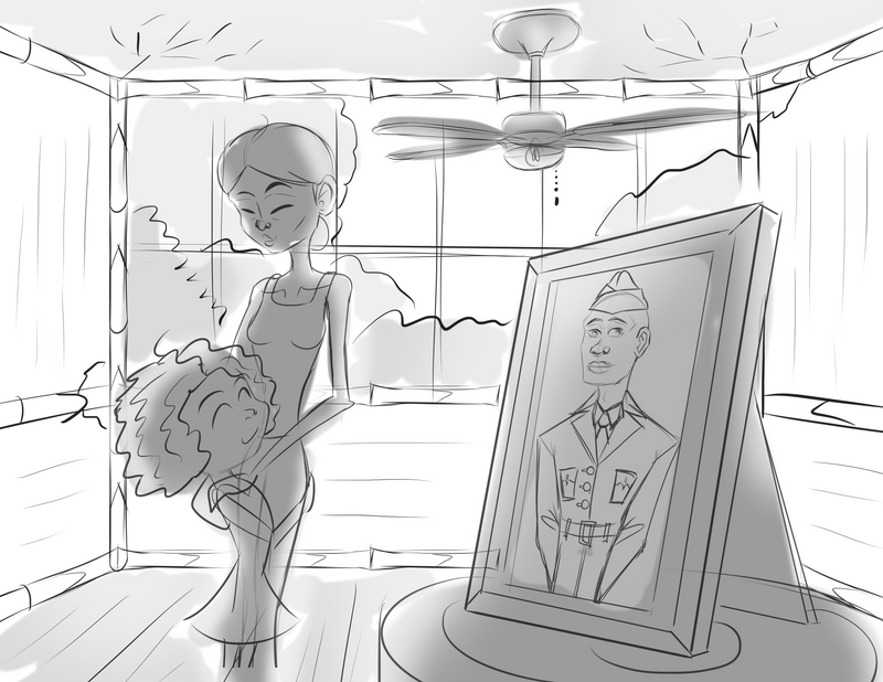
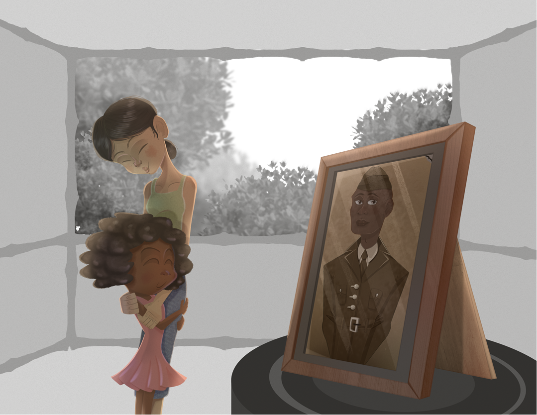
Okay after some outside feedback, I updated the piece to give the hollow room some more character.
Finis Coronat Opus
Instagram: www.instagram.com/madgcartoons/
Behance: www.behance.net/madgcartoons
Website: https://michaelangelodgo.wixsite.com/madgcartoons -
@Michael-Angelo-Go hi. My one suggestion is that maybe the mom is bending over, hugging the girl.
Portfolio: nyrrylcadiz.com
Instagram: https://www.instagram.com/nyrryl_cadiz/
YouTube: https://www.youtube.com/channel/UCbJCF1Im8ZO7hpGWTKOJMuA -
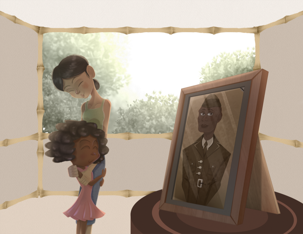
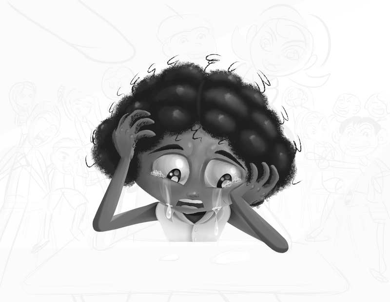
@Nyrryl-Cadiz Okay here's an update. I've been slowing down these days. I need to listen to that burnout podcast.
I'm trying a new technique where I draw everything in grayscale then add in color later. I think this composition will be very strong if there is a clear figure-ground (black part and white part).
I started working on the dad. I think the values are okay at the moment. I'm sort of guessing the lighting of this scene already. Oh and I already changed the pose for Maganda and her nanay.
 I think they look closer than ever.
Finis Coronat Opus
Instagram: www.instagram.com/madgcartoons/
Behance: www.behance.net/madgcartoons
Website: https://michaelangelodgo.wixsite.com/madgcartoons -
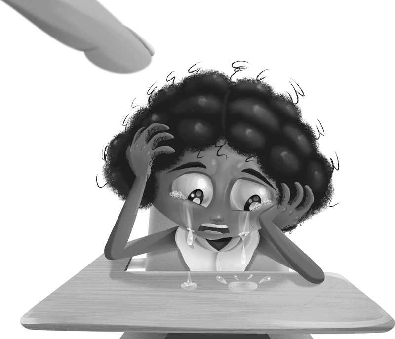
Ooh ooh @NessIllustration look at this!
Finis Coronat Opus
Instagram: www.instagram.com/madgcartoons/
Behance: www.behance.net/madgcartoons
Website: https://michaelangelodgo.wixsite.com/madgcartoons -
Finis Coronat Opus
Instagram: www.instagram.com/madgcartoons/
Behance: www.behance.net/madgcartoons
Website: https://michaelangelodgo.wixsite.com/madgcartoons -
Finis Coronat Opus
Instagram: www.instagram.com/madgcartoons/
Behance: www.behance.net/madgcartoons
Website: https://michaelangelodgo.wixsite.com/madgcartoons -
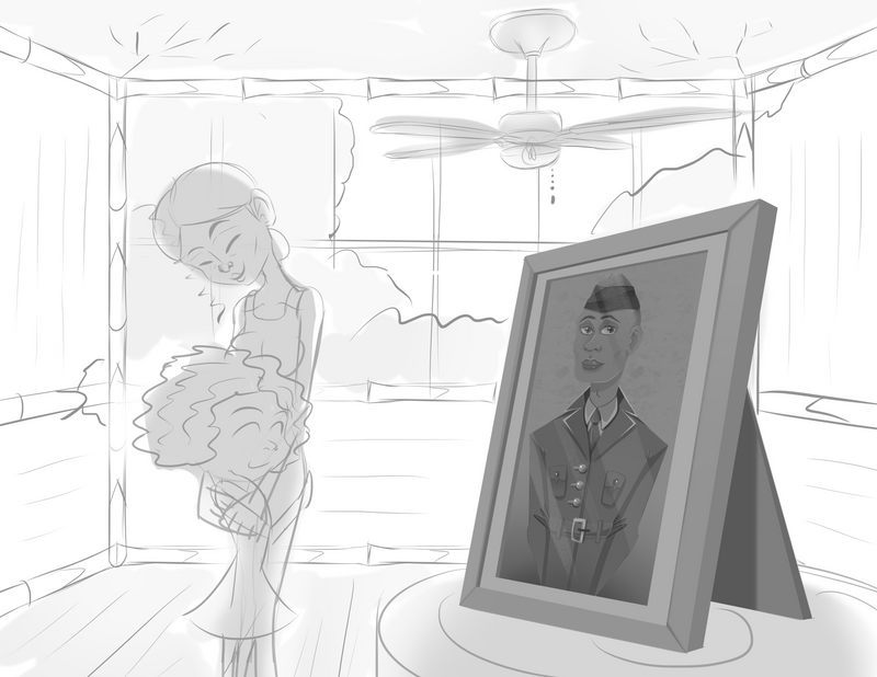
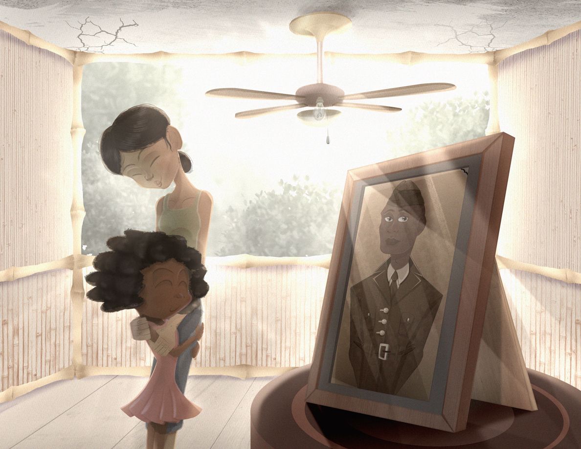
@Michael-Angelo-Go How pretty!
 This is a step above your other work, Michael! Try to add a bit more contrast to improve readability! For instance,the little girl's hair darker to distinguish it more from her hair. You could also move around the foliage in the window a little bit so the mom's head clearly pops out against the sky
 ")
vanessastoilova.com
instagram.com/vanessa.stoilova/Check out my Youtube channel for tips on how to start your career in illustration! www.youtube.com/c/ArtBusinesswithNess
-
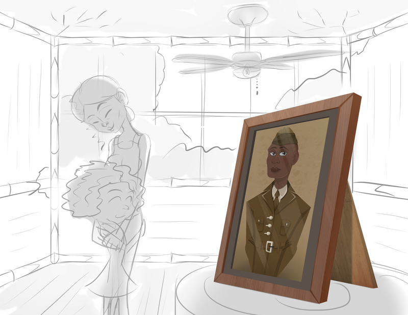
@NessIllustration Oh I forgot to mention I'm not done. I'll add an update later today! I didn't add the fan as you can see.
-
@Nyrryl-Cadiz @NessIllustration
I just finished rendering the scene. I added some motion blur, but I'm worried it might be overkill. Should I add some blur, no blur, or only a little bit of in-between? Let me know what you all think!


Finis Coronat Opus
Instagram: www.instagram.com/madgcartoons/
Behance: www.behance.net/madgcartoons
Website: https://michaelangelodgo.wixsite.com/madgcartoons -
@Michael-Angelo-Go I prefer without, it just looks nice and crisp
This is probably my favorite piece of yours ever! I love the limited color palette and the emotions. I do think you could push your blacks a bit more black to make the contrast sharper though!vanessastoilova.com
instagram.com/vanessa.stoilova/Check out my Youtube channel for tips on how to start your career in illustration! www.youtube.com/c/ArtBusinesswithNess
-
@Michael-Angelo-Go Like so?
vanessastoilova.com
instagram.com/vanessa.stoilova/Check out my Youtube channel for tips on how to start your career in illustration! www.youtube.com/c/ArtBusinesswithNess
-
@NessIllustration no blur and perhaps increase the value contrast.
Portfolio: nyrrylcadiz.com
Instagram: https://www.instagram.com/nyrryl_cadiz/
YouTube: https://www.youtube.com/channel/UCbJCF1Im8ZO7hpGWTKOJMuA -
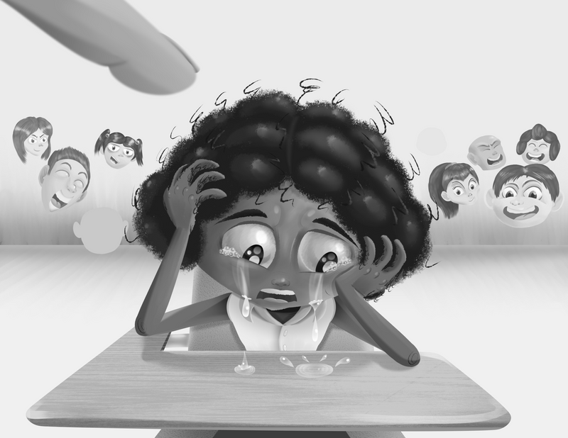
My next drawing.
-

I darkened the values, but now I'm thinking maybe the mother's shirt sticks out too much because it's a little saturated.
Finis Coronat Opus
Instagram: www.instagram.com/madgcartoons/
Behance: www.behance.net/madgcartoons
Website: https://michaelangelodgo.wixsite.com/madgcartoons -
-
Progress you guys!
Finis Coronat Opus
Instagram: www.instagram.com/madgcartoons/
Behance: www.behance.net/madgcartoons
Website: https://michaelangelodgo.wixsite.com/madgcartoons -
Finis Coronat Opus
Instagram: www.instagram.com/madgcartoons/
Behance: www.behance.net/madgcartoons
Website: https://michaelangelodgo.wixsite.com/madgcartoons -
Finis Coronat Opus
Instagram: www.instagram.com/madgcartoons/
Behance: www.behance.net/madgcartoons
Website: https://michaelangelodgo.wixsite.com/madgcartoons -
This one's taking a little while to render.
