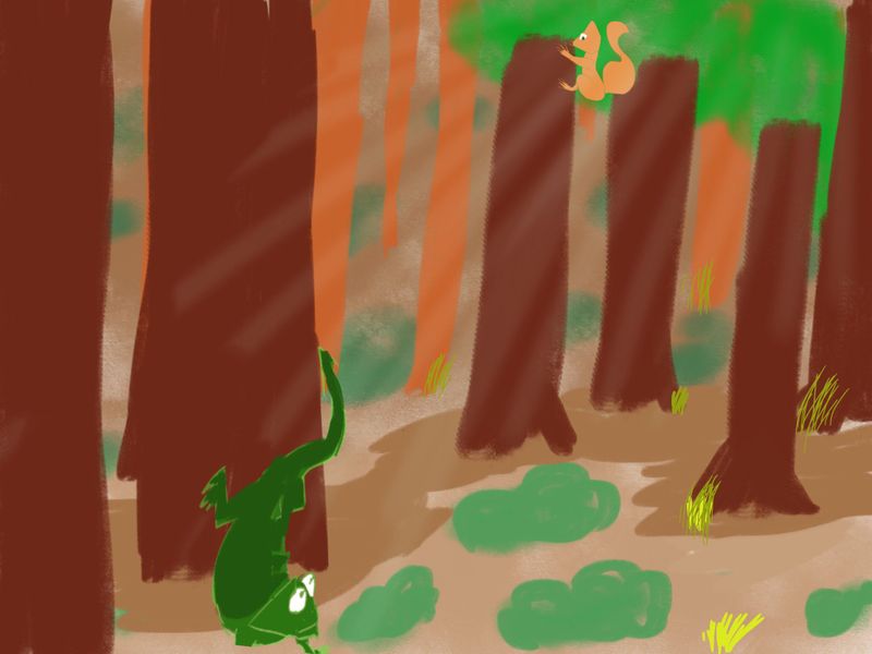
final composition course assignment -problems with colors!
-
it came out very meh...
what happened to all you composition lovers? no advice to give?
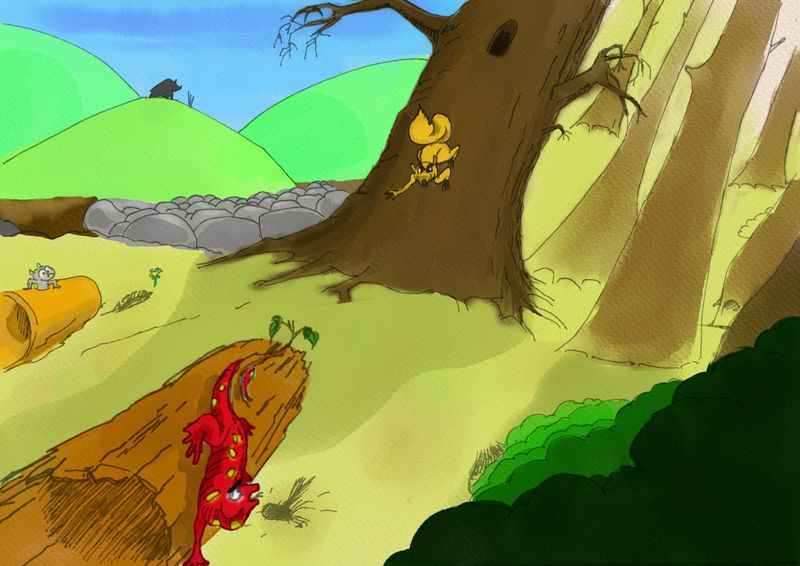
-
@arielg Hi Ariel. Yes, I think the story is pretty clear too so great job on that! Here are some suggestions:
Composition related:
- You may want to vary line weight through the composition to make it look more interesting. Instead of using a fine tip pen, try something with a thicker nib.
- The salamander and the bark are much more detailed than the rest of the picture. All the other tree trunks are pretty bland.
- The trees and ground both are slanting to the right which is looking a little wonky
Color related:
- I think the main thing is that your background colors of the hill are too bright. The further you go, the more the colors desaturate.
- The dark bear against the light sky is also acting as a high contrast focal point
- The warm bark and the red salamandor are too close together in the color spectrum. You could try cooling down the bark a little.
-
thank you so much
I'll try all of your feedbacks
@Neha-Rawat regarding the bark and salamander details, isnt that's what we're supposed to do to demonstrate distance? closer objects are more detailed while more backwards are less? or was i going too far with this?
i meant the horizon line to be tilted to the right...perhaps i should add it, but it doesn't work with the rest of the trees, so i don't know how to solve it, or perhaps the hills there are sitting on straight horizon line..and they should be tilted too.(too add tension and danger to scene...which i don't feel at all!)color-
do you think the color of bison should be more close to the sky?- i thought of making the salamander black...
even the red is captivating, it looks weird.
- i thought of making the salamander black...
-
The best colour combinations you have in this image are in the grass, shadow of the tree and tree trunks because they are harmonious in their tones. If you bring everything else in the foreground into that same colour relationship they will appear as though they belong to the same space (affected by the same atmosphere - light and shadows). Just remember that anytime you break that pattern, like by introducing a contrasting tone you are going to draw the eye to it so you need to wield that power with purpose and intention to tell the viewer where to look. The background hills are really eye-catching because they are so highly saturated and the bushes at the front are heavy and dominating because the colours are dark in a saturated tone - they look like they belong in a different picture.
As for the Salamander he is very bright considering he is in the shadow of the big tree, you could tone him down a lot by using the red that you used for the shadow on his body then deepen the shadow with a purple red. Also his expression is getting lost because his head is overlapping his body. I would lengthen his neck out to make it a clearer silhouette against the grass.
The log he is on could also do with more colours to show shadow in the grooves of the bark texture and the hollow in the middle.The bison looks more like a house to me, perhaps bring in down onto the hillside and have him grazing or standing in a more recognisable silhouette. He is also looking ginormous in scale, not sure if that is part of the story.
The rocks give a good sense of depth because of size variation but they look very tidy and uniform, perhaps have some spilling towards us and into the forest behind the main tree. The perspective of the trees are at odds with the hills in the background/horizon like they’re all falling over, I would straighten them and also vary the way they lean so it looks like natural growth. -
@Lovsey thank you! great feedback!
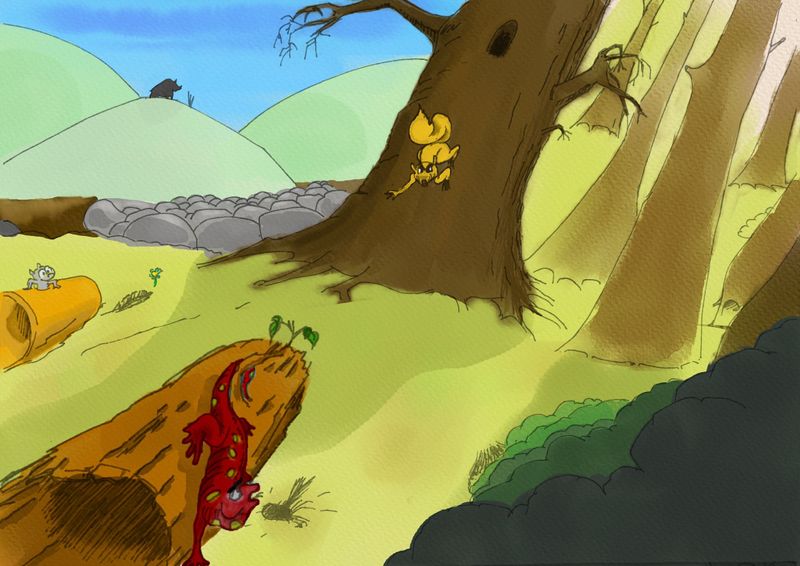
I'll get to redrawing later on, just had some spare time to play around with the saturation..
thanks again guys!
-
@arielg Great! It’s looking so much more cohesive already. Just toning down the colours has completely changed the way my brain can see what is happening in the image: my eyes go straight to the yellow squirrel and then to where he is looking (the salamander).
-
@Lovsey you did it my friend, the credit is all yours. i've learned something.
-
@arielg
 Happy to help in any small way - you did the hard part!
 -
I have a question though, which sounds to me alot like mixing audio:
i feel like i have lost the "quality" of each color I de-saturated, like its essence to the expense of the whole.are we all sure that's what it takes-to lower saturation, and to lose the liveliness?or perhaps the color picking is the real issue?
in mixing, you use equalizers to lower the audio parts that are making the mix more muddy, or that are lost in clarity, and you lower certain frequencies to make the whole mix clearer. i had problems in that field too... I feel like if the performance is great, then everything else falls in place.. but i don't know what it means technically
-
@arielg said in final composition course assignment -problems with colors!:
I have a question though, which sounds to me alot like mixing audio:
i feel like i have lost the "quality" of each color I de-saturated, like its essence to the expense of the whole.are we all sure that's what it takes-to lower saturation, and to lose the liveliness?or perhaps the color picking is the real issue?
in mixing, you use equalizers to lower the audio parts that are making the mix more muddy, or that are lost in clarity, and you lower certain frequencies to make the whole mix clearer. i had problems in that field too... I feel like if the performance is great, then everything else falls in place.. but i don't know what it means technically
I’m not entirely sure I understand your question but I’ll try to answer...if you’re asking if you have to avoid saturated colours to make a pleasing image, of course not. Part of colour composition is personal preference and there is a place for bright colours when done well, like in more graphic or editorial illustration and in children’s books when it suits and doesn’t distract from communicating the story. Lots of highly saturated colours can convey a bright, sunny, positive, cartoony world (perhaps the ‘liveliness’ you’re talking about) that is especially attractive to very young children. But like in music, it’s about balance between the colours - the different notes, rhythms, instruments all complimenting one another so that they sound pleasing and like they belong together in a song. The craft is revealed in the artist directing and managing the balance of all the levels and it takes many years of training and practise to develop proficiency in any craft.
Colour picking is usually the issue, the more one learns about colour theory and the more they practise painting and experiment with colour mixing, the easier it will be to pick the right colour levels on the first go without having to desaturate and repaint so much along the way. Doing greyscale value studies to find the light, mid and dark tones before you begin can help direct colour selection because you’ll know where the light is coming from and where the focus should be. I haven’t done it yet but Will Terry’s class on Choosing Colors for Storytelling might be helpful for you.
Also in this particular work, you can add in saturation through lighting - for example the salamander’s face is entering the sunlight so you can brighten the red to show that light and add highlights in the same or similar tones on other parts of his skin to unify and add form.
-
yes i did that with the face. but i should make it more saturated..!
thanks again, yes, its a craft. don't know why i thought it would be easy heh...
well i didn't know it'll be this hard perhaps. but yeah, there's a learning curve for everything, and i haven't really practiced that so yeah. -
@arielg i think you may be better off thinking less about colour, and more about light. Think in terms of value, then you will realise that colour is actually a lot less important than you think. Get the value right, and you can pretty much use whatever colour you want, within reason.
The colour of your object is a combination of the local colour (a red salamander) and what ever colour you shine on it. If you shine a bright blue light on a red salamander, in a pitch black room, it will certainly not appear red.
Watch this video, it will change your life!
-
@gavpartridge hi
im sure there's alot i dont know in terms of color/light/shading, since i havent taken the time with it. i will get to this foundation later on, even though i see it has a big impact on composition.thanks for the video and the suggestion
-
@gavpartridge
great video, indeed it opened up new worlds for me, but also many questions hehe. -
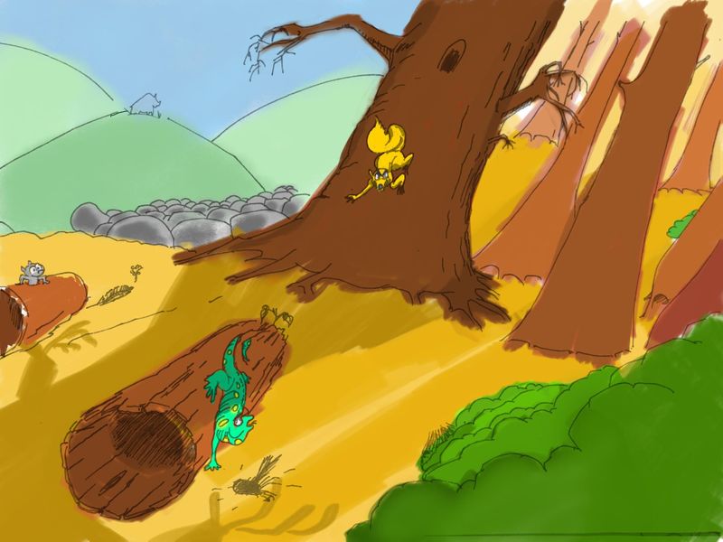
unfinished, but what do you think now of the colors and shades...cool warm...saturated..i don't know alot, but i experimented...
-
@arielg Hi so I have only read some of the previous posts. I use colour sparingly, because I am not that great with it but I love it. If you haven't taken Lee's Light and Shadow class I think it would really benefit you, especially understanding local colour, local tone and setting up light on dark, dark on light (as in darker characters on lighter backgrounds, vice versa).
After all that said I realize you are focusing on composition. I don't understand why there are green hills and blue sky on one side and a extreme jump in colour of oranges and yellows on the right. I don't know terrain to change that abruptly personally. Colour wise I also get easily distracted by the vibrant lush green bushes on the right side (front and middle). If you made the yellow grass/ground a more saturated green than the background, I think that would avoid the separation of the colours in the back, emphasis the yellow squirrel (right now it's getting lost from all the yellow around) and then the salamander might think he can slither away and hide with the green surroundings.
Just a thought.I know people have suggested in other threads to find a colour pallete in other people's work and borrow from them the type of mood/feeling you want.

-
@Heather-Boyd
well these weird choices are because i have no idea in colors.
i dont understand that there shouldn't be an odd jump in colors i mean in the sense that you've said.
perhaps i will just redo the whole thing again..heh, redraw the whole thing and think over the composition again. no one commented on my first black and white, so i thought it was ok...
the weird reasoning behind that terrain change and bushes are to focus the eye over the middle(hence the darker green) and also to try and create rotating eye focus. but i think that didn't work. also, I dont know how the light will work under foilage of forest. so i thought it will be easier with the salamander at the edge of a forest. but yeah. its kinda silly composition wise.
-
@arielg hi! I just got the time to reply to your post. Ok, so before I go to your colors, I would first like to tackle your composition. I'm a bit strapped for time so I just wrote on your work instead of typing.
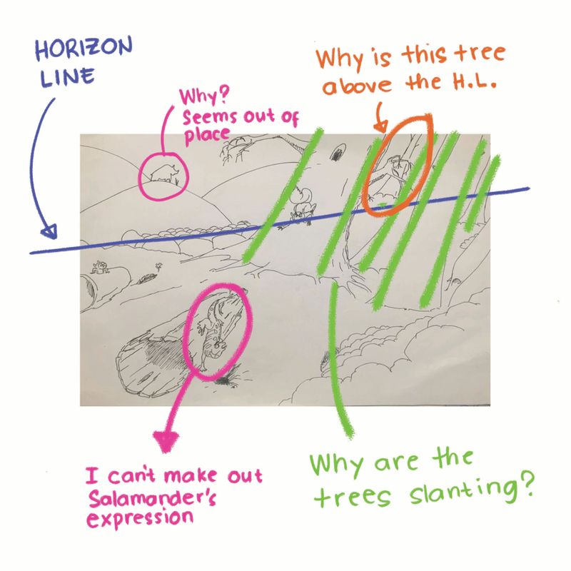
-
@arielg if I were to redraw it, this what I'll do. Disclaimer: there are other maybe even better ways to go about this. This just my personal take on it.
- i suggest simplifying your horizon line.
- enlarge you characters for easier read
- exaggerate your character's expressions
- bring your salamander to the fore ground and give it a darker value compared to the rest of the piece.
- move squirrel more to right to align with rule of thirds
- simplify whole piece to convey story quicker.
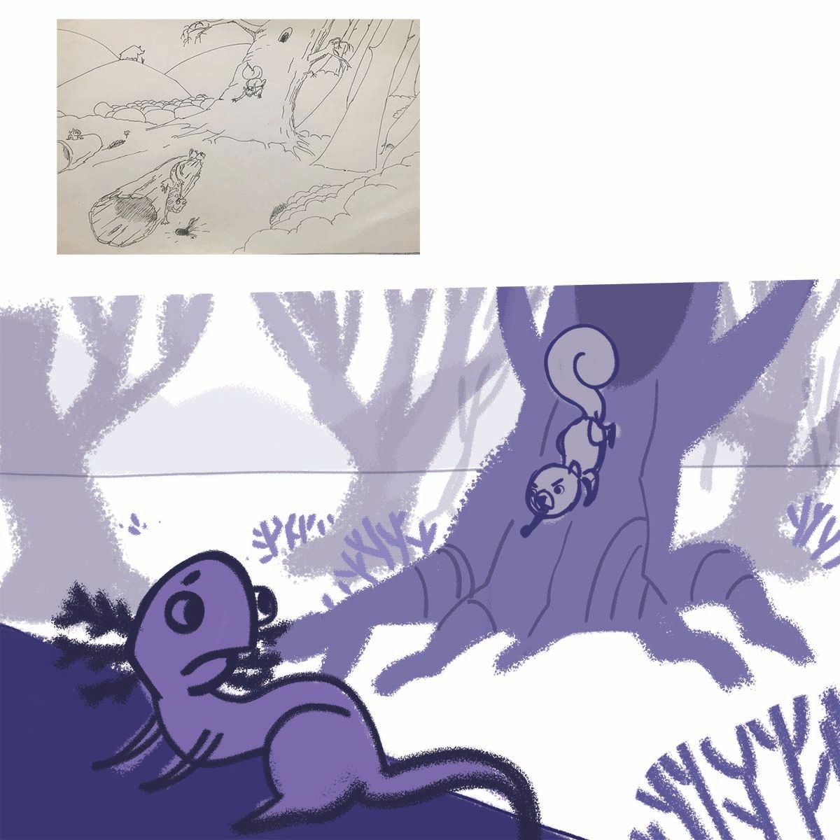
-
first, thanks so much for taking the time.
I will read it(i've drawn this before reading your post)
this was drawn with fingers. I dont feel i'm making progress heh... i dont know how to make the face of the salamander so big without sticking to the story where you can feel she's scurrying on the forest floor.
and also if she is escaping the "evil" squirrel he shouldbnt be that close, so his face is afar, hence you can't really see the expression..?I mean your composition is clear but i'm not sure it covers the forest floor from the story, it seems as if it was convenient that your salamander went abit up hill to emphasize a closer face.
@Nyrryl-Cadiz